Walking into Laurie and John LeBoeuf’s Richmond Heights home, you quickly find that color abounds in the 11/2-story charmer. Serene shades of blue and gray provide a base while bold pops of color add a fun twist in various spaces. John and Laurie purchased the property in 2012, and after a few updates, they have made the house a home for their family of three.
Already familiar with the area – Laurie lived on the same street before marrying John – the couple loved the look and feel of the neighborhood. So when they were looking for a home, it was no question Richmond Heights would be a great place to put down roots. “Looking at the home for the first time, we just loved it,” Laurie says. Previous owners had made many renovations to update the property, but there was still an opportunity for John and Laurie to add their own touch.
One major change the couple was adamant on making was opening up the main floor to include a casual family room. By eliminating one of two bedrooms on the main level and removing a wall between the bedroom and kitchen, the couple now has an open kitchen-living area perfect for entertaining or quiet nights at home with their new baby girl. “Once we got the go-ahead on taking the wall down, we knew this was our house,” Laurie explains. In fact, the day they closed on the property, the wall came down! Laurie drew up the elevation for the new space, and their families helped with the dirty work. Since the wall was load bearing, it wasn’t just a simple tear down, but the end result was an opened-up space with interesting details. Columns were added on each side to match the style of the home, while the curved entry and cutouts add interest.
Calling their style transitional with a blend of traditional and contemporary furniture, finishes, fabrics and lighting, Laurie and John have incorporated a variety of accent pieces and accessories that fuse the old with the new. A local interior designer in the hospitality industry for the past eight years, Laurie loves combining pieces that have sentimental value from the couple’s travels with great finds from local antique shops. “I don’t like to buy anything as a set,” Laurie explains. “We like to find pieces that work well together and complement one another for a less-matchy feel.”
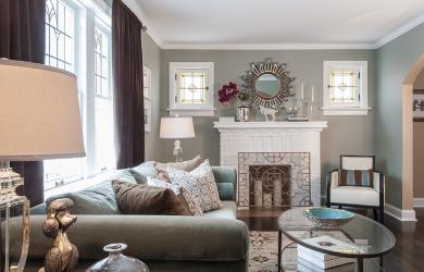
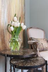
An oversized custom floral by Twigs & Moss is displayed in an intricate vase as you enter the home. The goal of the entry was to create a dramatic yet cozy and intimate feel. The floral brings a bright pop of color to the entry, which transitions to a neutral warm and cool palette in the more formal living room. Muted blue tones and warm gold hues juxtapose in the living room to establish the cozy feel the homeowners desired. The space showcases many of the great accent pieces the homeowners have collected over the years, including a blue and green bowl on the coffee table they purchased on their honeymoon in Hawaii.
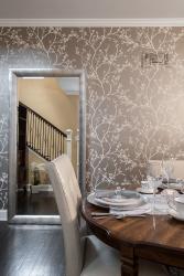
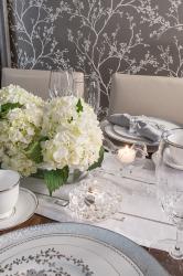
Adjacent to the living room, the dining room connects the front of the home to the combined kitchen/family room and guest bedroom. Because the space is small, the couple went for a more dramatic and distinct feel to distinguish it as a dining room and not just a pass-through to the back of the home. A prime example of blending old and new, a bold metallic Schumacher wallcovering in an organic print brings a contemporary feel, while the Stanley Furniture dining table, which belonged to Laurie’s parents, is a nod to the past. New, upholstered dining chairs were added to update the dining table and give it a more modern feel.
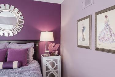
Just beyond the dining room is a first-floor guest bedroom where Laurie and John brought in a splash of color. Bold and bright, yet calming and inspirational, the purple tones complement the blues and grays found in the main level. The headboard wall is painted a deep plum, while the remaining walls are coated in a lighter lavender hue. Because the space is small and closed off from the main living area, the homeowners were comfortable going with a bolder color choice in the bedroom.
A piece of coral and a sea fan the couple bought on their honeymoon in Hawaii sit on the white-mirrored storage pieces that serve as nightstands. On the wall hang three vintage Barbie prints, which hold sentimental value to Laurie who has collected Barbies and Barbie ornaments since she was a child.
The second floor was another area of the home that required updating. Previously unused attic space, the HVAC units needed updating and two rooms were converted to the master bedroom and nursery. In the master bedroom, the roof was opened up to allow the bedroom to be the full width of the house. Laurie and her father-in-law drew up plans and then worked with Brewer Contracting to achieve the final design, which includes a walk-in closet and built-in storage niche by California Closets.
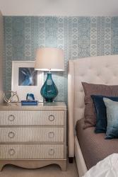
Soft grays with light and dark blue accents create a more neutral color palette in the sophisticated master bedroom. A painting the couple purchased from Cape Cod artist Tom Stringe in Brewster, MA, inspired the palette. After visiting Cape Cod three years in a row, they fell in love with the small-town charm and beautiful landscape and used the soft tones to inspire their bedroom. A ROMO chevron fabric on the bolster pillow as well as the ROMO wallcovering behind the headboard further bring the palette alive.
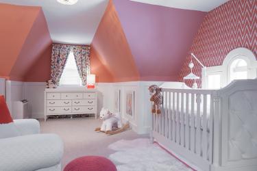
Just down the hall from the master is the nursery. An existing melon-colored, chevron wallcovering that was installed prior to becoming pregnant sparked the nursery design. Unsure if the color scheme was the direction they wanted to go for a nursery, Laurie came across the Schumacher butterfly fabric and thought it would be perfect for draperies. The wallcovering paired with the fabric inspired the creation of a fun, bright and playful nursery that their little one can grow into over time. White wood paneling was added to break up the bright wall color.
Pulling items from a variety of resources, the space came together into a room fit for a princess. “I didn’t want a theme,” Laurie explains. “Instead I chose to stick within the color scheme and find unique pieces that complement the overall look.” Abstract artwork by Britt Bass complements the color scheme and will not become obsolete as their daughter grows. By not limiting themselves to choosing fabrics or items from just once place, the homeowners truly have created a unique place to play or cozy up in the rocker and read stories.
By embracing color and mixing old and new furnishings accented with sentimental pieces, Laurie and John LeBoeuf have successfully crafted their Richmond Heights home into a space that is not only comfortable and cozy, but also reflective of their family and personality.


