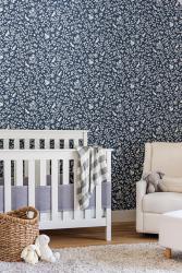
By Element Design Network. The designer wanted a true nursery wallpaper, not necessarily something that would grow with the client's son. They chose a darling Fox & Hare wallpaper from Magnolia in navy and used the wall behind the crib and glider as the focal point of the room. By only wallpapering that one wall, it can be changed out in the next couple of years to something that will stand the test of time. But for now, this sweet print is the backdrop to the cutest nursery. Photography by Erin Konrath Photography.
By Andrea Schumacher Interiors. Andrea Schumacher Interiors commercial space received a full inside-out renovation, and this kitchen was designed to reflect the designer’s signature style: vibrant, eclectic and carefully curated. The 3,500-square-foot storefront in Denver’s Art District houses a light-filled, mural-lined Showroom on the main floor and a designer's office and library upstairs. Photography by Emily Minton Redfield.
By CM Natural Designs. This space is all about high contrast and high impact. The drama and design are meant to evoke a hospitality feel within this client's home. The wallpaper offers energy, movement and color to a space that would otherwise feel a bit cold without only black and white finishes. Photography by Chipper Hatt.
By Hakuna Haus. The walls and details of the girl’s bathroom remodel are all wrapped up. Pretty enough for a little princess yet sophisticated enough for that sweet and sassy, soon-to-be preteen to grow into. Photography by Laura De La Cruz.
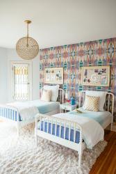
By Kate Taylor Interiors. This bright and cheery bedroom was created to reflect the sparkling personalities of some favorite little clients - a sister duo entering their tweens and teens. They gave the designer their favorite color combinations. The modern paper melds well with the historic and traditional bones of the home. Photography by Heather Talbert Photography.
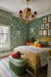
By Crystal Blackshaw Interiors. Located in an 1880 row house in Chicago, the home was renovated and restored for a family of four. This room is for a 10-year-old little girl who loves lemons and strawberries. Her favorite color is orange, so the designer went with a pattern-on-pattern fruit theme. Her playroom is located in another area of the house so the bedroom could solely function for sleeping and clothes storage while energized with colors and patterns. Photography by Heather Talbert photography.
By Fiddlehead Design Group. The designer chose a hand-blocked wallcovering by Schumacher as the perfect backdrop for this vibrant and layered dining nook. Pops of red on the dining chairs and upholstery make the space come alive and welcome you in. The brass light fixture is a focal point and brings out the gold in the wallcovering as well. The glow they both create at night is truly magical. Photography by Susan Gilmore.


