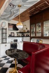
A painting of an octopus twists its way up a wall and across a soffit in the kitchen of a Central West End home, reflecting the homeowners’ unique design style.
The homeowners asked local artist Phil Jarvis to create the sea creature. “I thought it would be interesting to put some kind of mural there,” the homeowner says. “The reason we chose an octopus was because I wanted it to have movement, and also wanted it to be kind of unexpected.”
The recently-completed remodel of the kitchen had the goals of expanding the room, upgrading the flow and transforming it to the style of the homeowners. They hired Dana King Design Build Remodeling and worked with owner Dana King and designer Renna Barnes for the renovation, mainly to design and manage the engineering and layout aspects. “The biggest thing she needed from us was not so much the vision, but for us to carry out her vision,” Dana says. “We found new purposes, a new way of looking at the space. It was like putting together a puzzle.”
The kitchen gained space by removing a back staircase originally built for the household help. Previously, to access the 1899 home’s kitchen, you could either walk through the formal dining room, or around the back staircase. In place of the staircase they added a walk-in pantry. In the new pantry, an exposed window floods in light from above.
The homeowner also wanted easy access to the basement. A standard staircase would have taken up too much space, so the designers suggested a spiral staircase. While functional, it’s also a fun design feature. “They don’t take themselves seriously and they lean into whimsical,” Dana says. “You realize there’s a story here in every single artwork and piece.”
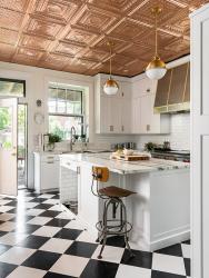
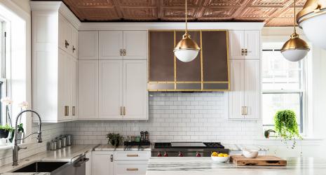
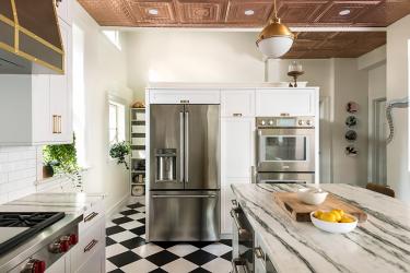
The homeowner loved the look of a pressed tin ceiling in a San Francisco bar. “I thought if I ever had an old house I would have a pressed tin ceiling in the kitchen,” she says. The designer used faux copper to provide the look of the tin ceiling, but with a few advantages, including that it won’t patina. The homeowner saw checkered black and white floors while vacationing in Albuquerque and in Puerto Rico, and had to have that for her own kitchen.
When dining out, the homeowners prefer to sit in half-circle booths. The designer collaborated with a local restaurant furniture maker to custom make an upholstered banquette for their kitchen. The homeowners knew they wanted the booth to be red. “We wanted something that stood out,” she says. “The booth can maybe seat up to six people, and on a day to day basis, it’s great for just the two of them,” Renna adds. “It’s very comfortable, and inviting for hanging out in the kitchen while the chef is preparing meals.”
The wood hutch behind the banquette is original to the house. “It was important to them to keep the hutch in place,” Renna says. “We gave it a refresh, not a refinish, to show and allow the natural aging of the woodwork.” A watering and feeding station—complete with a water faucet and drain—is tucked into the kitchen island to make caring for the home’s two dogs easier.
The kitchen now is more functional, and matches the style of the homeowners. “The white cabinets, the black and white floor, the copper ceiling, all of that is exactly what I pictured,” the homeowner says.


