When creative friends collaborate, their combined energy often produces something quite magical. A unique momentum evolves almost naturally—a dynamic nearly impossible to duplicate. Such was the case when a St. Louis builder and an interior designer joined forces with photographer Heidi Drexler and Troy Stehr, a dynamic, soon-to-be-married couple who were looking to construct their own little happy place. It all began one evening back in 2020 when Monte Herring, a custom home builder at Herring Design & Development, was out with the couple, who happened to be long-time friends.
“They expressed how hard it was to find their dream home in Kirkwood and asked if I knew of anything,” Monte recalls. “Before answering, I thought to myself, yes, I have the perfect house, but we are too busy right now to take this on. Then immediately, I knew it was perfect for them, and as soon I said Central Place, Heidi and Troy erupted. It was their favorite street, and they purposely had it on their running route because they love the atmosphere and history.”
Soon after, they were all working on space requirements and exploring lifestyle goals before switching the focus to interior design. “Monte has been a friend of mine for 15 years,” says Heidi, owner of Heidi Drexler Photography. “I have photographed his homes, so I saw first-hand his attention to detail and the passion he has for his projects. I truly believe I manifested this home—I knew one day I would live in a Monte House.”
Next, enter interior designer Lisa Knight of Design House STL, who Heidi met as a client when she photographed one of her projects. “I loved her energy and vibe,” Heidi adds, “and when we got the house, I knew I wanted to work with Lisa.”
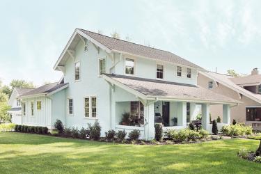
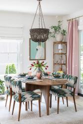
At their initial meeting, Heidi and Troy said they wanted to craft a happy house, so many of the design decisions were driven by this request, starting with the exterior. The homeowners wanted to respect the history but create an exterior color scheme that was unique and upbeat. So, the team came up with the perfect shade of blue—one that is ever-changing, depending on the light and time of day. From the moment you step inside, you are transported to a home that still feels historic in its roots but is also modern and very livable.
“From the beginning of the project, it was as if we had known each other for years,” says Lisa. “With some clients, you just click, and Heidi was one of those. She has a great eye and knew what she wanted in a broad sense, and I helped her refine her ideas and pull the look together.”
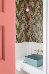
After discovering that many of the dwelling’s original architectural features could not be salvaged, the team added vintage-style embellishes, such as the dining room niches and the powder room’s wainscoting, to enhance the home’s 1920s appeal. Huge fans of using color, the owners wanted their home to be vibrant but not overwhelming.
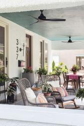
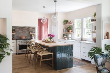
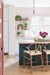
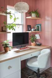
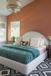
“It’s a sensory explosion in the best way,” notes Lisa. “Also, each space speaks to one another by repeating colors to create cohesiveness.” For instance, the turquoise ceilings of the exterior spaces are echoed in the kitchen island’s teal tile base. And the kitchen’s blush wall hue transitions to an adjoining room bathed in pink—Heidi’s favorite color. The hallway wallpaper includes tones of terracotta, so the primary bedroom accent wall, which can be seen from the hallway, is also terra cotta.
“I love standing in the front of the house and looking back to the primary bedroom,” says Heidi. “All the colors complement each other, and throughout, I used a lot of personal items to decorate. I started collecting coffee table books a few years ago and love to create vignettes and moments. During the renovation, we discovered the old sleeping porch was lined with newspapers from the 1940s used as insulation, which inspired us to put a time capsule in the walls for someone to find in another hundred years.”
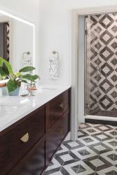
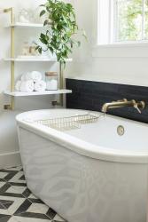
To balance their vivacious aesthetic, white paint was applied to most of the other walls, and pops of color and pattern were sprinkled in via fabrics, wallcoverings and accent pieces. For the front porch, the homeowners wanted to create a space that felt like an extension of the interior. So, they added sliding doors to both the living and dining rooms that open to the porch and painted the ceiling a playful shade of turquoise.
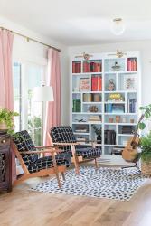
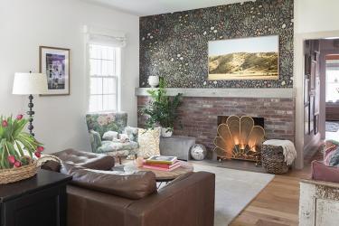
In the living room, they could not reuse the existing fireplace, so they created one that bridges the gap between modern and traditional. Here, traditional brick pairs with a beautiful custom concrete mantel and bench backdropped with floral wallpaper to create an artful focal point. They also added built-in bookcases and painted them the same blue hue as the exterior. To tie the living room and kitchen together visually, they designed a brick backsplash behind the stove.
“Heidi and Troy made a choice to only add on the space they needed,” says Lisa. “The house actually lives very large for its 2,400-square-foot design, and the couple spend time in every room.” Completed in November 2022, the original three-bedroom, 1.5 bath is now a four-bedroom with 2.5 baths.
“Working with Lisa was like designing my house with a friend who has great taste,” says Heidi. “She knew how Troy and I liked to live and created a home built around us. Lisa saw my vision, and together, we created something pretty magical. I knew I could trust Monte with the overall architecture and design of the home, and I knew I could style it and make it homey. Lisa was the icing on top, helping it all come together.”
Married just last June, Heidi and Troy are happy to be living in their very first home together. Between the two of them, they have four boys, two of them adults, and two soon to graduate. They love entertaining and being at home, so they wanted to create a cozy retreat and a space where their kids and friends could hang out. They even started an Instagram account, @thebungalowrevival, where they document the renovation process and give a behind the scenes look at their life in the house.
“My design style has always been colorful, eclectic and layered,” says Heidi. “I want it to feel warm and happy, and being a photographer, I am extremely visual, so aesthetics are super important to me. I read somewhere your home should tell the story of who you are, where you’ve been and what you love—I think we accomplished that.”
Resources
Interior Designer Design House STL
Builder Herring Design & Development
Architect DL Design


