The goal was immediately clear when Tina Wolff and Lauren Berry of Wolff Interiors were asked to design this elegant 3,000-square-foot condo residence: to create a sleek and simple space that would allow their clients’ spectacular artwork and custom architectural details to take center stage.
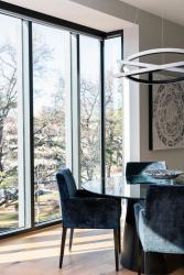
Situated in a vibrant neighborhood on the outskirts of Clayton just five minutes from Shaw Park, the contemporary-style condominium building aptly named The Pearl was developed by Toptop Way Condominiums, LLC (a Mehlman Family joint venture) with architecture by CORE10 Architecture. Modern bay windows, arguably one of the most notable features of the building, are made entirely of glass and black metal. "The Pearl's stripped brick facades and tall bay windows make for a perfect blend of old-world character with the modern details that make for wonderful streetscapes," says Tyler Stephens of CORE10 Architecture. From the outside, these windows set the new structure apart from the surrounding buildings. From the inside, the bay windows create a beautiful focal point for the dining room while framing the sunset perfectly and letting in an amazing amount of natural light.
“The homeowners, Cindy and Preston Fancher, have very clean, contemporary tastes,” says Lauren Berry. “We typically design homes with a more eclectic/new traditional look, so this was a fun challenge for both Tina and me. When the builders came to us with this project, we quickly concluded that a very simple and minimal look would work best for the clients. The Fanchers love art and wanted special pieces to be showcased throughout, so we decided to use color sparingly and stick to a tight color palette,” she adds. “We started the process off by sharing a lot of inspirational photos and color schemes with Tina and Lauren,” says Cindy. “They were able to find the exact elements that fit perfectly with our tastes. We wanted the space to feel open and full of natural light, and we like to use minimal window treatments to maximize the light,” she adds.
To personalize their space and highlight their favorite artists, Cindy and Preston commissioned St. Louis artist Michael Hoffman to create three unique pieces that serve as important focal points in their home. Friend and Santa Fe artist Amy Van Winkle created the stunning works displayed in their loft and master bath.
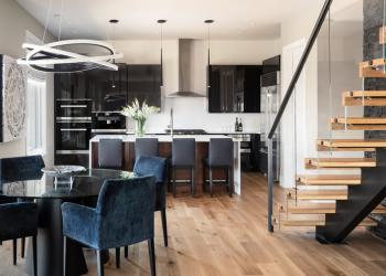
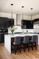
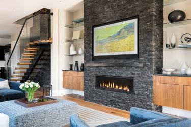
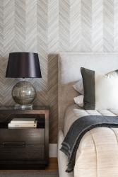
“We focused heavily on the textures in the home,” says Tina, founder of Wolff Interiors, who worked with Lauren Berry to design the condo itself, including the lighting, tile, stonework, kitchen, baths, staircase and all hardware and fixtures. “Everything, even the artwork, has textural depth—the rough surface of the stacked stone fireplace, the high-gloss black kitchen cabinets paired with a matte walnut island front, the textured master bath tile, the bedroom’s heavily patterned wallpaper and the carved custom living room rug,” she notes.
All the main living spaces flow seamlessly, from the kitchen to the dining room and living room. The designers worked together to keep the color palette in each space similar but implemented standout features in each area to create captivating focal points. For example, the warmth of the kitchen’s walnut island draws your eye in, and the brilliant dining room pendant light illuminates compelling artwork on both sides of the bay window.
“Lighting was a critical element of the style we wanted,” says Preston. “Tina and Lauren were able to locate beautiful and unique fixtures that perfectly fit our vision and complemented the design of the condo. In addition, the lighting design allows us to create a wide variety of lighting schemes and moods, which keeps the space interesting and fresh,” he adds.
“My favorite piece is the Modern Forms dining room light, which echoes the forms in the Michael Hoffman paintings flanking the bay window,” says Tina. “When you drive by the building at night, it gleams in the window—front and center. It was one of the first items we selected, and it set the tone for the rest of the home,” she sums.
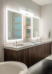
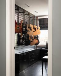
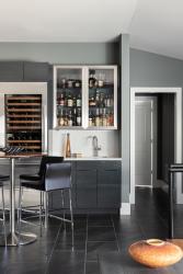
Other special lighting features include the toe-kick lighting in the master bath that highlights a floating vanity, recessed lighting that shines down on Preston’s guitar collection in the music room and the glass bar cabinet that is lit from within to illuminate the bottles.
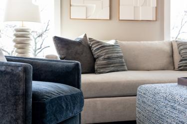
In the living room, a large-scale patterned rug creates a lovely texture and anchors the entire space. The rounded edges of a pair of curvy swivel chairs and table lamps lend a soft touch and introduce a satisfying contrast against the straight lines of the ottoman, sofa and end tables.
“We love cooking and entertaining intimate groups,” says Cindy. “The free-flowing spaces are functional and keep everyone engaged in the entertaining process. We spend most of our time in the living room—reading, talking, watching Netflix, drinking espresso in the morning or a glass of wine in the evening. The colors and design throughout our home are very pleasing to the eye and mind, so the space feels calm and soothing—almost like we are at a spa every day,” she laughs.
In the master bath, the textured wall tile and contemporary fixtures feature clean lines and simple design but are still interesting enough to catch the eye. In the master bedroom, a herringbone-patterned Phillip Jeffries wallpaper surprisingly made of wood provides a stunning textural focal point. The designers intentionally kept the other finishes in the space sleek and simple to allow the wallpaper to remain the focus.
“I especially love the juxtaposition of the heavily striated patterned wallpaper against the bold color-blocked bed pillows,” says Lauren. “We had fun designing these pillows—the modern graphic style was a first for us,” she adds.
The floating glass staircase, which informed the home’s overall design, became the ultimate centerpiece of the condo with its black stone wall behind it and showstopping floating treads and glass railing. Accent lighting glows from above, giving dramatic depth and texture to the stone. In addition, the cabinetry upstairs was built to showcase the pieces in and on them, such as the bottles in the glass bar and the guitars hanging on the wall in the music room.
“Music is an essential part of our lives, and we have musicians over frequently to play,” says Preston. “Being able to have a guitar display room is a wonderful way to enjoy the beauty of each instrument—and I am much more apt to play each of them regularly versus just the one or two that are out of their cases,” he notes.
“We love the feel of the entire unit, and every room has unique design elements that keep it feeling fresh and exciting,” says Cindy. “We enjoyed working with Tina and Lauren—they kept it fun and inspiring throughout the entire process and were able to pull everything together in such a beautiful manner,” she adds. “We are so happy with the results and love to show it off.”
Resources
Appliances: RSI Kitchen & Bath
Architect: CORE10 Architecture
Artwork: Michael Hoffman, Amy Van Winkle
Cabinetry: RSI Kitchen & Bath, The Closet Factory
Furniture: KDR Designer Showrooms
Glass: Floyd Glass
Granite: SFI
Interior Design: Wolff Interiors
Lighting: Wilson Lighting
Plumbing Fixtures: Crescent Plumbing Supply
Window Treatments: Berry Studio
Window/Door: Pella


