When interior designer Tamsin Mascetti told friends and family she was considering purchasing a tired, mid-century home that hadn’t been updated in decades, they were less than enthusiastic. In fact, “everyone told me I was crazy,” says Mascetti. “They couldn’t see what I saw.”
Others saw a Glendale house with no curb appeal, interiors so dated they still contained Cold War-area pink bathrooms, tiny inefficient windows, and a back yard with such a steep drop-off there was essentially no usable space.
Mascetti saw it differently. “When I was walking through the space, it made sense to me,” she says of the split-level floor plan. “I liked the energy of the home. I love finding a home that is tired-looking and lacks functionality for today’s standards and bringing it back to life.” She’s done that several times—most recently with her previous home in Kirkwood. But as her two children were leaving for college and she became an almost-empty nester, she believed a top-to-bottom renovation was a challenge she could handle.
An additional nudge—the renovation process began in July 2020 in the midst of the pandemic. “I actually thought this would be a great time to get people back to work by doing my house,” Mascetti recalls. “Little did I know, material costs would go up and availability of labor would go down. That part was a really bad idea. But we got it done.”
Mascetti approached the project the same way she works with her clients: determining the must haves, assessing and measuring existing spaces, designing the flow and functionality of new spaces after removing existing walls, and laying everything out in CAD drawings. She did turn to architect Michael Cyr of Forney + architecture for help with designing an addition to the home that would connect the existing detached garage to the house. That task had stymied even Mascetti, an award-winning designer. “He had to figure out the roof line for the addition,” she says. “This new space created an entry plus two bedrooms facing the rear of the house.”
Even though she approached the project the same way she would when working with a client, Mascetti acknowledges it’s a different ballgame when it’s your project. “With my clients, I can make quick decisions because I have a good idea what they should do,” she explains. “But when it came to my house, that was rough. I see too many different options out there, so it was hard to narrow it down because I love so many different looks.”
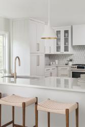
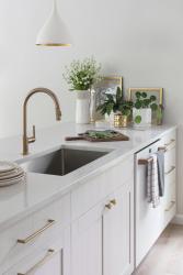
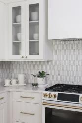
She says the kitchen was probably her greatest challenge. She knew she wanted a soft neutral look with elegant accents but achieving that goal can take many different paths. She ultimately decided on a white, cream and soft gray color palette. Bright, white lacquer upper cabinets mix with warmer, creamy-white wood cabinets for the lowers. “I wanted some different textures,” she says. “The wood grain on the lower cabinets is very warm and the lacquered cabinets are crisp and more modern.” A boxy range hood, custom crafted by Brooksberry Kitchens and Baths, is finished in a high-gloss sheen. And the white refrigerator from the GE Café Series is a “game changer,” says Mascetti, who was tired of constantly cleaning fingerprints off her previous stainless steel fridge. All appliances are from the GE Café Series. Darker gold pulls on the appliances coordinate with satin brass cabinet hardware.
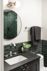
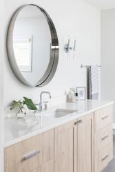
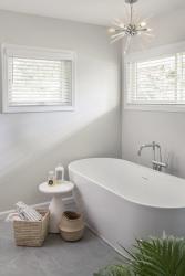
The larger kitchen is an important element of the redesigned lower level, which Mascetti opened up to create better flow and functionality. She added windows and a French door at the back of the home to add much-needed natural light. She took a 4-by 7-foot space from a storage area to create a full bath from an existing half bath. This serves as the home’s guest bathroom and accommodates Mascetti’s son when he’s home. She outfitted the bathroom in green Bedrosians tile and upped the drama with a black vanity and black, suede granite countertop.
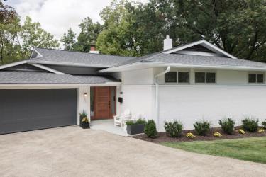
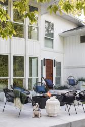
Transformation of the exteriors are possibly even more dramatic than the interiors. Mascetti painted the home’s brick a crisp white, which she acknowledges is not the traditional way to treat a mid-century modern home. “I wanted to make it a modern house for me yet not go entirely away from the mid-century modern details on the inside,” she says. She chose a walnut front door, nodding to the period-appropriate aesthetic. The garage door was painted dark gray, another unusual departure from the norm, yet it coordinates with the new shingled roof. “The front of the house previously had no color and no contrast,” she says. “It needed some impact.”
In the back of the home, Mascetti added tall windows so she can take in the views of the new outdoor spaces. Two large retaining walls were added so the backyard could be leveled, and a new concrete patio installed. “An outdoor living space was a must as I love being outside and entertaining,” she says.
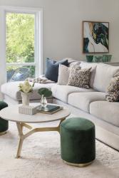
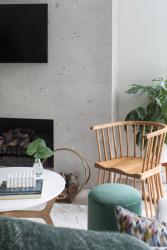
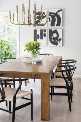
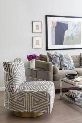
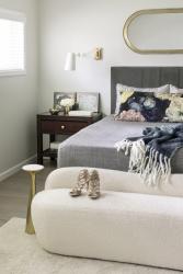
Having lived in the home for about a year, Mascetti says it feels very comfortable. “I wanted a warm, friendly, approachable place—that’s my type of space,” she says. “It’s not overly done, with a mix of old/new pieces, cheap/expensive, high/low, a little bit of everything. It flows nicely and it’s extremely functional.”
And whether she lives in the home for two years or 20 has yet to be determined. “This is a home I could live in for years, but I also have a history of moving every two years in redoing houses. I lived in my last house in Kirkwood for 15 years, which I had never lived anywhere that long in my entire life, and I did that more for the kids. Now that they are almost gone, I kind of felt I had the freedom to go back and do that sort of redo-and-move thing. Which I might do with this house and then look for another project, or I might stay here for a long time. It’s a new chapter right now.”
Resources
Appliances: Ferguson Bath, Kitchen & Lighting Gallery
Architect: FORNEY + architecture
Cabinetry: Brooksberry
Furniture: KDR Designer Showrooms, Mitchell Gold + Bob Williams
Granite: Stone Trends
Interior Designer: Tamsin Design Group
Lighting: Arteriors, Ferguson Bath, Kitchen & Lighting Gallery
Tile: Sunderlands


