The real challenge when marrying traditional and contemporary design is incorporating new furnishings in a way that won’t make older pieces look dated. Principal designer Teddy Karl of The Great Cover-Up achieved true transitional - we’re talking simple, clean and utterly timeless - by striking a flawless balance between past and present in this 25th floor urban high-rise.
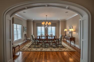
Formal Dining Room: The formal dining room represents transitional aesthetic at its very best because, well, it showcases an authentic mix of classic staples and modern décor that challenged Karl to think way outside the box. For familiar and time-honored, it’s hard to beat that table with its curvy legs and ornate detailing. Karl reupholstered an interesting mix of host and hostess and Queen Anne chairs, kept from the homeowners’ previous Ladue manor, with a monochromatic fabric. “We took the Persian hand-knotted carpet that previously had been in the homeowners’ family room and used that in the dining room,” says Karl. The rest, he explains, is ultra-simple. Sheer horizontal Silhouettes from Hunter Douglas and a minimalist blown-glass chandelier serve as contemporary counterweights.
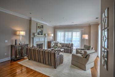
Family Room: “I love that it is a real entertaining space,” Karl says, pointing to a casual, open portion of the condo extending from a marble-filled kitchen. The area is monochromatic, but hardly boring. Gray predominates in the family room, and a clever beige strip in the striped chair and ottoman connects the room’s color scheme with the rest of the home’s equally restrained palette. Strong, large-scale furniture is what carries the space, while texture invigorates the neutral brigade: a tufted wool rug; grainy wood atop sleek stainless in the Kravet coffee table, and a paisley wing chair with matching cushions. The juxtaposition of rigid lines and gentle curves adds more visual interest and is seen in the end and coffee tables and that bold table lamp. Breathtaking views of the Arch don’t hurt anything, either.
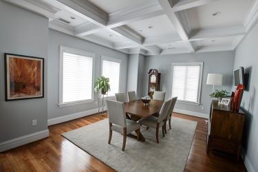
Breakfast Nook: Once a segregated sitting room, the homeowners took down a wall and continued the dramatic beamed ceiling and wood floors from the family room — a painstaking exercise in millwork matching — into the breakfast nook, essentially giving themselves a clean, contemporary canvas. To that they added modern conveniences like a full sound system and remote-operated, power-rise shades. A second Stanton rug, identical to the one in the family room, unites the adjoined spaces, while the casual trestle table and sleek chairs form a perfect kinship with a classic buffet and regal grandfather clock.
Living Room: Speaking of regal, there’s the unexpected Baby Grand just beyond a living room showcasing stylish, boxy, black-and-gold woven chairs. “I love the piano, and that they chose not to put a rug underneath it,” Karl says, adding that “you’d expect a black lacquered one.” The designer also loves the pristine hardwood floors carried throughout the condominium. “It looks like an old house,” he says. Art presented another opportunity for melding modern with traditional. “We could keep furnishings on the traditional side and go ultra-contemporary on art, and it was a fun balance to work with,” Karl says.
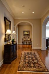
Hallway: A long, knotted Persian rug leads to an archway bowing above a traditional Chippendale settee Karl freshened with contemporary polka-dot fabric and glitzy linen throw pillows. The feminine painted console contrasts with rigid edges of a rectangular mirror. Can lights with dimmers were a simple way to incorporate general mood lighting throughout the home. “I like to joke that the homeowners downsized to a 4,800-square-foot condo,” says Karl, explaining, “The rooms are much bigger than they seem in pictures.” The less-is-more approach to home décor – seen in the lighting and elsewhere – calls for firm, judicious editing, and a keen eye that understands a few, well-chosen pieces are all it really takes to bring transitiona


