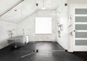
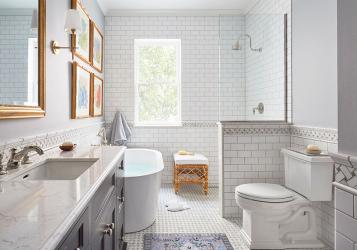
By Ashley Campbell Interior Design. Step into a realm of striking contrast in this ADA-compliant bathroom remodel, where light and dark elements harmonize in perfect balance. This wet room is complemented by a beautiful concrete soaking tub that adds a touch of organic elegance. Photography by Meagan Larsen.
By TKS Design Group. This Chicago wet room features white and gray marble, charcoal blue cabinetry and gold accents keeping with the vintage vibe in the rest of the home. To create this modified wet room, TKS Design Group started by eliminating the shower curb, which enlarged the footprint of the shower all the way to the edge of the bathtub. Then the shower was pitched toward a linear drain, so the water stays in the shower while a glass divider allows light from the window to expand into the room. Lastly, the designer added a freestanding tub to complete the spa-like feel. Photography by Michael Alan Kaskel.
By ALine Studio. The designer created a bathroom oasis complete with a custom designed and fabricated floating zinc-topped vanity and a wet room with a rain shower head and freestanding soaking tub. Along the back wall of the shower area, the designer added a recessed LED light into the ceiling in order to make it seem like a skylight was letting light stream in. This saturated the walls with light, which highlighted the finishes in the room, the amazing soaking tub and created another layer of ambience. Photography by Seth Caplan.
By Gast Architects. The clients made a strong effort to simplify the color palette because the views from the house are so spectacular. Fireclay Picket Braid tiles in the wet room were one of the few opportunities to bring gentle color to the living experience. To keep color use strategic, the rest of the wet room walls are Dekton. The cream-color Terrazzo was a perfect flooring material choice as it flows throughout the rest of the house and seamlessly into the wet room. A simple glass partition protects the blu Bathworks vanity from splashes. Photography by Mariko Reed.
By Kimberlee Marie Interiors. The client’s small and outdated primary bath was transformed into an expansive retreat. By borrowing space from the largely unused hall bath, the designer was able to create a wet room for the client that creates a true spa-like experience. To add some interest and depth the designer did a patterned accent wall in the shower and balanced the black and white with warm wood tones. Photography by Meagan Larsen.
By Marrokal Design & Remodeling. The 1950s home had a small, narrow bedroom with a bathroom. It did not accommodate the client's need for space or storage. An adjoining bedroom was seldom used, so absorbing this room for the benefit of the primary was ideal. Utilizing the added square footage from the spare bedroom, Marrokal Design & Remodeling created three design options for the primary bedroom, including a larger closet, more spacious bed placement and a larger bathroom. To make the most of the panoramic view, the client decided on an open bathroom layout where the shower and tub occupy the same space inside a wet room. Photography by Milan Kovacevic.


