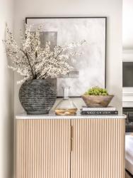
Creating a meticulously designed space from a blank canvas is a unique challenge. Looking for someone to take on the challenge, this new homeowner reached out to Morgan Brown of Castle Design after a neighbor’s home was transformed with Brown’s help. “She saw my work, and liked it, and so we went from there,” recalls Brown.
But what started out as a smaller project quickly grew into a larger endeavor. Brown was initially hired to help select furniture for the dining room. But it became clear these new dining and living room spaces needed a design refresh to create the monochronic look the homeowner craved.
“She didn’t want a lot of color, so what colors we chose came from the natural environment,” says Brown. Thus, the creamy whites and pops of black and gray in the dining and living rooms are balanced against a peppering of warm oak tones and greens, heralded in by wood furniture and houseplants. This balance of color offers an environment that doesn’t feel static, despite all the layers of white tones.
But perhaps the most important feature that breathes life into the home’s mostly white spaces is an abundant use of texture. “The homeowner loves textures,” says Brown. “So, I brought in velvet pillows, natural rugs and a unique wallpaper in the dining room that’s made of a handcrafted weave and gives a concrete, washy look. It was really cool, and we wanted to work around this.”
While many homeowners like white spaces—the trendy all-white kitchen being one of them—Brown encouraged layers and textures to create a sense of movement. Were the homeowner less inclined to balance all the white shades, Brown worried the spaces would prove sterile and absent of life. “So, we used linens, velvet and textured wallpaper. When homeowners want all the white in their spaces, it requires a lot more layers than they think it does.”
And the homeowner was more than happy to have these elements weaved in. “It was an easy process and great results,” says the homeowner. “She understood what I was asking and looking for, especially with the wallpaper that she provided as an option. Texture was the biggest element that I wanted to introduce in the design, and she understood what I was asking.”
The collaboration between homeowner and designer proved of immense importance. This is because both the women were able to bounce ideas off each other to create the perfect look for the home’s spaces. “I think a good designer knows how to listen to their client and make their preferences work,” Brown explains. “But the homeowner should be open to doing something different to make it all work, and that’s what happened here.”


