In interior design, a blank space can be a plus or a minus, depending on your point of view. Architects and designers Petr Lukyanov and Kirill Ustinov faced that challenge with their apartment in Moscow, Russia, where they were looking for a space with great views of the city and the opportunity to create a comfortable space unique to them.
Petr says new Moscow apartments come with windows, concrete floors, and that’s about it. “After purchasing you make all the construction work,” says Petr, who owns ANC interiors with partner Kirill. On the plus side, the space had big windows, perfect views from its 40th-floor perch above the city and high ceilings, especially for a city apartment.
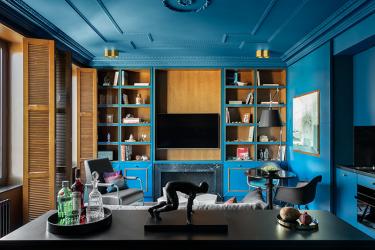
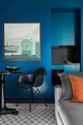
The designers, who have consistently been included in the Architectural Digest Russia listing of the country’s 100 best designers and architects, believe the key to good design is a comfortable floor plan and organized storage. In this flat, for example, built-in cabinetry provides ample storage while adding visual interest as a focal point for the living room. A sliding door hides the kitchen alcove when not in use.
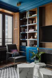
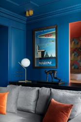
Daring color makes the space appear more voluminous, Petr says. Saturating the living room’s built-in cabinetry, walls and ceiling in a bold royal blue makes the interior seem monolithic, he says, “and helps bring a drop of extraordinary and add volume to the space.”
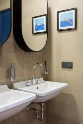
Eclectic furnishings combine both classic and modern styling, with a tilt toward mid-century modern. A prized example is a Jean Prouvé armchair by VITRA. Petr says VITRA made only five leather chairs in the color the designers own. “There is only one piece in Russia, which stands in this interior,” he says. The mid-century vibe is carried into the bathroom: twin, wall-mounted sinks and wall tiles with an industrial bent highlight the fuss-free space. The sink style was commonly found in European bathrooms in the 1950s and ‘60s, Petr says.
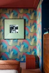
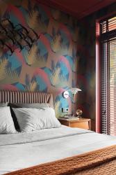
In their bedroom, a dramatic leaf-print wallpaper in shades of blue and terra cotta covers the headboard wall, with the ceiling painted in a complementary burnt orange hue. Louvered wood shutters here and in the living room add an organic element and control just the right amount of light for relaxation and rest.
These bold, rich color schemes and a combination of classic and modern helped create a bright, yet relaxing space, says Petr. St. Louisans may soon see more of their design work; Petr says he and Kirill recently moved to St. Louis and have begun work for local clients.


