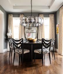
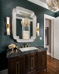
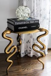
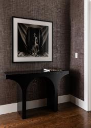
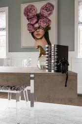
Fun, yet sophisticated. Classy but edgy. Interior designer Tina Wolff uses those adjectives to describe both this Clayton home and its owner. “She’s well traveled, and she has an art collection that reflects who she is,” Tina says of the homeowner. “She also likes a dab of bling, so all of those things together make the home and her style eclectic and interesting.”
An executive, the homeowner lived in a condo loft in Toronto, the most populous city in Canada, before relocating to St. Louis a few years ago. “My realtor pushed me toward Clayton because I was used to living in an urban environment, and now in retrospect, she was right,” says the homeowner. A Mehlman Brothers spec house in Clayton carried a vibe that reminded her of a New York City brownstone. The Clayton home’s spacious kitchen and living area, perfect for entertaining, sealed the deal. “I also loved that four of the bedrooms, including the primary, are upstairs, which worked for me,” she says. “And there was a lot of natural light, which was important to me because I was coming from floor-to-ceiling windows in my condo.”
Tina had already designed the spec home’s finishes for Mehlman Brothers, so she knew the house intimately. The two women worked together to make the house into the new homeowner’s bolder style, with her art collection driving many design decisions.
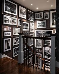
Case in point: the home’s stairwell. “It’s not a big open staircase, but it has very large walls,” says the homeowner. “And it just looked blah.” Inspired by her love of architecture and her travels, the homeowner obtained striking black-and-white professional photos of buildings and locales where she has lived and visited. A textured cork and metallic wallpaper provides the backdrop for the art gallery of photos hanging in the stairwell. “I think my love of art started with photography, particularly black-and-white photography,” she mentions. “Most of these are architectural photos because I just gravitate toward buildings, especially those in cities.”
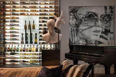
In the living room, neutral furnishings let the homeowner rotate artwork, both newly acquired and old favorites. On the room’s far end, a custom wine cooler occupies a former wall niche. “When I first moved in, we put a cabinet in this niche and a piece of art above it, and it was fine, but I just kept coming back to this space and thinking that this would be the perfect place to have a wine display,” says the homeowner. Custom acrylic and gold racking by VintageView holds about 300 bottles. Backlighting the Cristallo quartzite stone with LED panels turns wine storage into a work of art, complementing a new piece hanging nearby—pop art fashioned from one continuous piece of black string by contemporary artist Nemo Jantzen.
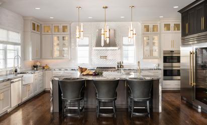
Even in such a large space with plenty of comfortable seating, visitors always seem to congregate in the kitchen. The kitchen’s recent facelift reflects the homeowner’s taste “and just makes me happy when I go in the room,” she says. Originally it featured what the homeowner calls “a housewife desk,” which for her, became a collector of junk—mail, her purse, the day’s castoffs and the like. Removing the desk allowed space for new True Residential appliances, featuring the brand’s large, columnar refrigerators and freezers, and additional cabinetry on that wall.
“We also took the cabinets all the way to the ceiling in the remodel and extended the island about a foot toward the living room,” she says. The bank of white cabinets features some doors with metal mesh and some doors with reeded glass. Gold cabinetry hardware contrasts with the stainless steel of the appliances and range hood.
Selecting these features, each of them a standout, yet knowing when to “pull back” a little posed a fun professional challenge for Tina, the founder of Wolff Interiors. “We didn’t want too many of the elements to fight with each other,” says Tina, noting the thick, quartzite countertop “has a lot of movement” while the gold-leaf scalloped tile behind the range hood is very intricate. “Doing that tile only behind the range hood and not extending it along the entire backsplash area makes it art,” Tina explains.
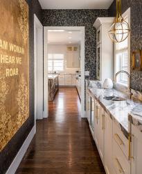
In the adjoining butler’s pantry, the York Wallcoverings paper was selected to complement artwork with gold gilding. A spherical Visual Comfort pendant hangs above the pantry sink, where a Hydrotap by Zip Water system provides instant boiling water, filtered sparkling water and chilled water, all out of the same tap. “It is one of my favorite things,” says the homeowner. “I drink even more hot tea because the boiling water is instant out of this tap.”
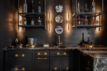
In the home’s lower level, an original two-tiered bar was replaced with counter-height Maximus Quartzite stone with a waterfall edge. A suspended shelf storage system from Architectural Elements adds an industrial vibe to the moody Phillip Jeffries hand-crafted wallpaper featuring a raised relief pattern. “This paper just makes everything pop,” says Tina. The collection of Fornasetti facial portrait plates nods to the homeowner’s love of pop art.
When asked about her inspiration for the suspended shelving system, Tina smiles. “My client wants to get out of the box,” Tina says, referring to bland, ho-hum interiors. “She just keeps pushing to do something different and unique.” Tina’s remark can be applied to her entire body of work with the homeowner over the past four years, as the home’s design style, finishes and furnishings have evolved. “We’ve slowly moved through different rooms to make them more of her taste and to reflect who she is,” Tina explains. “Mixing industrial with modern, adding warmth, yet leaning a bit more contemporary, and working with all the great artwork she has. She is concerned with every detail in her house, and part of my job is to give her a timeless look but one that is very up to date, so that in 10 years, she will still love it.”


