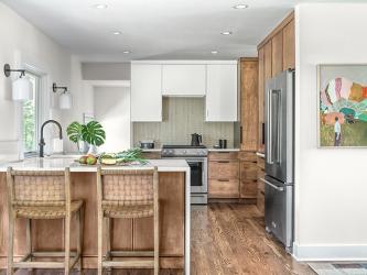
Delivering a cleverly modern, crisp redesign to a mid-century kitchen in Sappington allows utmost efficiency in its confined space, verifies Chelsea Smith, founder and principal interior designer of Chelsea Design Company. “I’d dreamed of ways I wanted my home to better function for my family of four. I’d even envisioned details. But I had no idea how to make that happen,” recalls homeowner Sara Hellwege. “Chelsea and her assistant, Christopher, made the picture in my mind come to life. What’s more, they helped me refine my vision and added things I hadn’t even considered.”
Sara says the objective was to keep the footprint while updating finishes, yet remaining true to the natural ambiance of their 1950s ranch home. “We wanted to create a kitchen that looked like it’d always been there and beautifully maintained,” Chelsea describes, after seeing prior remodeling of the kitchen didn’t harken to its architecture.
Within the 130-square-foot kitchen, the floor plan originally consisted of a cooktop and sink along the same wall, limiting the family’s prep and storage space. Chelsea says in the redesign, they centered the sink at the rear window, removed the outdated bay and added new sconces that created a focal point after entering the front door.
“We also added recessed ceiling and under-cabinet lights. With removing the sink and existing soffit, we centered the stove and included a deep, floor-to-ceiling pantry,” explains the operator of the St. Louis-based, full-service kitchen, bath and interior design company.
While the refrigerator was kept in the same location, the soffits were removed and the wall shortened, which Chelsea says enhanced overall spaciousness. Sara agrees. “We’re no longer bumping into each other from having to be in the same compressed space. And we now have a handy breakfast bar.” “Above the fridge, we included a tray divider. Beside it is hidden appliance storage, with a countertop for easy cleanability and pocket doors,” Chelsea adds. “The original peninsula was small and lacked seating or storage, so we added depth and a blind corner cabinet accessible from both sides, space for three stools and a trash pullout closer to the sink.”
As a further nod to the home’s grounded origin, a custom-designed slab door with walnut finish was installed. The design team intentionally kept things “airy” with high-gloss white cabinets and a hidden stove hood. Chelsea says finishes were executed in a minimal style with hand-crafted details and blended textures: wood cabinetry and floors, polished white countertops, stainless steel appliances, black accents and a mossy green mosaic backsplash.
Project remodeler Konnor Sincox, principal of Manchester-headquartered Wise Brothers Contracting LLC, says this kitchen was his favorite project of 2023. “It was by far the most dramatic change within the projects we’ve handled recently. I really enjoyed its unique finishes.”
Chelsea concludes, “We produced a cohesive kitchen design and throughout the main level of the home. Our intentional, compact cabinet design, where everything has a home, allows this smaller kitchen to feel like it doubled in size.”


