At best, every home renovation is a challenge. Even the process of selecting the right designer for the project can be daunting, especially when your wish list of must-haves is wholly ignored. Such was the scenario for this St. Louis couple when they wanted to upgrade their kitchen a few years ago. They had purchased a Garden Valley subdivision dwelling in 2011 and moved in with their three teen and pre-teen children. Like most homes in their neighborhood, it was a sprawling suburban two-story house with builder-grade finishes. They were content with its lived-in feel, even though it didn't reflect their personalities. Their first attempt to renovate was a kitchen remodel, which ended in disappointment with the two designers they had interviewed. So, they scrapped the remodel altogether.
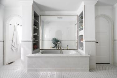
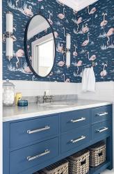
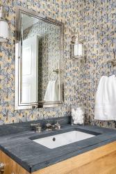
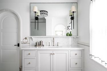
"Over time, there is only so much you can do with paint," laughs homeowner Mo Miller, who, with her husband, Scott, decided it was time to dive into a much-needed transformation for two upstairs Jack-and-Jill bathrooms and a full bathroom. "I kept searching for 'the one' and finally found C&M Interiors in a magazine—a bathroom renovation they had designed. Just from looking at that design and the quality products they had chosen, I knew we had found our team. The fact that they are delightful human beings was just icing on the cake."
Mo arrived at C&M Interiors, founded by Channing Krichevsky and Maria Hogrefe—both graduates of Maryville University—for her very first meeting to see if she might be able to form a partnership to achieve what she and her husband wanted to change about their home. The studio was "small but mighty—everything had a place, and it was cute, fun and organized," Mo recalls. "And then, waiting for me at the client conference table, were two of the most darling young women. They were poised and ready with notebooks, fancy art pens, smiles and hope. After lots of discussions and information gathering on both sides of the table, they asked me to think it over and let them know if we wanted to hire them. I just started laughing— I told them I knew we were going to hire them the minute I walked in. And they did not disappoint."
The overall design concept was to create a cheerful, happy home for these clients and their family while maintaining the refined and layered design aesthetic of C&M Interiors. "The core ethos of our firm is to design private residences and spaces that are livable yet refined—layered with texture, pattern and intricate detail," says Channing. "We also take into consideration our clients' personalities and the way they want to live and function in their space. Mo was incredibly open to color and, in fact, pushed us for more color. She also went into this project with trust and an open mind—and from that, we were able to make magic."
The project began pre-pandemic and wrapped up in February of 2023. Against a backdrop of classic design elements, including wainscotting, subway tile and rich wood tones, the design team layered in the color element that Mo craved for her home. "The two blended seamlessly for a wildly unique perspective," says Maria. "Mo already had the colorful personality, so we really wanted that to shine throughout her home while also being true to our design aesthetic."
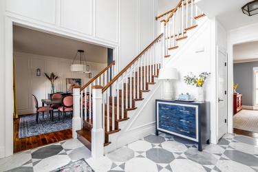
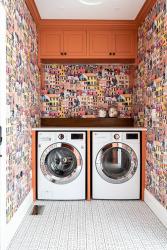
After the success of the bathrooms, they forged ahead with a total first-floor makeover that included an office, kitchen, dining room, family room, hearth room, laundry room, new staircases and a patio/pool area. "Our contractor, Todd Emms of Elite Properties, did a fantastic job of managing the project through those trying times," Scott recalls, "and there were several times that C&M had to make product substitutions based on availability. They were on top of all that and found options equal to or better than the original choices. Their attention to detail is truly remarkable, not only in their designs but also in how they run their business."
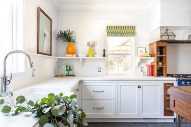
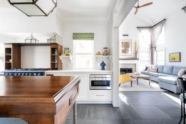
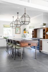
A significant highlight and design feature is the kitchen island—every inch is bespoke and incredibly unique. To bring warmth to the space, wood was the obvious choice. But the designers didn't want to create something that had already "been done before." So, they started thinking in terms of furniture and drew sketch after sketch until they hit on just the right design. "Scott is from New Hampshire, so we asked the design team to come up with an East Coast feel," says Mo. "Channing and Maria just understand what you are asking for and then kick it up ten notches with floor-to-ceiling pantries, light fixtures, hardware, and that oven—literally a piece of art for the kitchen! It was a huge splurge but one of the best things we did in there."
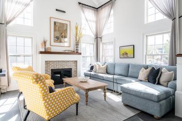
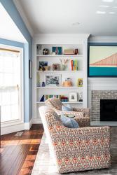
For the hearth room, the design team focused on creating a cozy and intimate space. So, they designed a custom sectional that extended wall-to-wall to make you feel enveloped when relaxing with family and guests. "From what we gathered, the homeowners spend time entertaining quite often, in a casual, 'let's just have a ton of fun' kind of way," says Channing. "There is nothing stuffy about them, and I think that is represented in all the design choices."
"We like color, and we like our house to give back some energy," Mo adds. "The designers totally nailed the sense of fun we were looking for while still providing a luxury vibe. We wake up every day in a home we love, that we're proud of, and that feels like us—a little loud, a little quirky, and hopefully, a whole lotta fun. Lots of people wonder if designers are worth it. If it's C&M, then yes—a thousand times yes."
Resources:
Appliances - Authorized Appliances
Cabinetry - Kenrose Cabinetry
Flooring - Mosa Tiles
Glass - Switch Glass
Granite - SFI
Staircase - Kirkwood Stair
Lighting - KDR
Plumbing Fixtures - Immerse
Tile/Granite - Global Granite
Window Treatments - fabricated by Fabricworks


