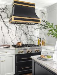
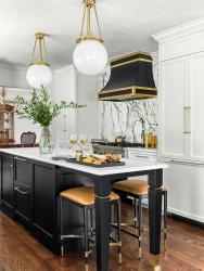
A young, hardworking couple requested that Chelsea Design Company transform their kitchen into a bright, classic space ideal for entertaining and cooking. The original kitchen had a U-shaped peninsula and tiny center island. The space wasn’t ideal for entertaining as it was secluded from the dining and living rooms. Chelsea Design Company removed existing soffits, widened the entry from the dining room and extended the wall separating the living room from the kitchen, which created a grand symmetrical moment at the stove wall. A panel-ready refrigerator is on one side of the stove and hidden appliance storage in a traditional white cabinetry is on the other side with ideal counter space on either side of the range. The custom black and unlacquered brass hood sits atop a gas range with a black drawer base that has storage for pots and pans. A single panel of porcelain that looks like marble pulls all the colors together. Opposite the stove at the bay window, the sink was kept in the same location but accentuated with two glass cabinets and decorative corbels on either side. Three brass sconces above the window add character and height. The backsplash is hand-glazed subway tile ran to the crown molding. This wall includes a hidden pantry and coffee bar, custom paper towel drawer, dishwasher, corner drawers and double ovens. Instead of a peninsula and tiny island, the designer created a long, black island down the center of the kitchen with a hidden beverage center and storage solutions. Without changing the footprint, this powerhouse kitchen is effortlessly glamorous for entertaining or cooking for this young couple.
Why the judges love it: Details! Details! Details! The touches of metal on the island, hardware and stools are fantastic in this well-balanced kitchen. The range cabinetry paired with the hood creates a power wall.


