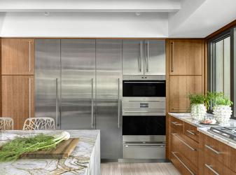
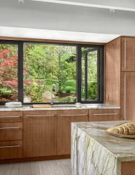
A dark, lonely kitchen unchanged for 40 years lacked natural light and connectivity. With the goal to revitalize the dated space working with limited square footage and the necessity to retain existing soffits and exposed ceiling beams, designers Alspaugh Kitchen + Bath and Castle Design transformed the kitchen design. To maximize the sense of space, the designers focused on blurring the boundary between the kitchen and its surrounding spaces. A U-shaped plan with an island for seating was the ideal solution. Custom-sized windows run cabinet to cabinet and from counter to soffit allowing for minimal trim and maximal glass area. Creating another opening to the dining room allows for seamless flow around the island enhancing the overall functionality of the kitchen. Straight grain cherry veneer was selected for the cabinetry to complement the other wood finishes in the home. The cabinetry is enhanced by the Blue Tempest quartzite countertops. The reflective stainless-steel wall amplifies the sense of light and spaciousness. Pop-up counter outlets flank the cooktop and eliminate the need for a traditional backsplash. The cabinets are fully accessorized with lift doors and pull-out shelves making for an organized space. This highly functional kitchen serves as the gathering point in the home with stunning views of the outdoors and an inviting atmosphere.
Why the judges love it: The transformation of this kitchen is outstanding. The space is warm and inviting even though it is more modern in design. The cherry cabinets are a beautiful choice.


