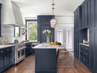
The original kitchen in this 1913 home was secluded from the rest of the house and separated by an unnecessary staircase and bathroom. The goal for the new kitchen design was to feel like it had always been in the home but with modern amenities. The designer, Chelsea Design Company, added symmetry, contrast and function to the 230 square foot space. The client requested a 48-inch Wolf range, a large island, a drink station, multiple modes of refrigeration and a cleaning closet. In order to fit everything the homeowner desired into the space without feeling cluttered, clean lines, contrast and color were incorporated to feel spacious and timeless. The designer centered the range on two existing windows with no wall cabinet and framed out a drywall hood, painted the same color as the walls, to give a floor-to-ceiling ombré effect. Navy cabinets paired with a tonal leathered quartzite countertop and backsplash that fade into the white walls and hood provide contrast. To optimize storage, toe kick drawers store cookie sheets and a floating quartzite shelf with brass rods lends additional space. Hooks for everyday pots, pans and utensils were added to keep the counters free of clutter. The top priority of the project was to modernize the kitchen while still staying true to the style and age of the home. Inset cabinetry references the time period while managing all of the family’s storage needs. The designer continued the full-height cabinetry on to the pantry and incorporated food storage and a hidden cleaning closet with a drink station in the center.
Resources
Builder: Tri-Square Construction
Interior Design: Chelsea Design Company
Granite: MSI Surfaces, Custom Stone Interiors
Plumbing Fixtures: Crescent Plumbing
Decorative Fixtures: Locks & Pulls
Appliances: Authorized Appliance
Lighting: Wilson Lighting
Cabinetry: Kenrose Kitchen Kabinets
Painting: Theiss Painting


