


Why Use Moody Hues?
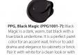
One of my favorite things about dark colors is the depth it creates. We often don't see definition as well with dark colors (why black is thought to be a more slimming color in fashion for example), so when used well in interior design, it creates depth and intrigue. Yes, dark colors can make a space feel smaller, but when done right, it can also feel expansive like a dark sky. Kathleen Grim, Srote & Co Architects | Planners | Interiors.
Paint is always fun because, after all, it IS just paint and is quite cost-effective and easy to change if the new look doesn’t quite feel right. We love adding bold color or moody, deep tones to accentuate architecture; i.e. on the interior of massive door casings, at the back of a bookcase, even as a ceiling detail to “cozy” a particularly high ceiling. Kris Keller, Design Source LTD.
If you love striking colors, why not embrace it? I love it when a client decides to make bold choices in their design. Matchy matchy is so out and color is the new thing! If going all in on moody and dark scares you, try it out in small spaces like a powder room, butlers pantry or even laundry room. Julie Reinecke, Julie Reinecke Designs.
Where to put it?
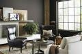
My favorite rooms to embolden with moody colors are family rooms and dining rooms. Think about dining in your favorite candlelit restaurant; it’s relaxing and allows you to deeply savor your meal and time with family and friends. Reimagine and interpret that feeling in select areas of your home. Joni Spear, Joni Spear Interior Design.
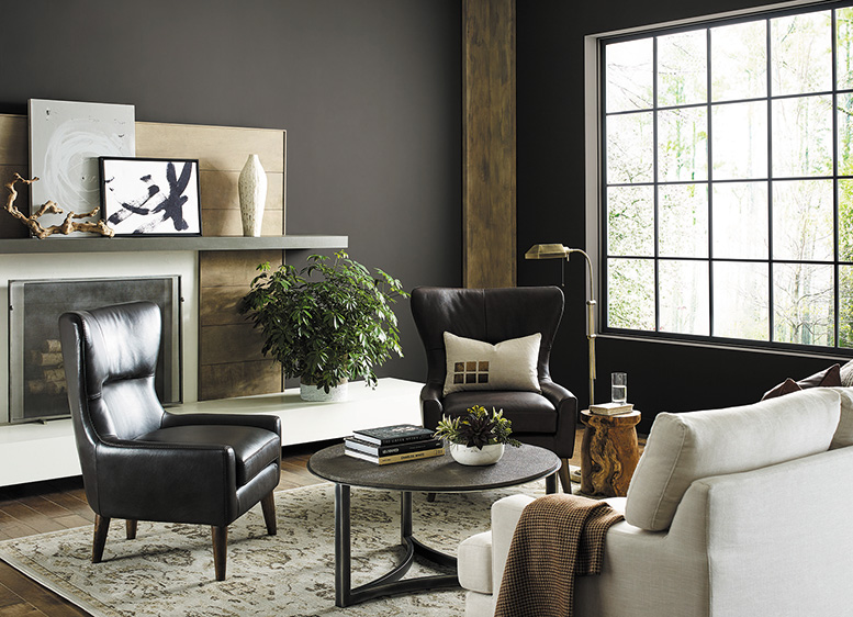
Using moody color in a room makes a statement and turns an ordinary room into an extraordinary space. I have always used deeper colors in powder rooms for a dramatic effect and in libraries for an intimate cozy feeling. I use colors that are in the color palette or complement the colors in the palette the client has chosen for their home. Diane Breckenridge Barrett, Diane Breckenridge Interiors.
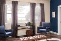
Master bedrooms, powder rooms and dining rooms are my favorite spaces to work with when using moody hues—they evoke a sense of drama, passion, elegance and sophistication. Don't forget to make it you! While black may be an obvious color choice, blue, purple, red, green and gray can add the same depth of richness and drama. Want to give a moody color project a try? Start small with a powder room. Try a damask-flocked wallpaper in a plum, gray, charcoal, or cobalt blue! M. Joyce Mathis, MJM Design Company.
Accessory Shopping
Adding light contrasts pops of color like creamy or white tones in pillows, upholstery art and drapery really add to a bold personality while keeping a space feeling light. We opt in for lighter hardwood flooring finishes now too as well as area rugs. Kris Keller, Design Source LTD.
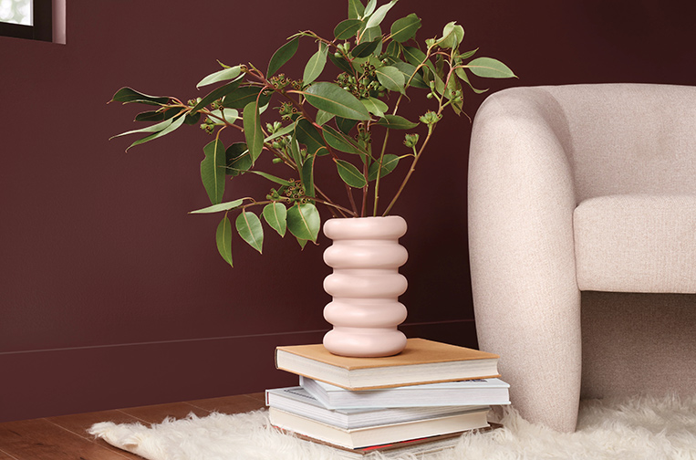
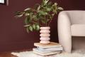
One approach to achieving moody depth is to use the same shade or tone of color throughout but with varied finishes; for example, use a flat finish on the walls and a satin finish on the trim. An additional tip I love to share with my clients is that dark colors recede, so painting your walls a darker color allows any shiny metallic accessories—lamps, vases, ceiling fixtures—to draw your attention. M. Joyce Mathis, MJM Design Company.
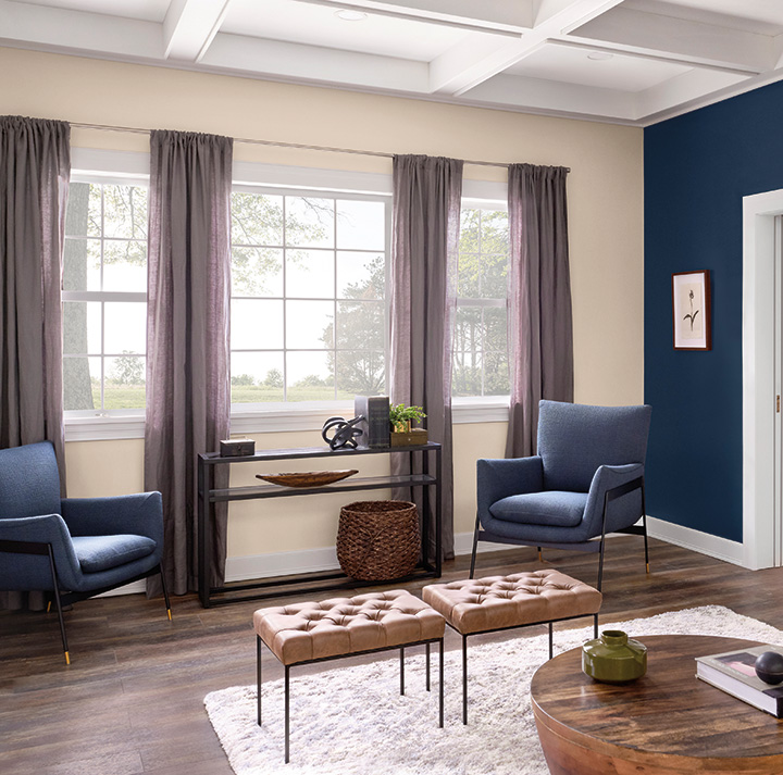
While it’s certainly not prudent to overwhelm a space in saturated colors, you can counterbalance the space by adding contrasting colors or bringing in other textures like natural wood and stone. Adding a glow of warm lighting with sconces and lamps can keep the room from feeling foreboding. Joni Spear, Joni Spear Interior Design.