
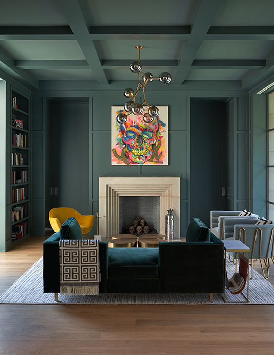


By Coats Homes and SHM Architects. This is a living room library and library space. The green walls and medium-tone wood make for a cozy and relaxed space, the fireplace adds additional warmth to the room. Traditional coffered ceilings mesh with whimsical modern art to create a curated and eclectic space.
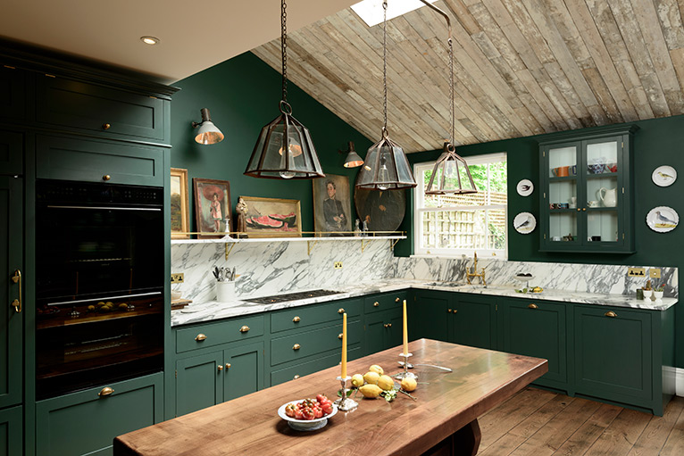
By deVOL Kitchens. If luxe and bohemian can be used together, then it is the perfect description for this classic kitchen. A crazy mix of beautiful bespoke cupboards, Arabescato marble, collections of stunning art and pottery, this kitchen is already making a stir. The paint on the cupboards is a cross between emerald and racing green and creates a fabulously dramatic and atmospheric kitchen.
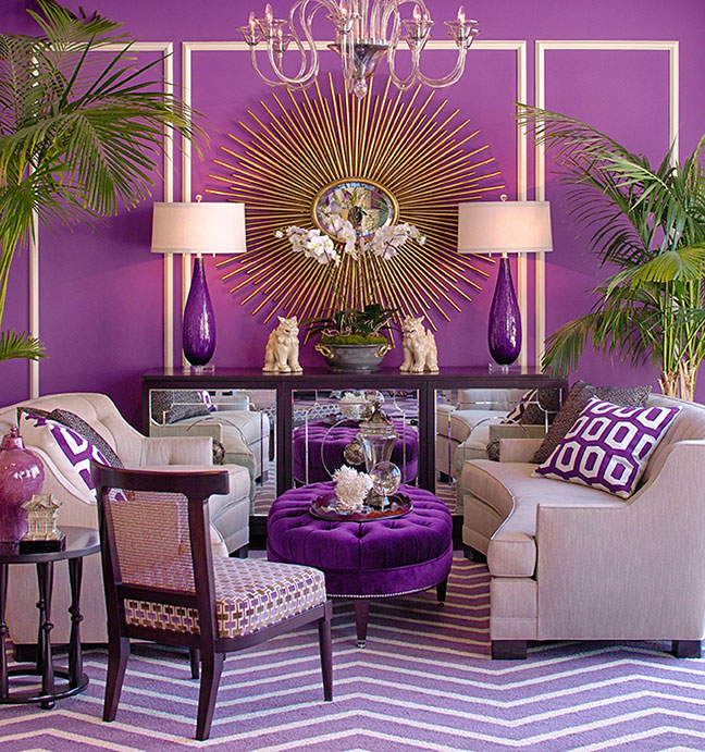
By Grace Home Furnishings. This monochromatic room features Sherwin-Willams Plum Dandy paint color as a backdrop. The furniture is an updated take on mid-century pieces, reimagined by Grace Home Collection. The mirrored Woodward Cabinet was inspired by a record cabinet seen in photos of Paul Newman and Joanne Woodward. The Clark Sofas feature a gentle curve and tufted back, reminiscent of a 1950s piece, but scaled up to provide a modern day level of comfort.
By Mary Douglas Drysdale. This tiny building in elegant Georgetown was originally built as servants quarters for one of the very large and grand homes nearby. The clients had just sent their last child off to college and were looking toward retirement and hankered for a tiny house, close to their law firm, so that would make an easy walk to work as well as, to all the great restaurants in Georgetown. Every room did double duty, but tall ceilings made it all work just fine.
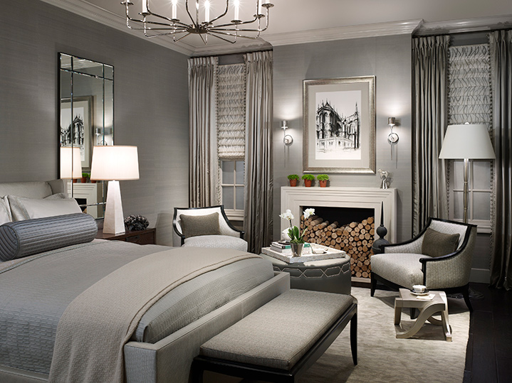
By Michael Abrams. Monochromatic rooms stand the test of time. This bedroom was designed for Dream Home 2011 at Chicago’s Merchandise Mart and looks as fresh today as it did over a decade ago. Neutrals work much better when creating a monochromatic environment while vibrant colors will look dated sooner.
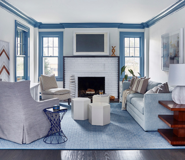
By Toledo Geller. In this home, the designer chose to play up the color blue by varying the tones of the color throughout—from floor to ceiling, in subtle to bold strokes. The showstopper here is painting the trim in the entire room a bold color and letting the walls be quiet. It really goes to show you how one strong design move can take a room to the next level.