
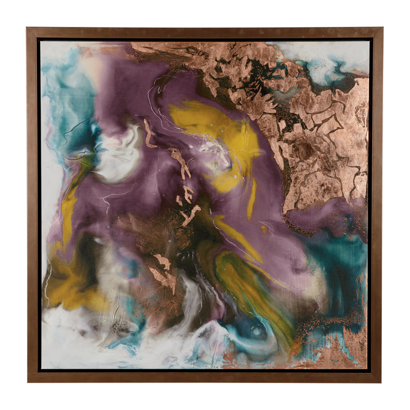


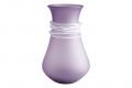


Pantone's 2022 Color of the Year: Very Peri! For the first time in the history of Pantone’s color of the year program, Pantone has created a brand new color as its color of the year, Very Peri. Very Peri encompasses the qualities of blues with a violet-red undertone. Pantone says the color evokes a carefree confidence and a daring curiosity.
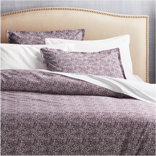
This year Pantone has selected Very Peri as their color of the year. A lighthearted, carefree color that will lift your spirits. This color can be wonderful in almost any room in the home. Gold hardware, white or warm wood tones, playful accent hues of orange and turquoise or moody darks such as navy all blend well with this new color. Using this color as an accent in bedding, throw pillows or trims is a great way to update and refresh your home. Janice Bohn, Anne Marie Design Studio.
According to Pantone, their newly developed color for 2022 is a “courageous presence that encourages personal inventiveness and creativity.” We recommend introducing Very Peri into your home office to improve the Zen vibe of your work space and to help spark new ideas. We all need peace and relaxation in our lives! Small accents of this color such as candles, mugs and notebooks will bring Very Peri into your space without changing the entire color scheme and design. Kim Taylor West, K Taylor Design Group.
The color Very Peri gives off a fun, playful, creative and carefree energy that could pair very well with pinks, greens, blues, whites, yellows and even oranges. Use a colorful floral accent wallcovering that has hints of Very Peri in it along with pinks, blues or yellows on a wall in a breakfast nook. Another way this color can be used is in a young child’s bathroom; it can be used on a shower curtain, soap dispensers, shower rugs, loofahs or even wall tile to add a playful environment that is used everyday.
Savannah Sells, Youtopia Designs.
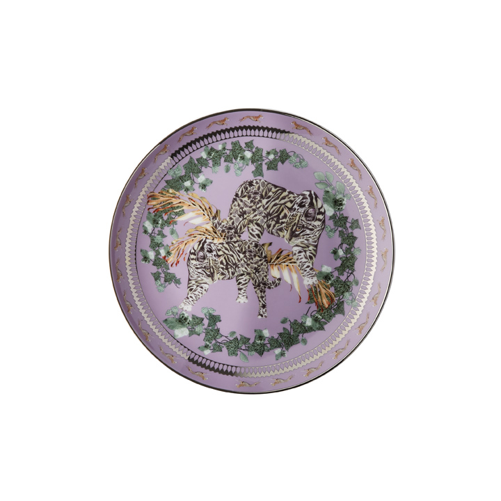
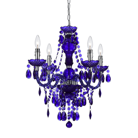
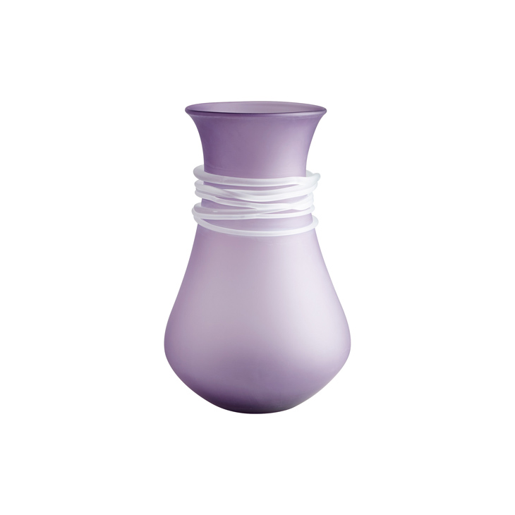
Pantone's Very Peri is such an amazing, versatile color because of its flexibility between blue and purple on the color wheel. You can dress it up or down, depending on your level of excitement. Very Peri would be a great wall color choice for a powder room with lots of drama, paired with a subtle wallpaper pattern or paint color in a pale gray for the ceiling. Add a mirror framed in gold. In a master bedroom, it takes on a soothing, tranquil vibe. Add a pair of Very Peri inspired table lamps against a wash of lilac wall color, white bedding and pops of blue violet, teal and yellow scattered about. M. Joyce Mathis, MJM Design Company.
Looking for more color inspiration? Each year the top paint companies in the country also chose their own color of the year, and this year will leave you feeling GREEN with envy.
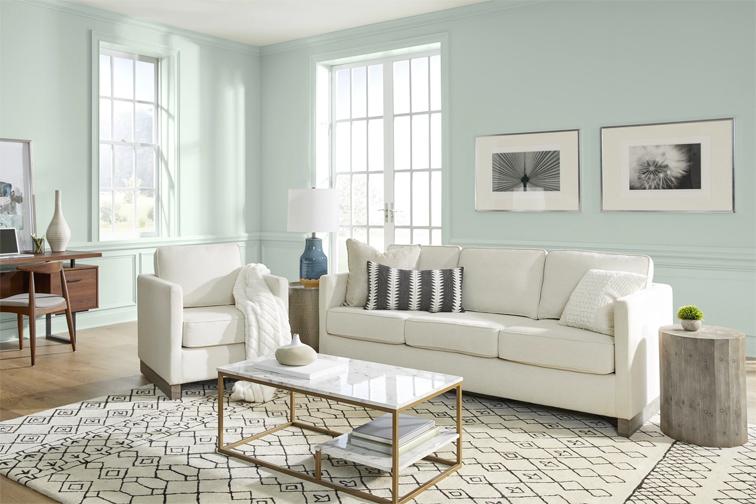
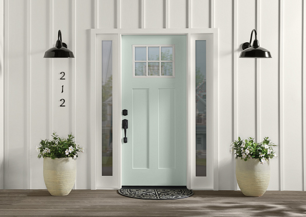
Behr—Breezeway: The silvery green shade with cool undertones is inspired by the earth’s beauty and mimics naturally stunning sea glass found on the shore of salty beaches. Breezeway evokes feelings of coolness and peace while representing a desire to move forward and discover newfound passions. Breezeway naturally harmonizes with shades of white, gray and natural wood tones for effortless style in any room.
Sherwin Williams – Evergreen Fog: Evergreen Fog SW 9130 is a versatile and calming hue, a chameleon color of gorgeous green-meets-gray with just a bit of blue. It's a simple but sophisticated wash of beautiful, organic color for spaces that crave a subtle yet stunning statement shade.
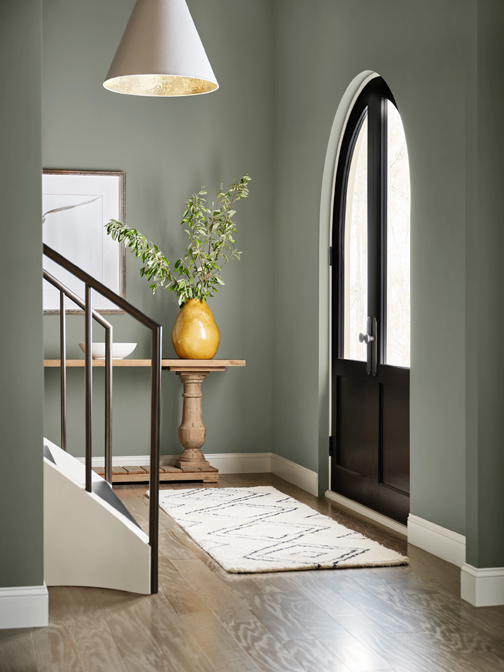
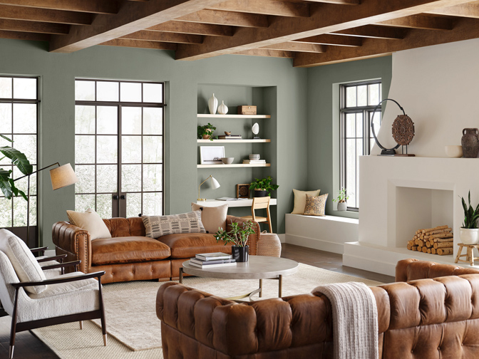
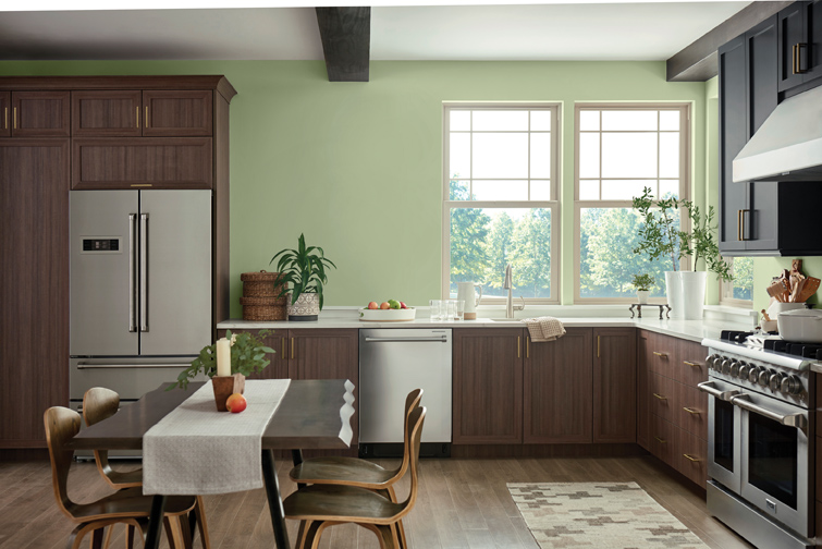
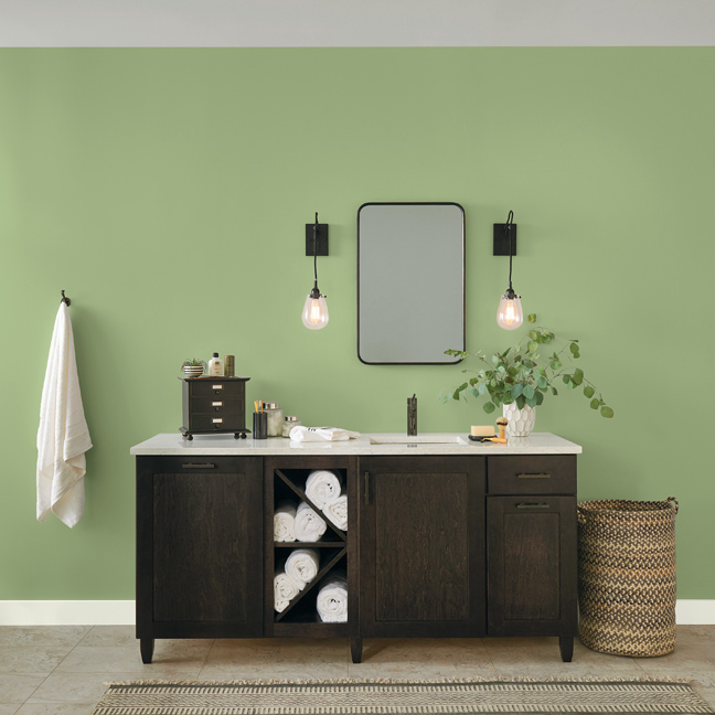
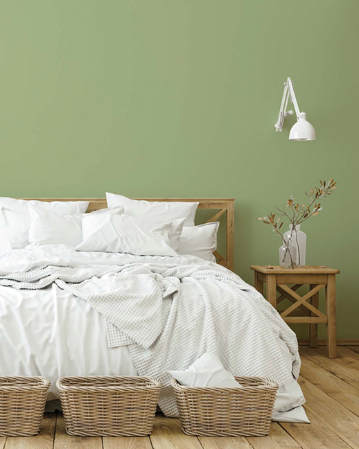
Benjamin Moore – October Mist: October Mist is a gently shaded sage that quietly anchors a space while encouraging individual expression through color. Much like the green stem of a flower, October Mist creates a canvas for the 2022 color trends and the imagination to blossom.
PPG – Olive Sprig: Olive Sprig is a midtone, neutral, lush green with an organic green undertone. It is a perfect paint color for any interior space. This soft gray-green is soothing, like a fragrant plant, reminiscent of the natural world; it brightens any space with an organic liveliness. Pair it with soft rose tones.
Glidden – Guacamole: This spirited yet soothing green brings an organic energy to any space. A great paint color for a bedroom, library or office; also makes a stunning dining room color.