Ready to upgrade their house and their furnishings, Kathryn Pfeiffer and her husband landed the right place at the right time. After their house sold, an inventory home being built by McBride & Son Homes became available. It was near their previous home and the subdivision backed to their children’s school. One of the last homes available in the neighborhood; the couple snagged the 1.5-story when it was nearly complete.
While they didn’t really have the opportunity to make any of the material selections, the husband and wife knew they could add their own stamp on the open-concept home. Their previous home was significantly smaller, so they had always planned to start fresh with furnishings and accessories. With a contract in place and their furniture for sale, they were headed to Crate and Barrel for furniture ideas when they stumbled upon I.O. Metro in the Boulevard, which has since closed. They hit it off with designer Mike Wyrock, and the three began working on furniture selections and layout. “As soon as we closed, Mike came over with a tape measure and started mapping everything out,” Kathryn says. “He understood what we were looking for in each room and the size it needed to be. It was helpful to us because we were lost.”
Mike eventually left I.O. Metro and went out on his own starting Nistenhaus Design with partner Justin Maine. The Pfeiffers continued their working relationship with Nistenhaus and have enjoyed the design collaboration for more than five years.
The homeowners knew over time they would update pieces of the home to better fit their lifestyle and aesthetic. “They were very conscious and realistic about the cost for each project and would take on pieces at a time that were reasonable,” Mike explains. First on the list was new flooring throughout the main floor. Carpet was replaced with wide-plank engineered oak. Mike says the wider plank is perfect in an open house, and the selection instigated other renovations and changes that were made.
Traditional in architectural style, the home was your typical suburban tract housing with standard builder-grade materials. “We were really able to add a modern twist to the house,” Mike says. “The open concept lent itself to using more modern finishes and bold pops of color for a transitional look.”
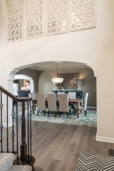
The designers added character to the home by modifying some of the existing architectural elements. The best example of this was the openings to the dining room and kitchen. Mike and Justin added drywall corbels to the typical arched entryways, proving the smallest details can make a big impact.
The homeowners didn’t give Mike and Justin many strict guidelines for the design. “We wanted color and more interesting things than we had before,” Kathryn explains. Mike says the homeowners wanted to create a style for themselves, something that looked like them. He and Justin were happy to help them achieve their own look by offering several options and working to help the couple form opinions. “Kathryn likes color, which is always nice,” Mike says. A teal piece in the dining room became the catalyst for the entire color palette on the main floor, and Mike and Justin mixed the color with soft neutrals to make the saturated hue less severe.
A raw wood table with upholstered chairs pairs well with the bright blue sideboard in the dining room. The mirrored wall art creates texture in the space, and the fixture from West Elm is modern and playful, giving off a warm glow. Since the homeowners were starting over in building a collection, Mike and Justin visited antique stores and gave the couple lots of options of pieces to fill their china cabinet. The area rug by Loloi Rugs brings additional color to the space and softens the strong blue of the sideboard with soothing green tones.
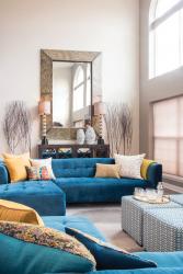
Since the dining room is open to the living room, which is then open to the kitchen, Mike and Justin designed the layout of the living room to bridge all the spaces together and didn’t want the furniture to block the view into the other spaces. Their solution was to mirror two teal polyester velvet sofa chaises by Jonathan Louis. The layout creates a natural conversation area that works for the family. Low-lying upholstered ottomans also by Jonathan Louis in a modern design complement the color scheme while being unobtrusive.
Mike and Justin also wanted to minimize the placement of the TV above the fireplace, so they painted the mantel the same color as the walls. A large mirror hung above a mirrored console table accentuates the ceiling height in the two-story living space, while layered branches bring texture and a bit of the outdoors inside.
Mike was instrumental in helping the homeowners with paint selections. He is adamant that homeowners should pick their furniture first and paint colors down the road. “There is a whole rainbow of paint colors, but you don’t always have that option in furniture,” he explains. “It makes the spectrum of possibilities way smaller once your furniture is chosen.” This approach made the cabinet color choice a no-brainer when renovating the kitchen.
The kitchen was a project that was on the homeowners list from day one. While the footprint has not changed, Mike says the space had a lot of “massaging” done to it. There was an abundance of cabinetry, which most people want more of, but it was even too much for the organized couple. After removing many of the upper cabinets, the space felt so much more open and light.
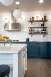
Detailed molding was added to the upper cabinets that remained for a custom look, and live-edge wood open shelves with metal brackets replaced many of the wall cabinets. For the backsplash tile, the designers selected a 4x12 white subway tile with dark grout. “The larger tile plays up the height of the room,” Mike explains. On the back wall, industrial brass fixtures from CB2 add additional light sources while giving a polished, industrial feel.
The base cabinets remained and were painted a brilliant bold teal to accent the furnishings in the living and dining rooms. The designers expanded the size of the island and wrapped it in shiplap, as the homeowners like to cook and entertain. Since the perimeter granite was dark, they chose London Fog Caesarstone for a lighter top for the island. The island lighting solution was unique and not your typical three-pendant arrangement. The four hanging pendants positioned at each corner of the island create an intimate atmosphere and allow for the range and hood to be the focal point in the space.
An eat-in breakfast room between the kitchen and living room includes a oversized table with curved benches. “It’s like having a banquette without the banquette,” Mike explains. The light fixture plays well with the table and adds sculptural interest without overshadowing the other statement light pieces in the main level. Custom window treatments pull in pattern and color. The larger woven shade finishes out the look.
The master suite completes the main level living space. Nistenhaus painted the walls a taupey gray to keep the space feeling warm and cozy. Patterned bedding and unique accessories were brought in for interest while the floral rug grounds the design and brings in more pattern and color.
While home remodeling is a frightening project to undertake for many homeowners, Kathryn says Mike and Justin made everything super easy, and she and her husband put their complete trust in the design duo. Even when a few hiccups happened along the way, Nistenhaus handled everything. As Kathryn says they have a special way of figuring out what their clients really want and do their best to give it to them. “Every room they have touched is really unique, and that’s what we like the most about our home.” Kathryn says.
Resources
Interior Design: Nistenhaus Design, 314-884-0016
Cabinetry: Richie's Refinishing, 314-6312887
Tile: Russo Stone and Tile Design, 314-771-1234
Flooring: ProSource, 314-896-2024
Painting: Paula's Painting, 314-440-9764


