“The bulk of the back yard was a blank slate,” says Richard Poynter, president of Poynter Landscape. Lead landscape architect Bob Wilhelm did have a few pre-existing features to work around: Mature trees, for example, and a sturdy wooden deck. The deck created access issues during construction, but it was worth keeping, Poynter says, because it softens the surrounding hardscapes and adds linear aspects to the overarching design scheme, too, which is zoned for a kitchen, living room and pool.
“The first step,” Poynter says, “was putting those three components in areas that made sense.” The alfresco kitchen belonged on the deck, near the main house, where a stone veneer kitchen base touts a built-in grill, refrigerator and weather-resistant stainless drawers.
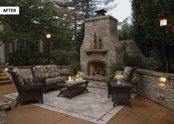
Heat and fire draw dinner guests into a cozy nook with a neutral rug and oversized wicker seating configured for comfort. The hot tub dovetails with a stunning limestone fireplace proving Poynter’s point that a chimney doesn’t have to be excessively tall to make an impact. “The height of a fireplace should vary by setting,” Poynter explains, adding, “With multiple features at play, we didn’t want one item stealing the show.”
Like well-designed indoor rooms, outdoor spaces should build off of one major element: Here, a geometric pool is the focal point. “It’s the biggest feature, physically, and the one that will be used the shortest time of the year,” says Poynter. “We pushed the pool far into the yard, and added another feature: the pool house,” he adds.
With three distinct zones laid out, it was time to establish traffic patterns via hardscaping. The rub, Poynter says, was integrating logical pathways into the back yard’s preexisting elevations. Forget cumbersome flights of stairs! “It’s about building gradual transitions between living spaces,” says Poynter. “And the art,” he adds, “is incorporating a variety of materials that break up the hardscape without looking busy.”
Exposed aggregate concrete takes the homeowners from kitchen to living room; below, tan Kool Deck, an insulated cement material, creates separation. “We used a neutral color around the pool because the focus isn’t the deck — it’s the pool and the pool house environment,” says Poynter.
Limestone retaining walls topped with weathered sandstone veneer caps were a functional way to further define each outdoor space. “We used some subtle lighting underneath the lip of the stone walls,” adds Poynter, referring to a smart touch that illuminates the walkways while minimizing light pollution.
“In the process of getting from one elevation to the next, we created planters, built-in areas designed to soften the retaining walls with vegetation,” Poynter continues. Plantings create privacy, too. “This particular yard can be seen extensively from behind the house,” explains Poynter. An “evergreen screen” offers year-round seclusion while “cozying things up,” as Poynter puts it. The living wall does double duty, veiling pool equipment in a hidden service.
Wilhelm and his crew peppered in flowering and leafy deciduous material, mixing perennials and shrubs capable of complementing and softening the stone and concrete work. “It isn’t any particular event,” Poynter notes. “It’s about how everything works together. That’s the art behind designing an outdoor space.”
Resources
Landscape Designer: Poynter Landscape, 636-256-2600


