“It’s all about the dance,” says interior designer David Kent Richardson. But he’s not referring to a series of choreographed steps timed to music. Richardson’s dance is all about creating an interaction among objects in a home to achieve a liveliness and harmony... a design dance. For one Central West End homeowner, the “dance” he and Richardson, owner of DKR Interiors, choreographed combines modern design with antiques in a contemporary envelope.
With a job that has him frequently traveling, the homeowner made a move from his former Ladue residence to a high rise on Lindell. “I was drawn to this building because it is an architect-designed building,” says the homeowner. Other amenities that appealed to him included elevator access directly to the unit, high-quality finishes and the CWE location. “When I decided to buy this unit, I really needed someone to help me personalize it and make it more entertainment friendly,” he says. He was familiar with Richardson from his past in the real estate business, and he was naturally the first person he turned to for design assistance.
“I got David’s input on 90 percent of the project,” the homeowner says. Even though he was moving to a relatively spacious condo, he still needed to pare down his belongings. David was key in deciding what to keep and what to get rid of because he could be objective, as many of the pieces held sentimental value. “We prioritized the pieces that were important and had the excitement of adding new,” Richardson explains.
Family furnishings, the homeowner’s artwork and Grand Tour Souvenir collections were all kept with new pieces sprinkled in. By taking what they already had and adding to it David and the homeowner began creating a new dance. “I like to work with clients with a sense of style,” Richardson explains. “Throughout the process I like my clients to have a sense of discovery and come to love what they put in their home.”
Stepping off the elevator into the unit, the dance begins. The homeowner’s personal collection comes alive against the exquisitely faux-finished wall. One of the most fun projects in the redesign, the entryway gallery was also the most challenging for the designer. “It was a lot like putting the pieces of a puzzle together, but we had to make each unique and stand out in its own right,” says Richardson. And with so many elements, balance was also important. A set of Empire tables, matching chairs and a bench sawed in half and placed next to one another for different effect bring an asymmetrical equilibrium and harmony to the entry. “People think this is all new stuff, but it is old stuff repurposed in a new setting,” says the homeowner.
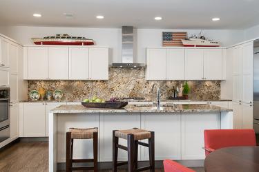
Since the unit was already built out when he purchased, the homeowner kept the lustrous white cabinets by Markus Cabinetry and gleaming granite countertops in the simple kitchen. In the adjoining hearth space, four Meis van de Rohe brno chairs recovered in a cinnamon wool fabric offers additional seating around the 1960s Italian modern table sourced by Richardson.
Richardson didn’t put a fixture over the table to make the space more flexible for entertaining, but recessed fixtures give off plenty of light. One of many structural changes made in the unit, the recessed ceiling in the hearth was removed and the designer restructured the kitchen and hearth lighting into a grid pattern, which brings more balance and harmony.
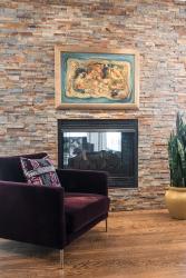
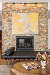
Adjacent to the table, a two-sided fireplace, which separates the hearth from the living space, is inlaid into a stone wall. The homeowner loves the rawness of the stone against the polished wood floors and cabinetry in the room.
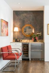
Off to the side of the hearth and living room is a small alcove that the homeowner had built into a refrigerated bar perfect for frequent hosting duties. “I tried to fill up any empty wasted wall space with storage,” the homeowner explains. “But I still wanted to maintain a consistency in the look and style of the finishes, so I worked with Markus Cabinetry to ensure uniformity.”
Looking as though it has always originally been in its place, the bar makes entertaining a breeze. The homeowner worked with architect Matt Wolfe and Markus Cabinetry to come up wtih a highly creative solution for serving guests. A pull-out bar is hidden in the wall only brought out when the extra space is needed. Richardson and the homeowner also spent a lot of time projecting how traffic would flow through the unit and how the separate spaces would be used, which played a huge part in the positioning of the bar .
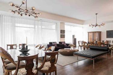
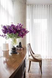
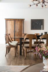
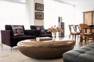
The living room functions as both a chic lounge and elegant dining space. At the suggestion of Richardson, the open room is edged by two custom-fabricated dining tables that each seats ten. A set of Biedermeier-style chairs made in the 1930s mix with a set of Italian chairs with bronze sun face and original crewel upholstery Richardson found for the homeowner.
In between the dining sets is a comfortable and stylish seating arrangement for guests to mingle before sitting for dinner. A Meis van de Rohe leather lounge pairs beautifully with two chairs covered in purple mohair. Above the fireplace is an abstract painting by Roger DesRosiers, who was the dean of the School of Fine Arts at Washington University from 1977-1988. Sourced by Richardson and purchased at Robert Morrissey Antiques, the painting is atmospheric yet architectural and blends perfectly in the living space. Richardson is an advocate of supporting St. Louis businesses. "If I can buy locally, I always do," he says.
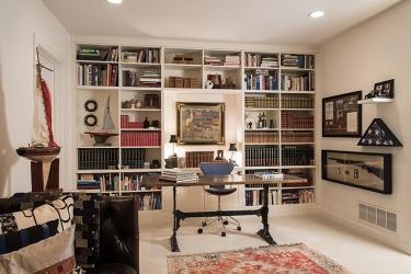
The other public room in the unit the study was previously a third bedroom. The homeowner had visions of transforming it into a more functional, open space. Working with Wolfe and contractor Lindell McKinney, a hole was cut into the wall gaining access to the utility room that has since been converted to a catering kitchen. The bedroom doors were removed and the closet was torn out and replaced with floor-to-ceiling bookcases by Markus Cabinetry that display the homeowners unusual collection of 19th century Grand Tour Souvenirs purchased from local antique shops such as Jules Pass, Robert Morrissey and R.Ege Antiques as well as his childhood set of encyclopedias. Family and other childhood mementos adorn the walls in the cozy study.
The master bedroom also houses special family pieces such as his grandmother’s quilts and great-grandmother’s sofa and accent chair. The showpiece of the master is the exquisite 1940s French painted linen depicting an oriental scene that hangs behind the rich-blue bed frame. “David really had to convince me on the blue bed frame, but it really makes the tapestry come alive,” the homeowner says.
Richardson’s guidance coupled with the homeowner's beautiful and sentimental pieces have transformed a typical CWE unit into a luxury condo. With a deft hand and an eye for antiques, Richardson’s design dance brings a new, fresh look to items that reflect the candor of its owner. “Good design should reflect what you’ve studied, where you’ve traveled and what is important to you,” says the homeowner.
Resources
Designer: David Kent Richardson, DKR Interiors, 314-401-1333
Cabinetry: Markus Cabinetry, 314-436-1494
Architect: Matt Wolfe, Wolfe Architecture & Design
Contractor: Lindell McKinney, St. Louis Building & Remodeling, 314-471-3278
Painting: Ron Mendez, River City Drywall & Painting, 636-474-9657
Robert Morrissey Antiques & Fine Art, 314-725-2695
Jules L. Pass Antiques, 314-991-1522
R.Ege Antiques, 314-773-8500


