After living in a 110-year-old home in the heart of Kirkwood for 30 years, it was going to take a lot to tear designer Karen McNamee away from her beloved abode. She loved the old Craftsman, but the upkeep of an aging home began to become tiring, and her husband Bob wanted a home with a basement. After searching the area for two years, the McNamees finally found a lot with a small ranch home they could tear down and start fresh. “Building new, I knew I could do everything I wanted my way,” Karen says.
Her experience as an interior designer for her firm Cottage Grove Design led her to the right resources, and the ideas for what the lot would be transformed into, well, they flowed easily. Karen served as general contractor, and throughout construction, she gained a great appreciation for the building process. “It is as hard as everyone says it is,” Karen says of overseeing the build.
She took a two-year hiatus from her design business so she could stay on top of the construction crews. Despite a five-week delay due to the challenges of a harsh winter, Karen pushed through and the two-story home was completed a year from when they started.
The 4,100-square-foot craftsman-style home has five bedrooms, four-and-a-half baths and the coveted lower level retreat Bob wanted. Karen looked through hundreds of house plans online and finally settled on a plan that made sense to her and had an open floor plan. She took her idea to architect John Odom of JSO Services, and the two sat together and revised her design into a plan that would work on the lot. “I love working with John,” Karen says. “He thinks like a woman when it comes to designing a home.”
Beyond the open floor plan, the new home also had to have a large master, wood-burning fireplace, guest suites for her out-of-town children, a big front porch and a kitchen island that would comfortably seat eight. “We have a group of close friends that get together every Friday, so we needed a place for all of us to sit for dinner and drinks,” Karen laughs.
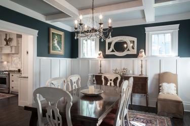
More on the kitchen later, but first the inspiration behind the interiors in the home... “I didn’t want this house to feel like a brand new home,” Karen explains. Using design elements that reminded her of her previous home helped her achieve the “old” look and feel. In fact, the dining room that welcomes guests right when they walk in is nearly identical to her previous dining room that she loved so much.
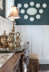
Crisp, white wainscoting wraps the dining room walls and brings a touch of traditional character found in older homes. Karen wanted a strong color to stand up to the white wainscoting, so she went with Benjamin Moore's "newburg." Another classic design element, the coffered ceiling was taken three shades lighter than the wall color to make it pop. Throughout the home is a mix of antique family pieces and new furnishings. In the dining room hangs a beautiful display of family china pieces. Hanging them on the wall is a creative way to show off the prized pieces instead of hiding them away in a cabinet.
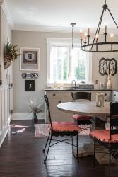
The wainscoting from the dining room carries through the entry hall into the main living area. For an old and “beat up” look, the main-level flooring is a dark-stained and distressed oak. The planks are composed of six smaller planks crafted together to keep them from warping in the St. Louis humidity.
A cozy family room is tucked off the expansive kitchen and breakfast area. Beautiful, white built-in cabinets flank the fireplace. Custom-created by Planks, an Amish cabinetry company in Illinois, the built-ins add a historic feel to the room. Karen wanted tons of light in this space, and a set of sliding doors, which lead to the back patio and well-manicured lawn, lets sunlight splash in.
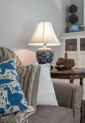
Many of the furnishings in the family room are family pieces that belonged to Karen and Bob’s grandparents such as the secretary, which houses antique trinkets and a set of matching chairs. How does Karen achieve a balanced look when blending old and new? “The key to mixing antiques with new pieces is simple,” she explains. “I try to keep the new in neutral fabrics and tones.”
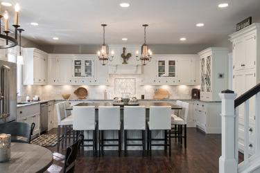
Karen has been drawn more to the soothing, neutral colors as she’s gotten older. The kitchen/breakfast area is a serene blend of neutral shades and natural materials. The whole concept of the kitchen is based around the center island that seats eight. “We love to entertain,” Karen says. “We knew we needed eight seats for hosting our weekly Friday night dinners with friends.”
The island base is finished in bead board that is painted a blue-gray to contrast with the white of the cabinetry. For the top, Karen wanted a material that looked like soapstone but needed something stronger than the soft finish. A Milky Way honed granite achieved the look of soapstone with the durability of granite.
The Shaker-style cabinetry in the surrounding work area was also custom built by Planks. Karen prefers drawers to cabinets because they are so versatile for storing dishes, pots, pans, etc. Seeded glass fronts on select upper cabinets give the time-honored charm of an older home, as does classic subway tile. “This kitchen is phenomenal for entertaining,” Karen says with a smile. “I find myself cooking so much more than I was before.”
The breakfast area/bar is an extension of the kitchen space and was important to Karen to keep guests out of the main kitchen area. The bar complements the kitchen with a matching countertop. The cabinetry is painted a taupe/gray to set it apart.
On the second story, two guest suites are reserved for the McNamees' visiting children and grandchildren. One room is themed for the ladies with girly bedding in shades of pinks, greens and yellow atop a wrought-iron bed that belonged to Karen’s daughter as a child. The other suite is for the gentleman of the family and has a mountain feel that reminds the McNamees of their vacation home in Colorado.
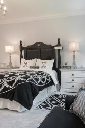
The master suite is set up very similar to their old home. “It had to be a black-and-white color scheme,” Karen says. A custom headboard and matching nightstands by Jim Stubblefield fit perfectly into the classic color scheme.
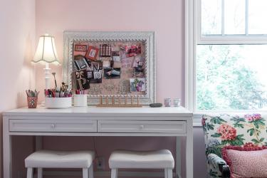
Just off the master is one of Karen’s favorite spaces in the home, her craft room. Splashed from wall to wall in a pretty, pale pink, the craft room is her own slice of serenity where she can hide away and get lost in a project, and Karen has hopes that someday soon she can transform it into a nursery for future grandchildren.
While most would call the home "finished," as a designer, Karen says her home is never done. Whether tweaking or adding a new piece, her new Kirkwood home is an evolving realization of her design dream.
Resources
Designer: Karen McNamee, Cottage Grove Design, 314-603-0173
Architect: John Odam, JSO Services, 417-343-2602
Cabinetry: Planks Cabinet Shop, 217-543-2687
Henry Plumbing, 314-773-3636
The Tile Shop
Hardwood: Boardwalk Flooring, 636-207-1974
Carpet & Basement Floor: American Floor Craft, 314-909-9993
Marble & Granite: Rock Creek Granite, 636-321-8090


