Traditional Detailing
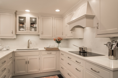
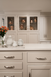
In scale with the small high-rise condo the owners purchased for use when in town, the 250-square-foot kitchen was transformed to match the rest of the unit. Previously a “dropped-ceiling, curling linoleum-floored, behind-the-door-scullery,” brooksBerry & Associates designed the new kitchen to be an open flowing area with a high level of traditional detailing. The homeowners are avid art collectors, so it was important that the kitchen include built-ins to display their prized collection as well as for storage. By relocating old laundry equipment, a wall of deep display cabinets could be installed over the pantries. In the breakfast area, a banquette bench was added for storage.
Structurally, a wall was removed, but a building support post in the center of the space had to stay. The support post anchors the new peninsula counter. Portions of the ceiling were raised 8”, and shallow soffits conceal mechanicals from the unit above. For a bit of pop in the kitchen, the durable porcelain-tiled floor mimics the look of Belgian limestone. Finally, to brighten the windowless space, painted cabinets are illuminated with LED lights.
Why the judges love it:
Creating a workspace without windows is hard, but the use of LED lighting and glass fronts on some of the cabinets really brightens the space. The built-ins are a beautiful way to allow the homeowners to display their collection. This kitchen is a creative use of space.
Resources
Wall paint, furniture: Castle Design, 314-727-6622


