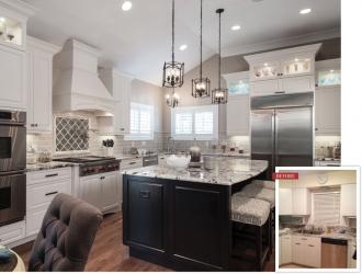
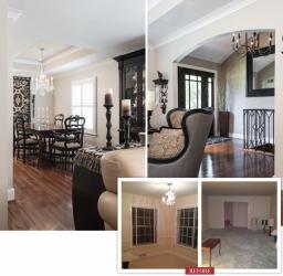
Like every stereotypical 1950s-era home, this 2,200-square-foot Des Peres ranch was immured with compartmentalized rooms and smothered by eight-foot ceilings, wall-to-wall carpet and linoleum. So, two brave homeowners renovated the entire floor plan, taking the space from stale to stylish. The crowning achievement: conversion of the segregated kitchen, living and dining rooms into a casual cooking and eating area that’s constantly begging for company.
The decision to make the kitchen the home’s focal point was an easy one, according to homeowner Walt Alles. “We cook and entertain at home often, and we wanted a large, well-lit kitchen with ease-of-movement and accessible components,” he says. Adding ample, adjoined space for conversation and, also, elegant dining was another no-brainer. But, decisions on how to structure and organize the home’s heart and soul, that’s where things got tricky. In fact, wife Maryann Vitale Alles spent hours perusing pictures on Houzz until her husband finally banned the site!
The homeowners, both well-versed in design – Maryann knows interiors and Walt studied architecture – were integrally involved in the massive remodel, working closely with designer Patti Martineau of Patricia Marie Designs and architect Julie Coulter, AIA, of Coulter Building Consultants, who opened the floor plan and lifted the ceilings, a feat another architect said required new trusses and removing the existing roof. Julie found a way to raise the ceilings to 11 feet while “keeping the loads on the outside wall,” Walt explains.
Coulter incorporated a masonry arch between the kitchen and living room, and an elegant barrel ceiling to subtly signify where formal dining begins. “We tried to keep in mind the original architecture of the house and didn’t want to go with anything too modern,” says Maryann, pointing, also, to Ballard Design pendants over the kitchen island, a smart way to enhance natural light gushing past plantation shutters.
“The original kitchen was a pink, all-electric, push-button GE design with pink, GE metal cabinets, which had been painted white at one time,” says Walt. Red oak hardwood, found hiding beneath the old dining room carpet, was salvaged and brought into the living room and then the kitchen to override outdated tile. Maryann picked new appliances based entirely on Consumer Reports reviews: the refrigerator-freezer, double oven, and warming drawer are Dacor, the range is Wolf, and KitchenAid received rave comments on dishwashers.
The homeowners fell in love with their Ann Sacks backsplash tile, which makes the space contemporary without being trendy. “If you stay neutral, you can get your splash of color with other items,” explains Maryann, who picked the home’s color palette and, because she tends to “tire from too much pizzazz,” added interest with colorful canisters and a lime-colored, milk-painted table that’s perfect for off-the-kitchen eating.
Sherwin-Williams “Accessible Beige” is taken through (almost) the entire home, and what’s noteworthy is how its hue transforms – gray to tan or beige – in different light. Copenhagen granite countertops, purchased locally and fabricated by Stone Fabricators, are subtle, yet, given the cut and polish, “there are certain areas that just pop with a gold sparkle,” says Walt. A beige leather couch in the living space brings brightness without overpowering pieces like the natural-color block rug and windy wingback chairs.
Decorative crown molding ties together the living and formal dining spaces while an antique china cabinet separates them without creating a barricade. The dining room is characterized by clean lines and simple yet standout décor: an expandable wood table, the glistening crystal chandelier purchased at Jon Paul Designs and Collectibles, and a hand-painted leather-and-linen tapestry featuring arches that pair nicely with nearby archways. Speaking of art, the original blueprints of the house are framed and hang in a hallway off of the living room, proving that the past is never too far behind.
Resources
Designer: Patti Martineau, Patricia Marie Designs
Architect: Julie Coulter, Coulter Building Consultants, 314-724-5100
Countertops: Stone Fabricators, 314-776-7776
Dining Room Chandelier: Jon Paul Designs, 314-645-2722


