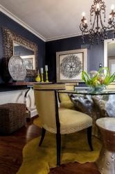
Homeowner Allison Englander always adored the individuality associated with contemporary finishes – a far cry from that Pottery Barn brand of shabby-chic filling her previous home. So, when she purchased her current Clayton property, Englander wanted to update its traditional aesthetic, starting with the blond hardwood floors.
But, Englander recalls, “The guys redoing my floor didn’t want to go dark because of the home’s age.” That was about the time Englander walked into Savvy Surrounding Style, where she met designer CJ Knapp, who drove to the new pad that afternoon and happily sanctioned a dark-stained base.
By now, as modern design sneaks its way into our everyday vernacular and favorite catalogues, it’s no secret that contemporary living needn’t mean barren rooms with off-white walls. Color, in fact, is an easy way to modernize without sterilizing. And, Englander wasn’t the least bit nervous about the room’s rich, navy hues.
“Your first instinct in a small space is to go light,” says Knapp. “But we painted the room dark blue instead because blue recedes, especially when you do it on the wall.” Granny apple green – “the easiest color to live with,” according to Knapp – and silver and black complete the palette. “Black,” the designer adds, “is actually a complete neutral in design.”
“With CJ,” says Englander, “You don’t have to say much because she is so experienced.” And, Englander adds, “If you have just half of a story, she can complete it.” Englander did have half of a story: The Zuo Modern dining table (pictured), with a dazzling silver base cast from an old tree trunk, was the synthesis for Englander’s vision.
The original oval-shaped tabletop was traded for a hexagonal piece of glass with more contemporary angles – and, also, some space-saving magic. The geo edges define six seating areas, affording room for four everyday-use chairs and two Interlude metal side tables, cleverly used as stools.
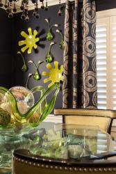
“This space,” Knapp explains, “is graphic and organic, all at the same time.” Clean lines found in the table, long drapes and purposefully placed mirrors and ottomans contrast beautifully with round features: that curvy cowhide rug, wall-mounted teardrop vases, a blown-glass bowl centerpiece, the Memphis-style console with its silver arced base – even an Egyptian cartouche made by Englander’s daughter, which integrates flawlessly. “Every wall has something interesting on top of it, so your eye moves around,” Knapp says.
Up above, Englander is especially fond of the Currey & Company chandelier with its eye-catching, dangling globed tips. “CJ opened up my eyes to fixtures being accent pieces that you can weave into your furniture choices,” says Englander, who advises fellow homeowners: “Don’t be afraid to try contemporary in a traditional space.” This room was a huge success, though Englander admits, “to take a more traditional home and make it modern is a little scary. Unless,” she adds, “you have somebody like CJ who knows what they’re doing.”
Resources
Savvy Surrounding Style, 314-432-7289


