Historic houses are beautiful, with their high ceilings, intricate moldings and gracious Old World touches. They’re not always practical, however, especially when it comes to kitchens and baths, where modern layouts, plumbing, fixtures and materials are not just stylish but essential to daily life.
But that doesn’t mean that fans of stately old homes need to forego the classic. Given knowledgeable contractors and experienced interior designers, these charming old spaces can be given a facelift that adds the best of the new while preserving the past.
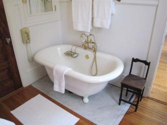
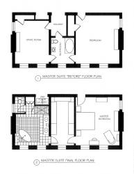
That’s exactly what happened when Janet and Guy Stevenson teamed with Emily Castle, ASID, of Castle Design to overhaul the master bath in their Central West End home. Built in 1905, the federal-style house featured a master suite that included a bedroom and a sitting room linked by a small bathroom. But not long after the couple moved in, “it became apparent that the floor plan was not going to work for us,” says Janet. The bathroom featured just a sink, toilet and tub—no shower—and, like many historic homes, the closet space was minimal. “We had clothes spread out all over the house,” laughs Janet.
Enter Emily. Both a space planner and an interior designer, she rearranged the space, moving the bathroom into the sitting room and transforming the original bathroom into a spacious walk-in closet. With the help of Patrick Moore Construction, a contractor who specializes in the CWE’s historic homes, walls were moved, plaster and lath was torn out, and plumbing was extended to the old sitting room. “It was a big gut to remodel the space,” says Janet.
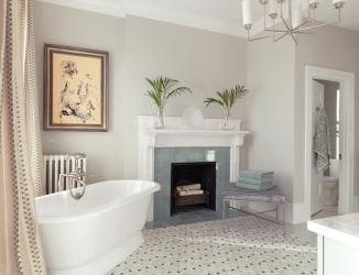
The new, spacious bath combines elements of old and new. The double vanity, freestanding angled tub, and separate shower and water closet would be at home in any newly constructed home, and the clean lines of the cabinetry, streamlined chandelier and floating vanity lend a distinctly modern vibe. But other touches fit right in with the rest of the house: the gray marble that was chosen to mimic the same material in the house’s other bathrooms, the vanity’s crystal hardware that recalls doorknobs throughout the home, and the original windows and fireplace—one of nine—that were retained. “We wanted to maintain the integrity of the house,” Emily explains. “It wasn’t necessary to cover up the fireplace to get everything we wanted in the space. And I prefer to leave them.” Additionally, Emily and Janet “were looking for luxury and comfort when making our selections [for finishes and fixtures],” Emily continues. “But they still had to be appropriate to the style of the house.”
“It blends seamlessly,” agrees Janet. “It has a crisp modern feel but with very traditional elements. It’s made our lives so much more organized and functional. We’re absolutely thrilled.”
Resources:
Interior Designer: Emily Castle, ASID, Castle Design, 314-727-6622
Contractor: Patrick Moore Construction, 314-535-5000
Tile: Sunderland Brothers Company, 636-680-2250
Plumbing: Immerse by Atlas, 314-375-1500
Art: Grafica Fine Art & Custom Framing, 314-961-4020


