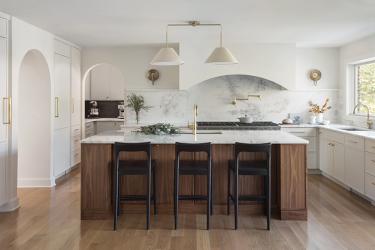
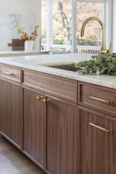
Accent on Cabinets was challenged to create a kosher kitchen for their client, which typically needs more space because Kosher requires you to keep meat and dairy separate. The original kitchen was approximately 250 square feet, but the designer more than doubled the space. A scullery was added to meet the demanding needs of Kosher guidelines and accommodate large family gatherings. A wall from the kithcen to the family room was knocked down, and the powder room was moved to a different location. Also, the laundry room was moved to the second story and a small amount of space was taken from the children’s playroom to create more square footage in the kitchen. The homeowner wanted an open concept with room for large tables and space for everyone to work together in the kitchen. The designer had to be creative to hide existing plumbing. The 1970s kitchen is now open, modern and transitional in style.
Why the judges love it: The design of this kitchen features interesting details, but the designer kept everything simple enough that a cohesive look was created. We love the way the simple cream tone of the lighting does not distract from the range hood.


