Perhaps best known for Ted Drewes in the summer and the holiday lights of Candy Cane Lane in the winter, the community of St. Louis Hills offers one of the city’s most charming and desirable neighborhoods. Dotted with an eclectic mix of gingerbread-style homes from the 1930s to the 1950s, the quaint town centers around the beauty of Francis Park, an especially appealing attraction for families with kids. After moving to the area in 2006, Emily and Patrick McGinnis bought one of the last undeveloped lots in the neighborhood in 2018 so they could put down roots and raise their three children here.
“When we built the house, our intention was to have our home look like it had always been part of the neighborhood from the outside, but with more modern interiors,” says Emily. “Our community is so special—it is a bit of a throwback. Our kids walk to school, grab lunch and snacks at LeGrand's and play in the park.”
Interestingly, there was a bit of intrigue behind the location of the McGinnis home, with many neighborhood rumors as to why the land had never been developed, most of which revolved around the idea that there was a cave or bedrock underneath. “The rumors even caused us to hire an engineering firm to dispel that nothing was there,” Patrick says, “but the real reason was that, up until 2005, the property was owned by the house next door.”
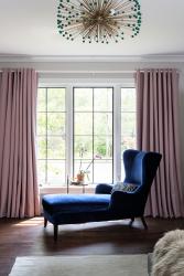
When the 5,200-square-foot build was complete, the couple enlisted interior designer Sara Weller, owner of Sara Weller Design, to begin working on the home’s four bedrooms, followed by the living room, a mudroom/laundry area and a basement that includes a family room, bar/game room, an office, a reading nook, a full bath, a home gym and storage space galore.
“With three children in grade school, family is very much the center of this home,” says Sara. “So, I focused on identifying choices to establish a core design that would allow the homeowners to curate and add additional accessories and art over time that were meaningful to them as a family. As a result, the children’s artwork is embraced throughout the home alongside professional pieces.”
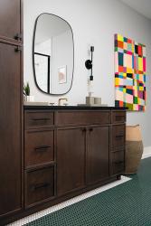
The couple’s posh, hip personal style and love of color are reflected throughout the design. The designer and homeowners share an appreciation for bold prints and high-contrast colors—especially green—which led to a truly collaborative design process. “I love color, and working with Sara was so fun,” says Emily. “She got my passion for color and was able to integrate it into our home in an intentional way—playful and refined all at the same time.”
With three kids, ages 14, 11 and 10—and an Aussie Doodle named Ginger—it was essential to create open spaces for people to hang out and a dining room to host big groups of friends and family. “When designing for an active family, the balance of form and function is always paramount,” says Sara. “Everything selected needed to withstand the demands of a young family but with a chic flair.”
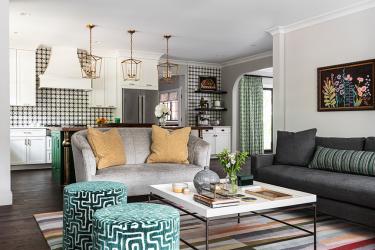
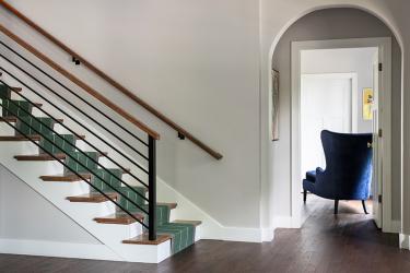
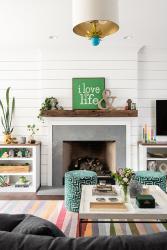
In the foyer, a green Roger Oats herringbone wool runner imported from London creates an exciting first moment that welcomes you into the home and sets the tone for the design to come. “The statement is clear,” says Sara. “Color is at home here, and the conversation continues as you head into the living room, where a showpiece striped rug with a kaleidoscope of colors generates a major impact in the sitting area.”
Building off this focal point, Sara’s space-planning strategy included a cozy conversation area with custom Chaddock loveseats upholstered in a chunky bouclé Pindler fabric accented with bright yellow Thibaut pillows. A whimsical pair of emerald geometric Fabricut ottomans at the fireplace complements the palette. “I love pattern and color,” says Emily. “I wanted a home with purposeful spaces that reflected who we are as a family—comfortable, fun, and welcoming. The rug in the living room was super fun to create in partnership with Sara.”
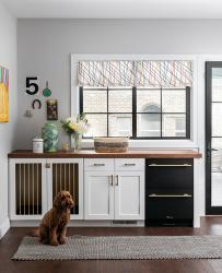
Located on the main floor and off the covered deck, the connected mudroom and laundry area needed improved functionality and an upgraded personality that incorporated the spaces into the rest of the home. The mudroom was commonly used as the family’s primary entrance and required a landing space and additional refrigeration for the kids. The area also had to accommodate the family’s Aussie doodle, who needed a comfortable spot she could call her own. Emily, a life coach, wanted a dedicated office with an attractive backdrop for Zoom calls and virtual groups for her clients.
With functionality requirements established, the form and personality came to life in many exciting ways. A new built-in dry bar featuring St. Louis-based True Refrigeration with matte black and gold accent drawer coolers brings stylish contrast to the locally made butcher block countertops, and a custom built-in doggie crate provides a conversation piece for the owners and a private den for the doodle.
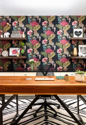
“Perhaps one of my favorite rooms in the entire house is Emily’s new workspace,” says Sara. “It brings a new spin on the adage that all work and no playful design makes for a boring home office. Harlequin wallpaper and a Nikki Chu area rug are gorgeous and powerfully feminine. Modern business demands a striking background for Zoom meetings—and this wallpaper delivers and establishes a clear visual tone.” Colors from the wallpaper are echoed in the bookcase, custom chair and ottoman, and sheer draperies with polka dots invite plenty of natural light without sacrificing style.
“One of my favorite things about my office is all of the personal touches—kids’ art, some family pictures, books that have had an impact, the rainbow basket my mom made,” Emily adds. “It is definitely a fun place to work!”
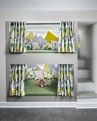
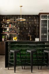
The unfinished basement involved a complete transformation that now includes a reading nook under the stairs with full-size bunk beds that are backlit and have hidden bookcases tucked inside. “It’s a pretty magical place to hang out and the first thing you see as you come down the staircase,” says Sara. Mirroring the initiation to the home’s main level, the entrance into the basement family room welcomes the children and their friends and establishes a space that can work for both adult and teen entertaining. Warm, gray-stained concrete throughout creates a modern feel that is brightened by a multi-colored rug to cozy up the main seating area. A large-scale contemporary chandelier makes a statement above the seating area, and matching wooden grid walls were added behind the TV area and at the side of the bar to add dimension to the massive space.
“We wanted to build a house our kids enjoyed spending time in and inviting their friends to,” says Patrick. “It was also important to create spaces that would bring us together but also allow everyone to have their own space when needed.”
“I enjoy how our family’s personality is evident in our choices,” says Emily. “It took a team effort to get it right, and we are so happy with the result. You can usually find us having a movie night in the basement under our giant blanket or hosting family and friends spread out in all the fun spaces throughout our home.” See stlouishomesmag.com for resources and additional photos.
Resources
Interior Design Sara Weller Design
Architect Killeen Studio Architects


