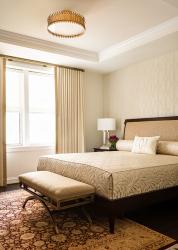
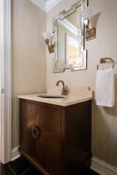
When the homeowners moved from a 3,400-square-foot home in Houston to the 1,260-square-foot condo in St. Louis they wanted to remodel the space before moving in. After interviewing a few designers, they chose to work with Jenny Rapp of JCR Design Group because she was willing to let them be part of the design process every step of the way. “They had a wonderful art collection. That was from the beginning what we wanted to build around,” Jenny says.
In addition to being phenomenal pieces of art, the homeowners know the artists, which makes them even more special. “Those pieces were so important to us. Those drove the color scheme,” the homeowner says. “We wanted to make things in warm tones and we wanted it to work with our artwork. That was a big driver.” In their previous home, they had a lot of antiques, but they wanted to go in a different direction for the condo. “In the Chase, we felt an art deco vibe would be better,” the homeowner says. “We got rid of all the antiques in different ways. We only moved things we absolutely loved.”
To help the homeowners, Jenny had floor plans made of the condo so they could suggest what furniture would fit and what wouldn’t. They also had pictures and measurements of much of their furniture from their previous space. They downsized to about a third the belongings. Most of the furniture is new.
They placed a 4-foot by 6-foot painting of a symphony scene, “Hallelujah Chorus” by prominent Ghanian artist Larry Otoo, in a place of honor on the living room wall.
For the Christopher Guy chairs in front of the painting, the homeowner loved a particular fabric but felt it didn’t look quite right. Jenny suggested they simply turn the fabric the other way, which changed its entire look and made the fabric on the chairs the perfect complement to the painting and the room. “She is a master at fabric choices,” the homeowner says.
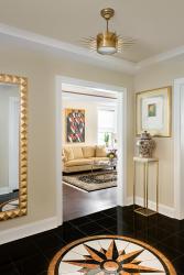
The homeowner wanted a compass rose design on the entry way floor and reasoned it should be only 24 inches in diameter because the space wasn’t very large. Jenny suggested making the design feature larger—they ended up making the compass rose four feet in diameter; the medallion mimics the Currey & Company light fixture hanging above. As a result, the homeowner loves it. “What Jenny said was right on. It makes that statement when you walk in,” she says. “Jenny was wonderful to work with. We loved the fact that she incorporated us in all of it, and valued and listened to us.”
Resources
Appliances: AUTCOhome
Builder: Jim Doss
Cabinetry: Beck/Allen Cabinetry
Furniture: KDR Designer Showrooms
Granite: SFI
Interior Designer: JCR Design Group
Plumbing Fixtures: Wholesale Plumbing
Window Treatments: Brewer Quilt & Design


