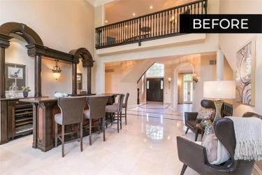
In 2019, Joanna and Brett Green moved to St. Louis from northern California. On the west coast, the pair had developed an affection for styles with a contemporary edge. Moving to St. Louis, however, they determined they would embrace a style of home that landed somewhere in the middle in terms of aesthetics, somewhere between modern and classic looks.
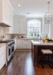
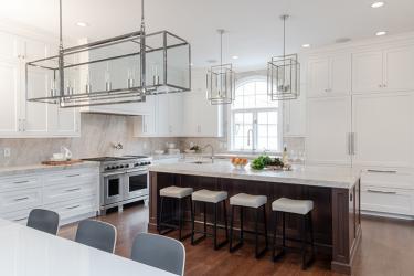
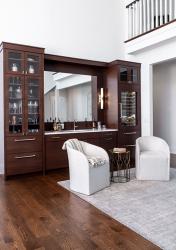
“I don’t think we went all the way modern for our home,” reveals Brett, “even though it does feel more contemporary. We kept our overall style a bit more transitional, with lots of new hardwood and polished nickel.” The kitchen’s island, the star of the kitchen says the pair, is a dark walnut topped with sueded quartzite layered in a double thickness, while all the pulls are a polished nickel. This latter element is a nod to the same hardware used in the nearby wet bar.
The result is a simultaneously classic yet modern take on the typical kitchen island, many of which today tend to be enveloped in bright, standout colors like blue jay or emerald green. “That would have just been too much color for us,” says Joanna. Brett agrees, “we prefer to stick with the classics as opposed to something that feels very now.” But all this planning and design didn’t happen in a vacuum.
The couple had reached out to Leslie Cusanelli, lead designer and founder of Milieu. “The goal of the project was to modernize and update the space along with solving some functional needs,” says Leslie. “The bar they had done with the help of Tim Hertel, owner of Tim Hertel STL, before I started working on the kitchen, so we decided to carry some of those designs through into the space.” Thus, the kitchen island coordinates with the bar, while the kitchen’s shaker cabinetry is decked out in white to brighten the space and match an adjacent hearth room.
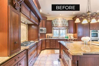
Reimagining the kitchen was one of the last renovations the Greens had planned. Before moving into the house, the couple had redone the main living areas, expanded the entryway to create a much-needed mud room and pantry, adding lockers to help keep their young children organized. “They can hang up their clothes and place their shoes inside the lockers,” says Brett, explaining some of the functionality of the space. The kitchen likewise needed some alteration in terms of its functionality as well, says Leslie. “We elongated the range wall to increase the sizing of the storage and function in the kitchen. We also dropped the original two-level island to be closer to the height of their young children.”
The same oak flooring runs between several spaces, from the kitchen to the bar and other areas to make everything feel continuous. The idea was to encourage guest overflow to run along these richly covered paths. “When you have guests over, how do you encourage them to get out of the kitchen?” asks Brett. “One way is to move the alcohol somewhere else,” he laughs. “It was another motivation for keeping the bar.” Originally, the home had an elaborate and ornate bar, but the pair did not like the style, wanting something that also fit their preference for a classic yet modern mix. “People would walk into the kitchen or the bar area and say, ‘what are you doing? These are already great spaces, but for us, they just weren’t our style,” he says. “And in the end, you want your house to feel like home.”
Resources
Appliances: AUTCO home
Architect: Lauren Strutman Architects PC
Builder: Tim Hertel
Cabinetry: Kenrose Kitchen Kabinetry


