When Jeff and Dave decided to move into a larger unit together in The Crescent, they needed to find a way to merge both of their distinctive tastes. Jeff Kapfer, a well-known local artist, loves bright colors and whimsical touches while Dave, a cardiologist, prefers a more tailored and classic design style. Realtor and friend Ted Wight introduced the pair to Dana King of Dana King Design Build Remodeling to make their shared vision come to life.
“When they came to me initially with this project, I knew it was all about collaboration,” says Dana King. “The main focus of this project was giving the home a clean, contemporary feel while adding in plenty of fun, whimsical accents. They both wanted the space to feel sophisticated.”
The living room is an elegant but casual space to enjoy time with friends in front of the fireplace. Two large couches anchor the room, and a large, durable coffee table sits between them. Jeff’s piece “Pigeons in Flight” and ceramics by artist Justin Teilhet are displayed to the left while a painting by Michael Hoffman and more Justin Teilhet ceramics sit on the right, creating a contemporary display instead of the traditional mantel decoration. Custom electronic window treatments by Integration Controls make transitioning from night to day simple.
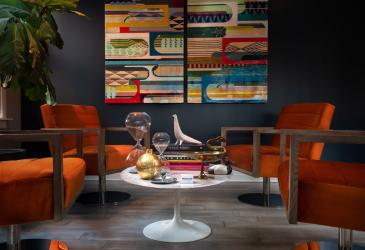
A small, vibrant sitting area to the right holds plenty of conversation starters. Dark blue walls and artwork by Alicia LaChance complement the space’s four orange velvet swivel chairs from Design & Detail, giving the room the vibe of a midcentury modern lounge. The coffee table holds some of the homeowners’ favorite bird decorations and assorted trinkets.
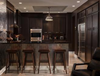
When they started working on the kitchen area, everyone tried to think of ways to bring light into the space. However, they eventually decided to work with the dark cabinets and countertops, shifting the design’s vision from light and airy to dark and dramatic. “When it came to the kitchen, our attitude was ‘If you can’t beat it, join it,’” Dana laughs. “It turned out to be one of the most stunning areas of the condo, and it’s surprising how fresh and enlivened it was compared to other, mostly white kitchens.”
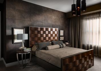
For their bedroom, they wanted the space to be a place to relax with a masculine vibe. Perhaps the most eye-catching element in the room is the handcrafted Mulberry wallpaper that looks like leather. John Beck of John Beck Steel in Belleville, IL, made the chandelier. Edison bulbs shed a warm glow across the room both day and night.
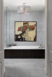
To keep the bathroom cohesive with the rest of the home, they chose a shade of gray that shows throughout each space in the flooring, marble and trimwork. To make it feel like their own, they selected a large, statement art piece from Houska Gallery above the tub, which brings color into the largely marble room.
“We wanted to work together to create a new space that reflected our individual style, but also our style as a couple,” Jeff says. “Dana King’s knowledge and experience helped guide us through the project while respecting our ideas and challenging us to look at other potential solutions.”
Resources
Designer/Contractor: Dana King Design Build Remodeling
Shades: Integration Controls


