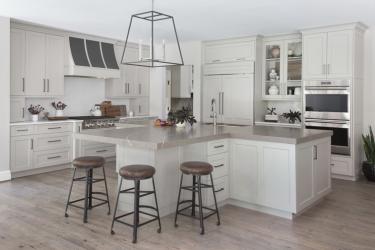
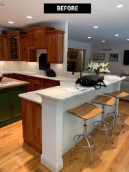
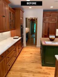
Family was the focus of this recent kitchen remodel. The homeowners’ goal was to create an open and flowing entertainment space for family gatherings that included a large island for seating for their grandchildren. Ken Henry, premier designer at Alspaugh Kitchen & Bath since 1986, reimagined the kitchen changing the design from a U-shape with a peninsula and tiny island to an L-shape space with a large T-shaped island. “The old kitchen was cut off from the family room and had a tiny island,” Henry explains. “The finishes were dated and the staggered heights of the wall cabinets was distracting.”
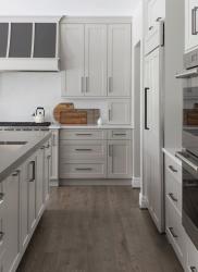
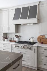
The wall between the family room and kitchen was removed to open up the space. After refinishing the wood floors with a more current stain, the soft transitional style of the kitchen took shape. Greige cabinets emanate warmth into the new kitchen. White quartz countertops with subtle gray veining line the perimeter, while darker gray quartz with large-scale white veining adds drama to the island top and bar area, where Henry was able to match up the veins to run up the backsplash. Henry says the boldness of the island quartz would have been too much for the perimeter. “The white quartz with gray veining is much smaller and more subtle so it lets the island top shine,” he explains. Plus, Henry notes, the contrast of the ash gray paint on the custom range hood is much more distinctive against the white background.
The oversized T-shape island is the hub of the kitchen. The homeowner did not want two islands, but she wanted to maximize usable work space and seating for the grandkids in one area. Henry came up with the T-shape concept. “The T-shape gave the homeowner that flexibility without creating a huge monstrosity of an island where you can’t reach the middle to clean,” he says. The shape also provides better traffic flow to the table and into the living room.
The island houses the homeowner’s requested appliances including the sink with two dishwashers on each side and a pull-out waste cabinet creating a “cleaning station”. A microwave drawer is also in the island and hidden from the family room view. Other unique storage in the kitchen include pull-out spice and oil units on either side of the range top. A tilt-up lid-stay door above the refrigerator makes accessing that cabinet easier. Two appliance garages are tucked to the corners to maximize countertop space and keep clutter at a minimum.
A small butler’s pantry marks the transition to the living room and includes a bar sink and wine cooler. Henry selected matching light fixtures in both areas and chose mostly warm gray and neutral finishes so the spaces complemented one another. “The most important consideration to bridge the two spaces was making sure there was enough distance between the kitchen cabinetry and the family room furniture to distinguish them as separate spaces even though they are entirely open,” Henry says. The soft neutral tones and simple clean lines of the kitchen effortlessly transition into the adjoining entertainment spaces making the ideal spot to enjoy with family.
Resources
Contractor: Alspaugh Kitchen & Bath
Granite: UGM, DiPrimo Fabricators
Plumbing: Crescent Supply
Decorative Fixtures: Top Knobs
Appliances: Roth Living
Lighting: Metro Lighting
Cabinetry: Alspaugh Kitchen & Bath


