Founded in 1984, Liston Design Build has earned numerous awards and an enviable reputation for superior service to clients throughout the St. Louis region. At the helm since 2009, co-owners Keith and Jeanne Liston have continued the proud family tradition, assisted by their expert team of craftsmen, contractors and suppliers.
“We see ourselves as a concierge to the whole remodeling process,” says Jeanne, “accompanying clients to showrooms, helping them make their selections, then putting the layers together for the beautiful, functional new space they had in mind.”
Although nowhere near retirement, the Wildwood residents of this story had decided to downsize to a more manageably-sized home. “With just the two of us, 7,000 square feet of space was really more than we needed anymore,” owner Matt Behlmann explains. Finding an attractive 4-bedroom 2-story in an upscale community nearby, they made their purchase in late December of 2019.
Set on a lushly landscaped half-acre site, the 3,760-square-foot plan was built in the mid-90s characterized by the traditional styling of its era and due for some updating. Matt viewed the new acquisition as an opportunity to pursue his lifelong passion for creating new spaces. “It’s been kind of a hobby since I was a kid,” he says, “I’ve even helped friends design their homes.” The choice of Liston Design Build was easy for Matt as well since he’d worked with Jeanne previously.
Design and renovation began in January, but several factors made this project unique. First, Matt’s vision for the interior was a complete departure from the existing décor and that of their former home. His objective was a “warm, contemporary look—livable, but not stark,” a style that was somewhat out of his comfort zone and would mean all-new furnishings. Further challenging Liston’s normally seamless process, COVID-19 threatened to interrupt work in mid-March.
The solution, however, was achieved with remarkable efficiency. The homeowners moved to an apartment for the duration, allowing Keith and his team (considered essential workers) to stay on schedule. In spite of the difficult circumstances, communication was no problem either, since Liston provides an app that keeps owners advised daily of the progress onsite.
Meanwhile, Jeanne and her client were busy selecting colors and finishes, and Matt was perusing magazines, Houzz and various home décor websites for an entire houseful of new contemporary furnishings. Once ordered, most of the items were stored in the home’s three-car garage and, just seven months later, the house was ready for move-in!
Although no major structural changes were made, the comprehensive design plan called for remodeling all the main-floor living areas and the upstairs master suite, including new casework, flooring, paint and cabinetry. Matt’s preferred color scheme of black, white and gray establishes a visual flow throughout the home, and Sherwin Williams’ light “Agreeable Gray” was chosen as the predominant wall color.
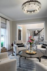
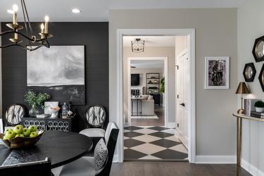
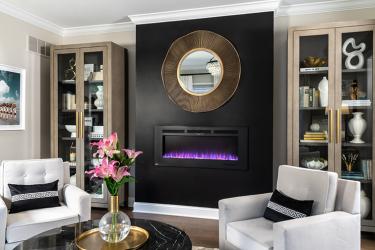
The theme starts in the foyer, where the handrail and treads of the central staircase were refinished in a dark charcoal glaze, and a gray tufted velvet bench is set on oversize black-and-white floor tiles, installed diagonally. Flanking the foyer, the former living room is now dubbed the “cocktail room.” Four comfy armchairs are arranged on a plush, striated rug in two-tone gray, encircling a sleek black marble table. Since the room hadn’t originally included a fireplace, it wasn’t vented. So, to create a warmer, more inviting atmosphere, Liston installed a Napoleon electric fireplace, mounted on a near-black accent wall.
For dramatic effect in the adjacent office, the walls and Liston’s custom-built shelving are painted the same deep charcoal hue—a sophisticated background for the distinctive bronze and shagreen desk, wood and wicker side chair, zebra print rug and striped Roman shades.
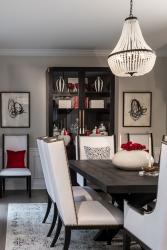
Across the foyer, wainscot paneling was added to the formal dining room, and Matt chose a dining ensemble from Restoration Hardware featuring a black-finished French X-based table, streamlined white chairs studded with bronze nailheads, a glass-doored black oak sideboard and hutch and a contemporary beaded chandelier.
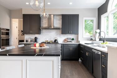
Moving to the activity areas, the kitchen illustrates Liston’s ability to integrate existing components with a totally new design style. The original range and sink walls—including appliances, cabinets and countertops, stainless range hood and porcelain marble backsplash—were all in excellent condition. So, it took only repainting the cabinets, a Brizo sink fixture, a new custom-built center island topped in suede-finished Silestone Marquina quartz and pendant lighting to give this culinary space its bold contemporary ambience.
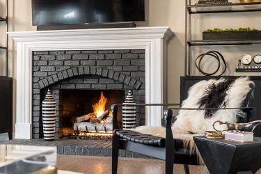
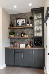
In the bayed great room, a coat of charcoal paint—inside and out—transformed the look of the original gas fireplace with white birch logs for contrast. Liston also converted the outmoded desk area into an eye-catching dry bar with a custom alder top and shelving, backed by variegated subway tile in a herringbone pattern.
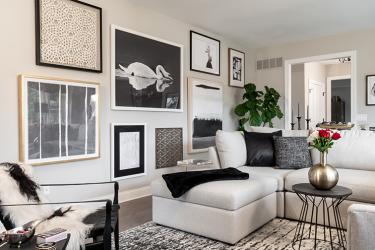
The dimensions of the great room, however, presented some problems for Matt when configuring the seating. He opted to center a linen-textured Bassett sectional on a plush charcoal and cream rug, adding a leather strap side chair, casually draped with a sheepskin. Initially frustrated by a long blank wall, he made it into a “gallery wall,” displaying a wonderful array of black-and-white photography, paintings and paper art.
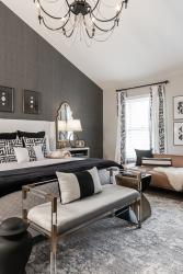
Upstairs, the master suite is visually intriguing, yet almost Zen-like in its tranquility. Textured charcoal wallpaper extends to the cathedral ceiling behind a white-upholstered king-size bed. At the foot is a chic contemporary acrylic and bronze bench, and, against one wall, a low-profile leather lounge introduces a warm caramel tone to the otherwise black and white décor.
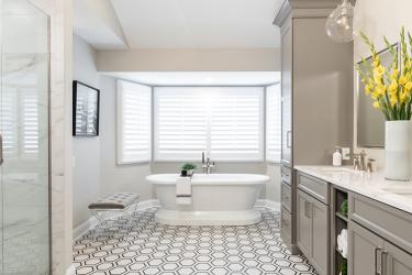
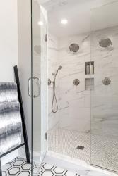
The master bath retained its original footprint, but was completely renovated. The outdated tub deck was replaced with a free-standing Barclay Cordoba tub and floor-mounted Moen filler and hexagonal-patterned porcelain floor tile complements the “Dovetail” gray cabinetry, designed by Beck/Allen. The glass shower enclosure has an easy-maintenance porcelain tile surround resembling marble; separate valves control the multiple shower heads, and the mosaic tile pan mimics the flooring on a smaller scale.
Reflecting on his collaborative working relationship with Liston Design Build, the delighted homeowner enthused, “I’d never done a remodel before, but everything was perfect! Keith and Jeanne are incredibly knowledgeable and involved, and their people are great! They understand your vision and bring it to life.”
Resources
Builder: Liston Design Build
Cabinetry: Beck/Allen Cabinetry
Flooring: St. Charles Decorating
Galss: H&H Glass Works
Granite: Russo Stone & Tile Design
Interior Designer: Liston Design Build
Plumbing Fixtures: Premier Plumbing Studio
Tile: Virginia Tile


