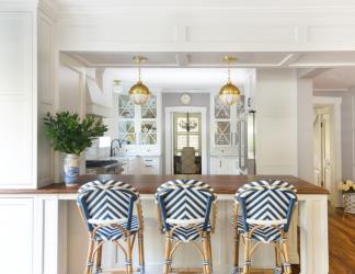
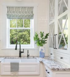
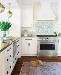
A Webster Groves home had a new addition that added square footage to the house but lacked flow and left the kitchen with little space for storage. Thick, cumbersome walls were added as part of the addition. The homeowner worked with Karr Bick Kitchen + Bath to create a new design that would better fit her needs. The new design moved an old window up so that the perimeter could extend further and offer new sink placement under the window instead of in an island. The designer chose soft white cabinets and a distressed walnut top for the island to accent the white farmhouse shaker sink. Two symmetrical cabinets with glass X mullions sit on top of the counters and showcase the homeowner’s beautiful dishes while bringing an extra layer of charm to the kitchen. Additional charm is found in the Walker Zanger blue ceramic decorative range tile. Wainscot woodwork was added to the thick addition walls and soffit to make them feel intentional and aesthetically pleasing. Beadboard on the ceiling echoes the age and style of the history of the home. A peninsula was added to the kitchen with unique brass pendants that hang from the soffit in perfect symmetry for the line of sight into the kitchen. Navy counter stools add a pop of color and fun to the completed space.
Why the judges love it: We love the detail in the paneling on the addition walls. The symmetry of the cabinetry is fantastic. This classic kitchen has lots of attention to detail.
Resources
Contractor: Karr Bick Kitchen + Bath
Interior Designer: Karr Bick Kitchen + Bath
Tile: Virginia Tile
Granite: Hallmark Stone
Plumbing fixtures: Brizo
Decorative fixtures: Atlas Homewares
Appliances: Monogram Appliances
Lighting: Hudson Valley
Glass/Mirror: Mouser Cabinetry
Cabinetry: Mouser Cabinetry


