After purchasing a ranch on nearly three wooded acres outside the city, the new homeowners quickly made plans to renovate the vast kitchen. Having renovated four kitchens in past homes, they were familiar with undertaking such a major project. But this time, they chose to work with a professional to make the process easier and stress-free. The couple was introduced to Rebekah Murphy, designer at Karr Bick Kitchen & Bath, by their realtor.
“We clicked right away,” says the homeowner. “She understood my design aesthetic and made everything so seamless.” The home’s exterior had a lodge feel, but the interior was Tuscan. The homeowner really wanted the kitchen to match the feel of the home’s exterior. She describes her vision as “Forest Chic,” meaning neutral colors that mix well with the greens and browns she sees from her window: simple, clean lines and elements of visual interest with a rustic touch.
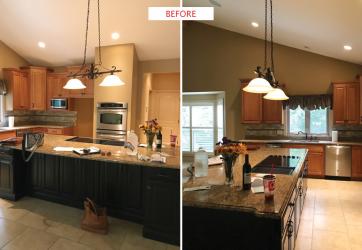
Rebekah says that from their initial meeting, her client was ready to hit the ground running. “She was someone who really helped the project move quickly by making decisions on materials and layout,” Rebekah says. Rebekah created three to four different layouts for the space as a starting point for the design. She says the biggest challenge of the project was the large amount of space they had to work with, nearly 600 square feet. The old kitchen layout didn’t function right, and the work area was scrunched together. The new design called for the area to breathe with a more large-scale layout.
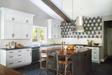
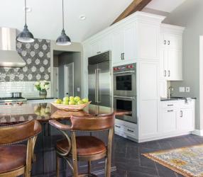
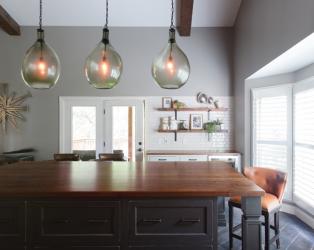
To fill the square footage, Rebekah incorporated two islands into the kitchen. In one area, a massive island with a wood top was made to feel more like a table than an island. With chairs on all sides, it is a great place for the homeowners and guests to sit during meals or entertaining. The second island is the husband’s spot because he is the cook in the family. There is no lack of storage in the new design with tons of pull out drawers for pots and pans. A coffee bar behind the oven wall includes doors to conceal appliances.
With the layout challenge solved, the next obstacle to tackle was ensuring the space was balanced. “We had to figure out how to embrace the rustic qualities the homeowner wanted while also marrying it to an industrial edge with touches of feminine charm,” Rebekah explains.
For cabinetry, the designer encouraged the homeowner to think beyond stark white. The tungsten perimeter cabinets are not white or gray but somewhere softly in between. They are finished with contrasting dark hardware. The dark gray island cabinetry has hints of distressing to soften the look and bring in rustic qualities.
Dark wood beams channel the rustic roots of the home and it's rural location; however, they were almost left out of the project due to placement issues. “The overall look wouldn’t be the same without the beams,” says Rebekah. Also complementing the rustic feel of the home, the dark, herringbone floor tile has hints of wood tones that echo the wood beams on the ceiling. The designer laid it in a herringbone pattern for a softer foundation against the rest of the kitchen elements.
The stainless steel appliances have an industrial vibe and bring in a more contemporary edge. For the feminine flair, the homeowner fell in love with the show-stopping backsplash mosaic tile that has hints of flower designs in contrasting dark colors that pick up on reflective mirror tones. They sparkle every so slightly in certain light to complement the stainless appliances. “The mosaic is so unique, and pictures don’t do it justice,” Rebekah says.
The backsplash is a favorite aspect of the design for both homeowner and designer, but Rebekah also loves the amount of natural light that spills into the space, and the view into the backyard is breathtaking. “You feel really serene and calm in this kitchen,” she says. “I am proud of how it reflects the homeowner’s taste and how proud she is of this space.”
As for the homeowner, she says picking a favorite part is tough. Beyond the backsplash, she also loves the “beautiful combination of different materials” in the space. “Functionally, I love the amount of cabinet space that Rebekah worked into the design,” she adds. “For once, we have plenty of room to store everything!”
Resources
Contractor: John Richter
Tile: Artistic Tile, SOCI
Granite Supplier/Installer: Stone Fabricators, Hallmark Stone Co.
Decorative fixture supplier: Atlas Homeware
Appliances: Sub Zero, Wolf
Lighting: Pottery Barn
Woodworking/Cabinetry: Mouser Cabinetry


