Purchasing a new home and moving isn’t typically a fast and simple process for most homebuyers. But for Brett and Jennifer Cecil, the move to St. Louis came quickly after Brett signed as a pitcher for the St. Louis Cardinals in late 2016. Soon after, the couple got to work finding a home for their family in the Lou before the season began.
After Facetiming with their real estate agent to check out properties, a brand-new spec home in central St. Louis was the winning choice for its lot size, open concept layout and casual feel. As they packed up their belongs and prepared for the move, the couple got in touch with local interior designer Laura Lee of Laura Lee Home. “We didn’t meet in person until Brett and Jen moved into the home,” Laura says. “We got to know each other over Facetime.”
While not the typical working relationship, Laura enjoyed the added challenge and found creative ways to engage her clients from afar. She gives each of her clients a homework assignment after their initial meeting. Laura asked Jen to gather five inspiration photos to use as a starting point in conceptualizing the design of their new home. Before even meeting in person, Laura had a good idea of the way the family lived and their likes. “All the inspiration photos had a few elements in common...mostly neutral colors, cozy and lots of layers and texture,” she says. “They are a very laid-back couple and a pile-on-the-couch family.”
After the inspiration photos, Laura started building a color story for the home. While the Cecils gravitated towards neutrals they mixed in splashes of cool colors like blue, aqua, lavender and gray in fabrics and accessories. “I would select fabrics and textiles I thought would work in the home and would send Jen a box of swatches for each space in the home wrapped up with a pretty bow,” Laura explains of her process. “It allowed Jen to touch the materials and really visualize the space.” While different for the designer, it was a fun way to approach the design process and keep the homeowner involved.
Once the family finally moved in, the real work began. Since the home was brand new, there was no major construction needed. The designer changed out all of the lighting in the home and installed blinds and shades for privacy. Though the Cecils didn’t bring a lot of their furniture with them, Laura and Jen had already purchased most of the pieces before the family moved in. “We prioritized which spaces needed to be done first and then worked in phases to order,” Laura says. Phase one included the great room and the nanny’s room. Phase two focused on the dining room, sunroom and kitchen.
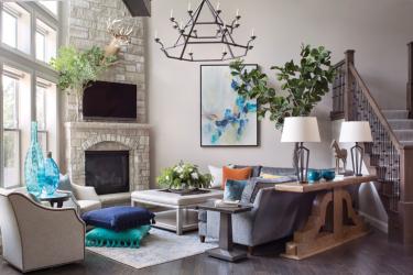
Since the main level of the home was open concept with no walls delineating spaces, each space had to complement the other. Dark-stained floors and griege-painted walls throughout helped create an even plane for decorating and accessorizing. The great room is central to the main level and the prime place the family hangs out. It is two stories in height, so the size and scale of the furnishings and lighting was important. Laura found a Ralph Lauren chandelier that is 5.5 feet wide and fills the ceiling space while casting beautiful light.
For seating, she chose an oversized charcoal sectional that was extra deep with a higher down fill so it is one of the most comfortable places to lounge for family movie nights. An ottoman measuring 4.5 feet by 4.5 feet has storage baskets underneath to stow away the children’s toys and books. It was important to the Cecils that they purchase furniture and case goods made in the USA whenever possible. One challenge the designer faced was the corner floor-to-ceiling stone fireplace and how to maximize seating with the angle. Laura’s solution was to mount the TV above the fireplace on a tilt for easier viewing. Then she angled the sectional and essentially tilted the arrangement of the whole room to the same angle as the fireplace.
Two special gifts are displayed in the home. Jen surprised Brett and had his prized deer head mounted on the fireplace in the great room. The other surprise was a set of four pen-and-ink drawings of St. Louis landmarks Laura gave the family as a Christmas gift, now displayed in the sunroom. “This is the Cecils first ‘real’ home, so they didn't have any original artwork or antiques,” Laura explains. “It was fun to introduce those to them and they really embraced those elements. New homes always have to have old things to add a sense of character and interest.”
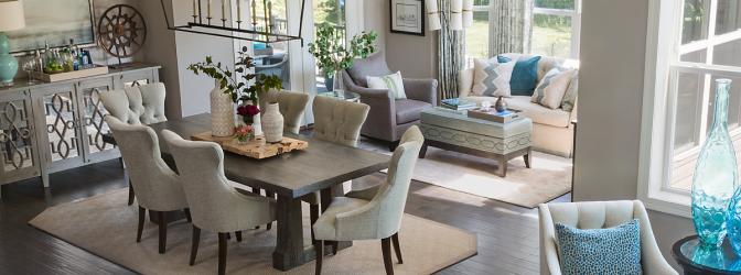
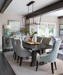
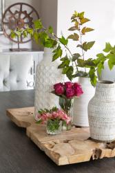
Displayed in the dining room on a rustic buffet piece with antique mirrored doors is an antique valve mounted on an iron base from an old building in St. Louis from Rick Ege Antiques, which adds an industrial touch. The 8-foot dining table is made of solid oak. The thick, heavy piece grounds the space and is surrounded by gray Crypton upholstered chairs. An oversized aqua glass lamp on the buffet adds color, and the palette was inspired by the soft, beachy tones in the artwork.
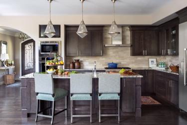
Open to the dining room, the kitchen carries the Aqua tones with three bar stools covered in an aqua leather seat with a textured fabric back and spaced out nailhead trim. The designer changed out the lighting opting for three pendants over the island. A Parisian waitress tray sourced from Rick Ege Antiques holds produce on the island. Laura likes the piece because it helps control the clutter in a big, open-concept space.
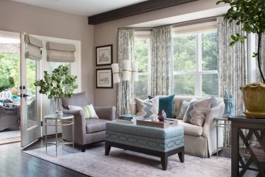
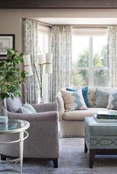
The sunroom is a cozy place for the whole family and easily viewed from the kitchen if the adults are cooking. A bookcase with baskets and storage ottoman help hide away kids toys, especially the youngest child's. “With the home being so open-concept, you can’t just shut the door and hide all the kids' mess so we had to create options to conceal them,” Laura explains. The ottoman is a laminated vinyl in a snakeskin print, making it very kid friendly while still aesthetically pleasing. Laura says the sunroom is a space that is all about the kids, but it still looks grown up. She was able to achieve this balance by working with Fiber-Seal to treat most of the furniture and soft goods in the home making them pretty yet practical. “It allowed us to incorporate elements into the home we otherwise would not have been able to with young kids,” Laura says.
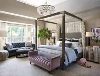
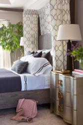
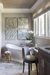
One space that they made all about the grownups was the master suite. The couple wanted it to be a place to escape, so the designer focused on making it very sophisticated and tactile with lots of layers of texture. They added a white, stacked-stone LED fireplace with crystals that let off a cool glow. Two Donghia covered silk pillows with threads of lavender, gray and blue defined the color story for the room. A lavender velvet bench is set at the end of the four-poster bed. Laura added the drapery around the bed to enhance the room's sophistication. Metallic silver-leafed nightstands and a crystal chandelier further amp up the grown up feel. A charcoal coverlet and light gray duvet fit into the color story but allow for the couple’s dogs to be on the bed. Laura also had a figure drawing by Denver artist Theresa Davis made for the space.
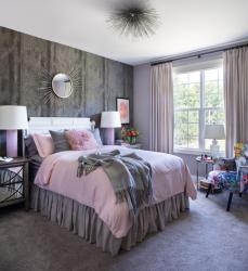
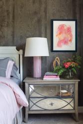
Another space fit for a grownup that was very important to the couple was their nanny’s room. She loves the color pink, so Laura made sure to incorporate touches of the hue in the space, like in the pink glass lamps on the nightstands. Their nanny requested a rustic feel, and Laura found a faux wood wallpaper to accent behind the bed. Layers of texture in the space make it feel cozy, while the mirrored nightstand and chandelier make it sophisticated.
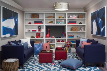
One final space was designed just for the kids. The playroom in the lower level is outfitted with custom-built bookshelves with places for the boys to display their Lego creations. Laura chose a red, white and blue Americana scheme and included tons of floor pillows to make the space cozy. Patterened FLOR tiles were used for their ease of care.
With family at the forefront, designer Laura Lee has given this new-to-the-Lou couple a place they can call home. Neutral furnishings and accessories chosen to withstand the wear and tear of kids, layers of texture and splashes of color have resulted in the right mix of casual and sophisticated. A place for a Cardinal and his crew to cozy up and be together.
Resources:
Appliances: Thermador
Artwork/Antiques: R. Edge
Carpet/Wood/Floor Coverings: Carpet Art of America
Furniture: Laura Lee Home
Ironwork: AS + W Stair
Landscaping: Garden Oasis Landscaping & Nursery
Lighting: Laura Lee Home
Window Treatments: Laura Lee Home


