For 10 years, Carol lived within minutes of the Chesterfield villa she now calls home. It’s on the same street as her sister’s and sister-in-law’s and walking distance from pretty much everything else.
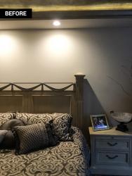
But after years of sameness, the place needed a reboot. “It had gotten to where I’d been here for 19 years and I hadn’t done anything major practically since I moved in,” Carol says. “It had gotten really dated.” Aside from recently purchased living room recliners, marble bedroom flooring and a Murano glass chandelier she purchased in Italy, she was open to most anything.
Carol met her interior designer, Gina Dill-Thebeau, through her design of Carol's son's house. Gina saw potential in Carol’s home and aesthetic. “The whole space was a generous-sized villa and the ceilings were nice and high, so to me it had really great possibilities,” Gina explains. Carol has a preference for neutrals, but she also has an adventurous spirt—something that helped the designer zero-in on her bold style.
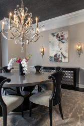
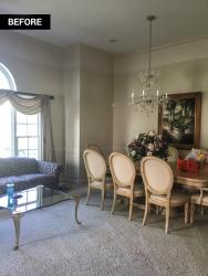
That isn’t to say there weren’t compromises. Right off the bat, the prized chandelier in the dining room had to go. “We ended up with a 72-inch dining table and the recently purchased 24-inch Murano glass fixture was too small,” says Gina.
Once Carol laid her eyes on the 54-inch chandelier that Gina suggested, she knew Gina was right. “Boy, I really hate to admit that I was wrong, but I sure was! The whole room has a repeat of the curves of the chandelier. It blends and it flows, and it’s just gorgeous.” (Carol ultimately got her Murano in the form of a glass bathroom sink, and the chandelier now holds a prominent place in her lake house.)
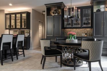
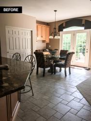
In the kitchen and breakfast nook, Gina upgraded the yellow oak cabinetry with a coat of black paint and gold hardware, then replaced the glass and backsplash with mirrors that reflect the adjoining family room. She had cabinets built in the breakfast nook to match the character of the kitchen.
Gina designed drapes for the large palladian window in the family room and raised it up above the arch to create the perception of greater height. White molding on a gray backdrop around it is an interesting twist and keeps the long rod from looking clunky or out of place. With all the added sunlight, she was comfortable giving Carol a non-traditional dark ceiling that complements the black, white and shades of gray elsewhere on the 1,600-square-foot main floor.
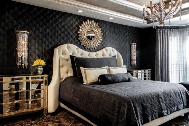
The contrasts are carried into the master bedroom, where the custom wood veneer black-and-metallic wall covering create dimension. Thanks to a custom peacock cabinet, there is now less furniture crowding the room and Carol has a place for absolutely everything. The birds on its doors inspired “peacock-y” elements all around the room from the ornate light fixtures to the textured bedding. The contrasts are courageous but sophisticated, ornate but in an exceptionally clean way. “Many people do have reservations about things they haven’t seen,” Gina says, “but [Carol] really just trusted me to make it beautiful. I love that about her. And, of course, she just loved it when it was done.”
Resources
Artwork: Dill-Thebeau Design Co.
Builder/Remodeler: Builder's Bloc Contracting Inc.
Cabinetry: Dill-Thebeau Design Co., KM Designs
Furniture: Dill-Thebeau Design Co., KM Designs
Interior Designer: Dill-Thebeau Design Co.
Kicthen Cabinet Painter: Dawn Lynz Surface Design
Lighting: Wilson Lighting
Window Treatments: Dill-Thebeau Design Co.


