As interior designer and friend Lori Olsen McElvain describes it, Rob and Nicole Rosenwinkel’s kitchen remodel started with a Joybird sofa.
Typical. Right?
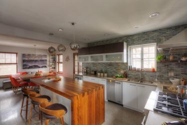
For years, Olsen McElvain and her husband Doug, an architect, would visit the Rosenwinkel’s Lindenwood Park bungalow for dinner parties and game nights only to spend the entire night apart. Split between the kitchen and the dining room, talking to different people and remaining almost completely unaware of where the rest of the party was happening, the couple always left a little dissatisfied and wishing. “Wishing that the homeowners would remove the wall that separated the kitchen from the rest of the house,” Olsen McElvain explains. “They’re entertainers, but their house wasn’t working for entertaining.”
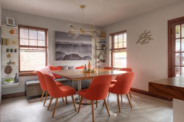
Then, Rob and Nicole found a 10-foot-long, mid-century modern, orange sofa. “They had to have it, and it kicked everything off.”
Olsen McElvain says that once they finally sat down to plan, it took about 15 minutes to lay it out. “We had all been thinking about it for such a long time. There was a lot of plotting before we got started, but we all knew — basically — how we wanted it to end up.” Being a long-time friend certainly helped the process along. “I knew that balance that they needed,” explains the designer. “They love nature and photography and the outdoors, and with this orange couch — that color and style — I wanted to bring these warm woods in with the mid-century. In the residential world, I had been choking on Carrera and grays, so this was like, ‘YES!’”
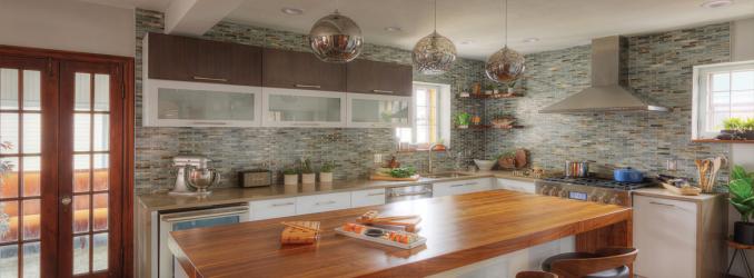
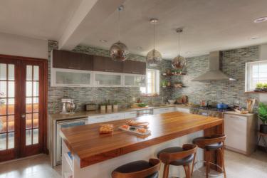
After removing the wall, Olsen McElvain unleashed the energy flow that had long been stifled, carrying the modern orange of the Joybird sofa into the gathering and game area via sumptuous and classically curvaceous dining room chairs. That warmth is echoed throughout the space in the warm wood tones of the custom walnut dining room table and island countertop. “Kirkwood Stair did a beautiful job on the custom woodwork,” Olsen McElvain swoons. “The island is dovetailed with this amazing waterfall edge.”
For the custom cabinets, created by making tweaks to standard Shiloh Cabinetry, the designer wanted to make sure they chose a finish that “didn’t fight the walnut.” The result is a horizontal stacking of glass-front white storage under a rich, chocolate natural wood with brushed silver hardware. The whole setup is delicately framed in soft blue tiling that spans the entirety of the wall, removing the typical backsplash break at eye level.
“It’s utilitarian, not pretentious,” Olsen McElvain says. “They really live in this kitchen, so it had to be comfortable and beautiful. It’s what led us to choosing subtle hardware and plumbing…and heating the limestone floors.”
It’s the many details like these, she explains, that make the Rosenwinkel kitchen renovation a professional and inspired space, which is especially impressive considering that the project began with a huge orange couch and a modest budget. “People joke a lot about the while-we’re-at-it mentality that makes people bust their budgets. But this was, in fact, a budget job. The planning made all the difference.”


