Jean and John of Clayton faced “love it or list it” moments over the last several years in their 91-year-old home. The couple has lived there for more than a decade and a half, all the while bringing up three kids — ages 19, 17 and 13 — within walking distance of the bustle of downtown Clayton, the kids’ school and the MetroLink stops where they frequently catch rides to Cardinals and Blues games and other St. Louis-area attractions.
But the family gradually began to outgrow the house. The small galley kitchen lacked flow and functionality and the screened-in porch begged for a higher purpose. What was once ample for a young family began to feel cramped and dark; needs and interests had changed but the house remained as it was when they first moved in.
Jean says they contemplated moving out. “We could not beat this location. We needed stuff done to sell it, so we drew up renovations.” That responsibility fell on architect Chris Marshall, who had the heady task of coaxing the most out of the home within a stringent set of local codes. Though living space was added largely within the existing footprint of the foundation, he also bumped out the east side of the house by several feet and added a mudroom on the west side.
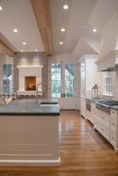
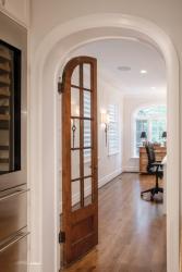
And he repurposed. Gone was the covered porch on the east side, converted to a main-floor office for Jean, while the narrow kitchen disappeared into the family room. Jean’s former office space and back patio were absorbed into the larger kitchen and open butler’s pantry. Off the kitchen at the back of the house, a sitting area with a raised fireplace eases the transition between the kitchen and the back door leading out to the new patio.
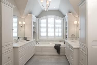
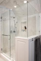
Chris worked the same magic to the second story, creating a large, en suite master bath for Jean and John over the existing attached garage, complete with 10-foot ceilings, walk-in closets and deep soaking tub. Down the hall, the couple’s teenage daughter now has a bedroom nearly twice its former size, with a bathroom and window seat where only the porch roof once sat.
Even the basement expanded. Thanks to an 11-foot-deep pour, the couple’s two sons have a small hockey rink with enough clearance for the boys to don skates and knock out slap shots freely without scraping beams.
“This poor little house is like a bump-out RV. We just didn’t want it to look like additions.” Jean admits she couldn’t envision how Chris was going to make it work. “I thought, ‘Where’s all this going to fit?’ I was in a panic.”
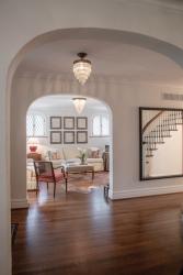
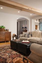
“We basically ended up touching every corner of the house because every end had an addition,” Chris says. “On the interior we made the flow of the house better than it was originally. The new and the old all connect, and you really can’t tell. We changed the interior aesthetic so that it complements what was there but made it better.”
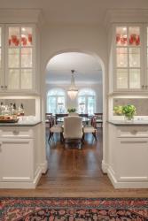
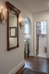
The design allows for a straight sightline through most of the main floor. The family can view the back door and fireplace from the dining room, while Jean’s office gets light from front and back and side to side — something that was in no way possible as the home was originally laid out.
Off the kitchen/living area, at the back of the house, is an entry court with an open gable Chris calls “Tudoresque.” The gable connects the high ceilings of the kitchen visually with the patio and backyard. “The composition at the back of the house is something I’m really proud of. The high gables make it feel roomy without swallowing up a smaller gathering. It works really well with six people there and it works great with 30 people there. It’s kind of a roomy-intimate — a grand-intimate space.”
The new detached garage — which houses two lifts — is large enough for four vehicles and John’s upstairs “man cave,” where the man of the house often yields the floor to visiting guests. All told, the home went from approximately 3,200 square feet of space to more than 5,000, all without sacrificing symmetry.
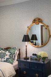
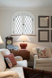
Subdued color throughout most of the house completes the sophisticated look the family was going for. It is most notable on the ground floor, where white cabinetry and neutral walls reign. Un-oiled soapstone countertops and a light tile backsplash add interest without too much “movement,” says Jean. There are more tall windows letting in light and fewer partitions blocking the others, lending the illusion of even greater spans.
“It was hard for us to imagine how it would all come together, but it did,” she says. “We’re not missing anything with this house. I can stand at my kitchen island and hear kids playing hockey downstairs and I’m happy.”
Resources:
Architect: Christopher D. Marchall Architect LLC
Contractor: Bozich Construction
Windows: Pella Windows & Doors, Cardinal Blinds & Shutters


