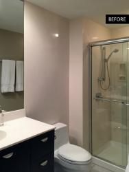
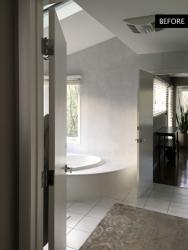
Built in the 1970s, Tom Kraatz’s Kirkwood home possessed some anachronistic elements in the master bath that kept the retiree from fully enjoying the generous 375-square-foot room.
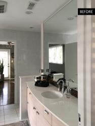
“While there was a lot of space, it was all disconnected and in smaller separate rooms,” Tom says. “The prior owners presumably wanted independent bathrooms, which made for redundant fixtures, aisles and restricted natural light into the different spaces.”
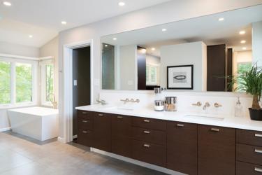
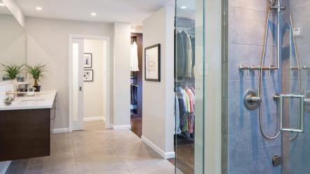
The old floorplan included two toilet-and-sink sets separated by a wall that ran parallel to a window by the tub, blocking the natural light from the rest of the master bath. With the redesign, Keith Gegg of Gegg Design & Cabinetry kept the his-and-hers vanity and one toilet, and shifted them to the wall that lies perpendicular to the tub and window. The toilet is separated from the sink by a pocket door, and it was Tom’s idea to also keep the closets open near the ceiling to let even more light into the entire room.
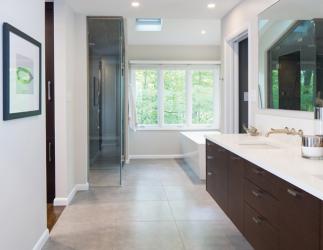
“The biggest goal was to have a unified space and give a sense of openness. The house is situated on a hillside in a natural setting, so the views are important and are to be enjoyed,” says Keith. “There were three major window groupings in the original master bath and each was only visible from each independent space. So, we wanted to allow all the windows to be visible from the vanity area; this would allow natural light into the room at different times of the day. The new design has a view of all the windows from the vanity, either in peripheral view or via the full-width mirror.”
Keith further enhanced the lighting with can lighting strategically placed over the vanity and in the closets. With lighting addressed, he was able to warm up the room by replacing the stark-white — and rather dated — vanity with inviting dark wood. The tub is modern and sleek, while the new shower/steam area is larger and more open than the old shower had been.
And, while the renovated master bath is physically smaller than the before — Keith moved the wall adjoining the master bedroom by 2 feet to make the bedroom larger — it looks and feels roomier and more luxurious.
“It wasn't very fun before,” Tom says. “We had a lot of doors to access clothing, but it wasn't really functional. It flows better now [with] two private, separate closets—his and hers closets—that are open. It looks like this is what was meant to be here.”
Resource
Bath design/cabinetry: Gegg Design & Cabinetry, 636-394-4455
Contracting: McCoole Custom Contracting, 314-393-4634
Interior design: Becca Design
Tile supplier & installer: Folkweave Carpet and Flooring Co., 314-645-4468
Granite supplier & installer: Stone Fabricators, 314-776-7776
Plumbing: Service Plumbing
Painting: S-H Painting
Glass/mirror: Total Glass and Shelving, 636-946-5622


