Marketed as a possible tear down, a two-story Clayton residence had lots of potential for future buyers with a vision for what could be done on the 1.4-acre lot. But when its current owners saw the listing and learned more about the extraordinary property, which is also listed on the National Register of Historic Places, the thought of tearing it down was the farthest thing from their minds.
The home was built in 1952 for Morton D. May, president of the May Department Stores Company, an avid art collector and proud St. Louisan who passed away in 1983. The couple purchased the home in 2010, making them just the third owners.
After seeing the property in a publication, the husband and wife were drawn to the aesthetics of the exterior, which could be characterized as International Style, popular in the early 20th century. Attributes of International Style include straight lines, open interior spaces and minimal ornamentation or decoration, both inside and out.
“The previous owners had torn everything out and started a gut rehab,” the wife explains. “We had the opportunity to take carte blanche and put it all back together.” The husband and wife agreed that they could add their own stamp on the home, but they would keep the home period-appropriate to honor the late Mr. May. The economy was still turning around, and the homeowners were fortunate to find top-notch contractors who could start on the project right away. Chuck Schagrin of Amherst Corporation led the remodel. “It’s a good sign that we are still friends with Chuck after all these years,” the homeowner says of the process with a laugh.
After getting rid of the existing pool and chain link fence that surrounded the property, it was time to focus on the interior renovations. New windows and flooring were necessary, and for the floor the homeowners chose oak laid in an oversized herringbone pattern. Several design elements original to the home were retained such as the real stone walls, the living room fireplace and staircase. Beyond that, the homeowners had the freedom to reconfigure the layout and personalize the home with their style of furniture and artwork.
“We wanted a clean home with not a lot of ornamentation,” the wife says. As the structural elements came together, the homeowners began to configure the living spaces to work best for their family of four. The wife explains it as a series of phases, with phase one being the basic furnishings they needed to get the home up and running, like a kitchen table. Over time as they lived in the home the family has added new pieces and replaced old. “Initially we were under pressure to get into the home, which made us move forward and make decisions,” she explains. “After five years of living in the house, we just need to finish it.” With 85 percent done they added the finishing touches to call their mid-century masterpiece complete.
A wall of floor-to-ceiling windows stretches the length of the home in the main living area. With such a large, yet narrow, space, the homeowners were not sure how to make it functional for their family. After a year spent living in the home, they were able to tackle the layout, essentially separating the vast room into three distinct spaces: living room, dining room and sitting area.
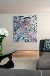
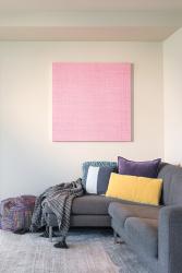
The homeowners’ extensive art collection, much of which was acquired from Philip Slein Gallery, whom they call a good friend, helps to tie the three spaces together because of the similar color schemes. “A lot of the artwork in this space has pink undertones,” the homeowner explains. “We originally wanted to do the whole home in neutrals and let the artwork be the color, but the house needed more with all of the stone and wood features.” So, furnishings and accessories were chosen in fabrics and finishes that complement the art.
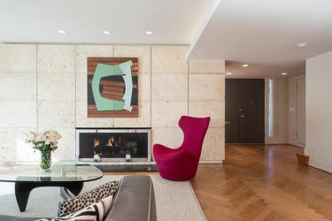
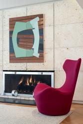
In the living area, a rich magenta B&B Italia grande papilo armchair plays up the pink and purple tones without being too bold. The homeowner kept the rest of the space more neutral with a B&B Italia bend sofa in dark gray and a lighter gray rug. The Noguchi coffee table is an iconic piece, and one the homeowners always knew they wanted.
The Missouri limestone-faced fireplace is original to the home, and the homeowners converted it to gas. They wanted a grate, but not anything standard they could find in a store. “We saw photos of Emily Rau Pulitzer’s childhood home [in Cincinnati], which got us inspired,” the wife says. They commissioned Eureka Forge to make a custom grate with simple lines and a sleek, stainless finish.
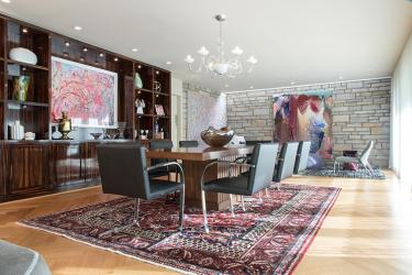
In the dining room, the Baker table was the only piece the homeowners brought with them from their previous residence. They modernized the more traditional table with iconic black leather Meis van der Rohe chairs. The previous owners designed the custom built-in wall unit by Classic Woodworking. The couple didn’t originally install it in the dining room, but it eventually found its way back and now displays treasured accessories and family pieces.
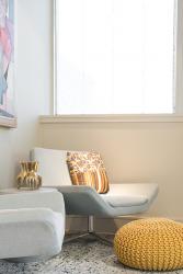
At the end of the long space, an additional seating area makes the home perfect for entertaining. A gray Bensen sofa and B&B Italia chairs from Centro and the coffee table from Frill set up a natural conversation space to admire the artwork, which pops against the original stone wall.
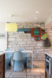
A doorway leads to the kitchen and hearth area. The current kitchen was added on in 1956 by notable architect Frederick Dunn. It was largely partitioned off from the rest of the home, so the couple took out a wall and put in a structural beam. They matched the stone floor for a seamless transition. A white four table by Ferruccio Laviani for Kartell with icy blue Panton chairs provides a place for the couple’s children to do homework while dinner is being prepared.
The kitchen layout had to be functional and livable as the family cooks and eats most meals at home. The walnut slab cabinetry by Henrybuilt keeps everything clean and simple, while being easily wiped down. The adjoining hearth is a simple and comfortable place for the family to hang out in the evenings.
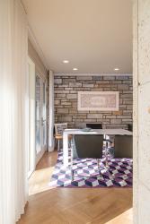
The main floor is completed with a powder room and an office, where the wife often works from home. Another original stone wall was retained and is washed in natural light from the original skylight above. A white four table from Centro is used as a desk while spare Meis van der Rohe chairs from the dining room add seating when not needed for extra dinner guests. The purple tones in the cube rug from Design Within Reach coordinate with the adjacent living area. More outstanding artwork completes the space, and the art lovers couldn’t pass up Tom Friedman’s “Untitled 'Dollar Bill'” painting when they found it. “There are so many creative people out there,” the wife adds. “We enjoy finding art. It’s a fun thing for my husband and I to do together.”
There are four bedrooms on the second story, and the homeowners stole space from an unneeded fifth bedroom to expand their master closet and bathroom. Now settled in the home for seven years, the homeowners are comfortably enjoying life in their restored residence. “Its pretty amazing that 60-plus years after this home was originally built it is still livable for the modern family,” the wife says of the forward-thinking of May and the builder. “We were happy to take something that was going to potentially be torn down and save it.”
Resources
Builder/Remodeler: Amherst Corporation, 314-862-9399
Architect: Fisher & Campbell, Robert Dunn
Kitchen/cabinetry: Henrybuilt
Woodworking: Classic Woodworking Inc., 314-544-0121
Woodworking: Waterhoust
Window: Loewen
Lighting & Furniture: Centro, 314-454-0111
Window treatments: Berry Studio, 314-954-4010
Artwork: Philip Slein Gallery, 314-361-2617
Plumbing fixtures: Crescent Plumbing, 314-727-4200


