Sometimes you get a feeling and just know something is meant to be. That is exactly what happened when the homeowner of the classic stately Georgian Revival-style home in west St. Louis County drove up to her soon-to-be house for the first time. Ready for a move and always looking at real estate, she convinced her husband to walk through one Sunday after church. The minute the family stepped into the entryway she thought to herself, we are going to live here.
Built in 1963 for the Stupp family, founders of a local steel company, the home was one of the first constructed in the neighborhood. Designed as a personal favor to the owner by commercial builder Sverdrup & Parcel Engineering Co., the engineering components of the home meet commercial-grade standards. Footings rest on cement piers drilled to bedrock, and steel floor joists were used instead of wood. As the homeowners learned the history and details behind the two-story, they fell in love with the Old World charm and elegance.
Set on two lots with three acres of land, the family is only the third owners of the property. Throughout the buying process and with the assistance of agent Anne Hizar, the current owners developed a close relationship with the second owners, who provided much of the information about the home’s history and significance. “The details make this home so unique,” the homeowner says. “I was drawn to the history as well as the details like the trim, flooring, French doors, etc.”
Part of the charm was also that the homeowners didn’t have to make any structural changes; just aesthetic updates to make the place their own. With the guidance of Anne Tipton, owner of Expressions Furniture, the couple added their own flair. “I call our style eclectic with traditional undertones,” the homeowner explains. “But on a whim, I like to throw in something funky.”
She says Anne shares the same traditional style with a flair for funk, which is one of the reasons they worked so well together. Noting that Anne is very open and listens, the homeowner says they were able to bounce ideas off one another. The homeowner also says Anne knew where to find the products to match her ideas. "The homeowner really knew what she wanted," says Anne. "She was very involved in the design and after working together for more than a year, she is a customer that has become a great friend."
Special family pieces blend with new furnishings from Expressions. "We love the marriage of old and new," says Anne. Plus, everything you see has a story. “It is not just ‘stuff’,” says the homeowner. Several key design elements existing in the home added to the design.
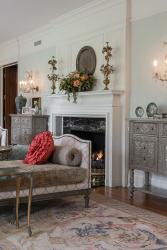
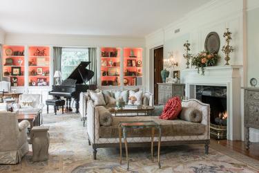
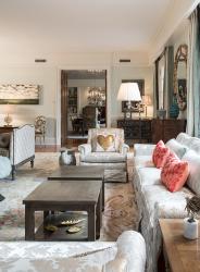
One such item, the 15’6” x 25’9” French area rug in the living room, was purchased from the previous owners. While not exactly the homeowner’s personal style, the rug had a historic past of its own. One of 93 carpets ordered by King Louis XIV for the Louvre, the carpet features two images of Ares, the Greek god of war, as well as two griffins. Never actually produced, the drawing of the rug was painted in oil and purchased by a wealthy French-Armenian man in 1979, who had the rug made.
Instead of downplaying its vast size and dated colors, the homeowner worked with Anne to modernize the carpet with furnishings and accessories. Tones of browns and greens with punches of orange play well with the hues of the rug and existing pale sherbet walls. Two distinct seating areas separate the room. The area against the wall of windows, which open to the back patio, are all family pieces. A new grouping featuring a daybed and loveseat in neutrals, mohair bench and occasional table were purchased new from Expressions along with matching console tables in a soft brown.
And for the touch of flair in the space, the homeowner painted the backs of the bookshelves with a cheery pop of orange. “Anne was unsure about using orange on the backs of the bookshelves, but I did it anyways,” the homeowner laughs. “Once she saw it, she loved it. It really adds color and depth.”
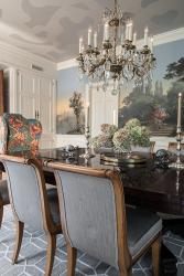
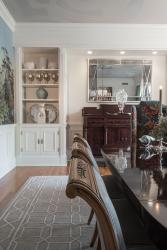
In the adjoining dining room, the designer and homeowner faced another challenge pre-existing in the home. Wrapping the interior wall is a custom Zuber wallpaper put in place by the original owners. Crafted in the early 1800s by 20 artisans who engraved heavy wood blocks with specific details on the panorama and then painted and pressed the blocks to paper, the mural is one of only 15 of the designs still produced. “Once I learned of the history, I knew I couldn’t take it down and had to make it work in this room,” the homeowner says.
Simple, white paneling was added below the mural by PK Construction to modernize the space. Other decorative touches include an antique chandelier in brass with a silver overlay and the painted ceiling and medallion hand painted by local artisan Charles Blood. The dining table and coordinating hutch were the first purchase made by the homeowners after they were married. To punch up the room, two accent chairs head the table. The homeowner found the quirky printed velvet fabric at Expressions and knew it would work in harmony with the mural.
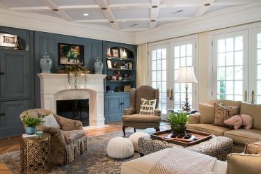
The hearth room and adjoining kitchen had minimal changes. In the hearth room, the homeowners loved the detailed woodwork of the built-in cases, coffered ceiling and floors. The built-ins have a cream wash on a steel-blue frame. That same blue is carried throughout the room into the bar and kitchen and worked well with furnishings the homeowner already owned. Touches of blue are sprinkled throughout the hearth room in the area rug and leopard-print ottoman. Pleased that she could use furnishings from her old home the homeowner says,” If you buy what you love, your tastes never change, so it will always work.”
A casual dining nook between the kitchen and hearth includes a glass-topped round dining table and rattan chairs. The homeowner already had the glass top, and Anne found the base and chairs. She chose glass because there is so much wood in the house the space needed to be more airy. Mixed in with the furnishings are eclectic pieces of art the homeowners have commissioned and collected through the years.
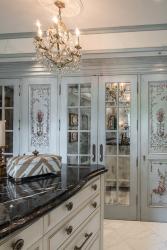
In the workable kitchen, the homeowner added a tile backsplash in a shade of blue to coordinate with the hearth. On the back counter-island, the homeowner worked with Troy Duncan of PK Construction to design a custom backsplash featuring light-blue tile with cream and brass accents. Each tile was individually made, which made installation a challenge because not every tile was the same.
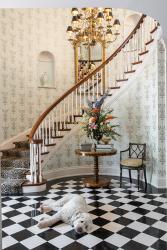
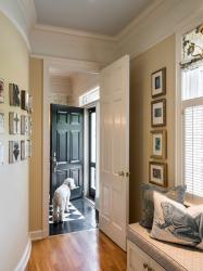
Just off the kitchen, the grand entryway features the original black-and-white linoleum floor, which is made up of individually cut and laid tiles. The homeowner fell in love with the wallpaper as soon as she walked through the front door. She purchased the existing gilded mirrors from the previous owner, as she knew she could never replicate them herself. Tossing in her bit of funk, she changed the staircase runner to a fun and unexpected cheetah print. A unique detail, the molding of the entry foyer is Tuscan Order Architecture, the same used by Thomas Jefferson in the Rotunda at the University of Virginia.
The second story includes a guest room as well as the family’s private bedrooms. The daughter’s room is every tween girl’s dream. Bright and cheery, the homeowner worked with the existing wallpaper and accessorized with a lime green area rug, aqua bedding and a hot pink chaise lounge that belonged to her grandmother. The paisley fabric on the windows perfectly ties together all of the colors in the space. She also created an art alcove that displays all of her daughter’s masterpieces. There is even a table – painted by artisan Charles Blood – for her to continue to create her works of art .
Down the hall in the master suite the homeowner also worked with the existing wallpaper to create a serene space. Soft shades of blues and greens echo the colors seen out of the room’s windows. Noting how her grandmother’s desk fits perfectly into the color scheme, she remembers how she would place her purse and shoes on the chair in her bedroom each night. The desk is painted bright green and houses her grandmother’s collection of birds.
A true believer in filling your home with pieces you love in addition to the people you love, the homeowners have turned their residence into a chic space that is also casual and cozy.
Resources
Designer/Furniture: Anne Tipton, Expressions Furniture, 314-567-6200
Various painting on furniture: Charles Blood, 314-223-4651
Kitchen backsplash and dining room trim: PK Construction, 314-692-8383


