We’re living in the age of widespread modular DIY. Cabinets come in boxes, bookshelves begin as slats and are built bare handed with the help of poorly illustrated instructions, a one-size-fits-all Allen wrench and prayer. Living-room furnishings are sold in a bag, ready to be aired out and arranged on moderately priced, tonally neutral love seats. Curtains are functionally significant, but crafted in a process akin to afterthought. But if afterthought doesn’t suit your color palette, you’re in luck. There is a realm beyond ready-made.
“People are fascinated with the process of design,” says Melissa Hummel. And she would know. As a senior designer at The Great Cover-Up, a full-service interiors firm in Ladue, and a long-standing member of the American Society for Interior Designers, her fascination with design has been honed for more than half of her life. Her wealth of experience, paired with the expertise of a variety of St. Louis-area artisans, contractors and architects, brought one area homeowner’s redesign dreams to life.
“They had some photographs and showed those to me at our first meeting and said they wanted to achieve this transitional, fresh, clean look. They wanted it all to be about texture, not pattern, with soft, clean colors.”
With a refreshment and redesign rather than a remodel, the designer, homeowner and other team members faced a number of unique obstacles, the greatest involving the retention of the overall structure and a treasured collection of heirloom furniture.
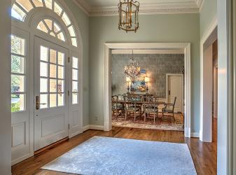
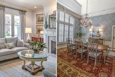
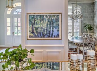
Challenge accepted. With a loved piece of art serving as inspiration, mineral blues and greens, mixed metallics and subtle greige developed a room-to-room color story. Beginning in the entry foyer, previously painted a banana yellow reminiscent of classic Williamsburg style, a sea-salt blue-green delicately introduces the freshened look and pulls out the ice blues and silvers of a patterned area rug. Tracing the green through the dining room, cork-covered walls washed in metallic blue develop a textural collage that replaces the enveloping deep red. As a nod to the traditional however, the red rug was retained and topped with the homeowner’s mahogany table and chairs.
“They had a lot of really pretty, reproduction traditional pieces of furniture that I had sold them earlier in the decade from Baker, really good furniture makers, ” Hummel says.
She has to contextualize for what comes next. “I asked them if they would consider having those pieces refinished to have them fit in with their new sort of greige metallic – a whole new palette – rather than mahogany stain,” she explains. Taking this design advice, the homeowner’s and their team enlisted the help of artisan Carlo Alu to refinish many of the heirloom furniture pieces they chose to keep.
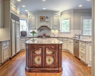
“It would be difficult with most homeowners to talk them into taking their prized pieces and changing them,” Hummel says with a well-deserved sigh. “But they did! And the before and after is phenomenal.” The result is a subtle shimmering blue-gray on the dining-room chairs, as well as the living-room china cabinet and secretary. Clean, cool and bright, the color choice extends to the redone cabinetry in the previously rich, dark kitchen.
“We did a lot of work in the kitchen. New granite,” a fluidly dappled gray and cool off-white, “and a new tile backsplash,” a subway-style herringbone that adds a surprising linear element to offset the curved features of the other rooms. “We added a new furniture-esque pantry that looked like it was always there, built-in, and then drew that into the expanded family room.”
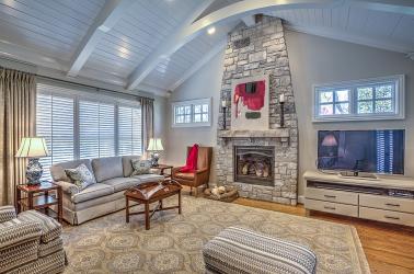
Room-spanning windows flank the airy family room, which is grounded by an awe-inspiring stone fireplace. Architect Bill Cover and contractor Brad Langeneckert completed the space with cathedral-style arched beams finished in a low-sheen white to bring out highlights in the stonework and upholstery patterns.
Pattern as texture was a concept explored throughout the home, mixing and matching geometric with organic, complex with simple. From the hand-knotted rugs to the refreshed chairs, couches, accent pillows and yes, the all-important but underappreciated curtains, the designer and homeowner pulled dozens of textile swatches from The Great Cover-Up’s fabric library to find the perfect selections. Even the range of metallics, the variances of gold, pewter and bright silver in the living room, add a dynamic tension that keeps the eye moving. Nothing is boring; nothing is superfluous. Ultimately, that editing down, picking and choosing what goes and what stays, is what hiring a professional is all about.
“The entire project took six months total and for this level of quality and long-lasting change, you really do need a designer,” Hummel explains. “We make it happen faster, and we go about it in a professional manner.”
If you’re committed to full-on refreshment, to pushing the boundaries beyond what your house has been to what it could be, it may be in your best interest to think beyond the ready-made route.
“The designer is your gateway to possibility,” Hummel says. “With professional help it’s not just a redesign, it’s a labor of love.”
Resources
Designer: Melissa Hummel, The Great Cover-Up, 314-995-5701
Contractor: Langeneckert Homes, 636-529-9600
Architect: Cover Architects, 636-458-6767
Furniture refinishing: Alu Carlo Refinishing, 636-332-0247


