Purchased in 1999, this stunning residence in Ladue had thoroughly captivated the new owners with its lush grounds and classic French Tudor styling. Embellished with rough-hewn beams, finely crafted woodwork, arched entryways and magnificent fireplaces, the multi-level home was built in 1925 and symbolizes the luxury of its era.
A number of changes would be necessary to suit the couple’s lifestyle, and they planned to begin immediately, renovating the home in stages. Still, a remarkable coincidence seemed to indicate this was the place destined for them to raise their family. Native St. Louisans and high school sweethearts, the couple were amazed to learn that the home’s original owner was the obstetrician who had delivered the husband!
In 2000, the first items on the renovation agenda were to flip the garage to the opposite side of the home and add a master suite above the kitchen. An exhaustive search led to architect Howard Koblenz. “Howard ‘got’ the house,” says the wife. “Unlike some of the architects we’d consulted, he didn’t want to change everything. He understood why we loved this home and was respectful of its architecture when redesigning the spaces to meet our needs.”
The former garage was converted to an office on the upper level, with a billiard room and wine cellar on the lower level. Then, the upstairs bedrooms were remodeled and an upper-level laundry room added.
Fast forward to 2013, and it was time to tackle the kitchen – a gut rehab that also presented the opportunity to add a casual dining area. The wife envisioned this space as a “conservatory,” or more accurately, an orangerie, since a true conservatory has a glass roof. Again, Koblenz was brought in to create the architectural design.
Once the major structural work was completed, the owner “needed someone to pull the house together and make it livable.” Friends referred her to Garison Salinas, architectural design consultant and principal of Garrison Ltd. Salinas’ tasks included unifying the spaces, making them “comfortable and welcoming, not too formal”; finding places to showcase stored antiques and pieces from the couple’s international travels; and choosing furnishings that would be sufficiently durable for entertaining and regular use by the couple’s three young daughters and their friends.
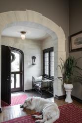
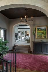
Salinas established the overall theme in the entry foyer, retaining its original brick floor, adding a wood ceiling, and enhancing the walls and archways with a faux limestone motif designed by Claude Breckwoldt. The foyer also forecasts a significant feature of the home – multiple raised and sunken levels that give each living area its own sense of identity, while maintaining the openness of the floorplan.
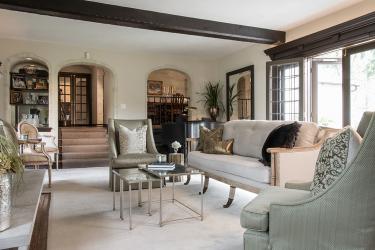
Visible from the foyer, the step-up living room is dominated by a massive fireplace, rough-hewn ceiling beam, and classic pediment windows. “The woodwork was a big issue,” explains the owner. “It’s one of the things we loved about the house, but some had oxidized.” Restored by master wood artisan Rich Acton, the woodwork is now an orginal, rich espresso. Formerly painted, the fireplace mantel and limestone surround were stripped, an original dogwood blossom motif was carved into the mantel at the time the house was built, and Breckwoldt enhanced the limestone effect.
Display niches at one end of the living room were transformed into faux-limestone keystones. On the opposing wall, a small closet was converted into a dry bar, and an open arch above the grand piano was railed with wrought iron.
At the owner’s request, the room’s furnishings are “organic, textural – and movable,” allowing guests to rearrange the seating for conversation areas. An exquisite, pre-owned antique settee determined the soft sage and light taupe cream color scheme, which is carried through by a Lillian August sofa, upholstered in Belgian linen, with polished bronze legs and nailhead trim; Baker slipper chairs; and side chairs in a grosgrain basket weave. Nesting tables with French antique mirror tops serve as a coffee table, and the neutral wool-and-silk area rug was custom-made to accommodate the room’s large dimensions and contoured spaces.
Describing the dining room as “so European,” Salinas calls attention to the faux-limestone walls, decorative ceiling and inlaid 18th-century French gondola table which can seat 16. “There are no nails in the entire table,” he noted, “and we had it completely restored to museum qyality.” The graceful dining chairs were reupholstered in mohair; bronze-toned Dupioni silk drapes line the windows; an antique sideboard fills one wall; and two exquisite curved cabinets, one suspended above the other, provide storage for glassware. Concerned that a chandelier would detract from the spectacular dining ensemble, Salinas illuminated the room with low-voltage, museum-quality can lights.
Accessible from the adjacent butler’s pantry, the pine-paneled, step-down family room was originally the library and is now a hub of family activity. Salinas raised the ceiling to add spatial volume, and Fusion Media Systems disguised the large-screen TV with a dramatic mirror above the original Michelangelo marble-faced fireplace. Seating includes a comfy sofa in a durable cotton/poly herringbone, nailhead-trimmed velour swivel chairs from Carolyn Peterson Design, cushioned wicker and ladderback chairs, and a large ottoman with a crackle-finished base.
The butler’s pantry was opened to the newly designed kitchen, creating a vast space for the wife’s culinary talents, as well as beverage and buffet service. A collaborative effort of Salinas, Jim Baygents of National Kitchen & Bath, and Koblenz, the kitchen revolves around a 10-foot island, topped with absolute black flamed granite and “bookended” with elevated butcher block stations.
Alabaster-and-antique brass lights from Visual Comfort are suspended above the island, and three separate sink areas – one in the island and one at each end of the kitchen – allow for multiple functions to take place simultaneously. Reminiscent of a French country house, the off-white Wood-Mode cabinetry is complemented by honed Whitaker marble countertops in Imperial Danby with a custom edge, and the hardware and fixtures emphasize the vintage styling. Many of the finishes are hammered white bronze (which are more harmonious to historical details for this era, according to Salinas), and the imposing vintage range hood, custom made similar to the elegance of LaCornue and was fabricated by West County Forge.
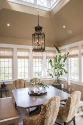
Open to the kitchen, the pièce-de-résistance is the step-down orangerie, where the family tends to linger over informal meals, enjoying gorgeous views through window walls on three sides. Centered beneath the soaring lantern ceiling is an oversize pedestal table with clipped corners, a parchment finish, and a lazy Susan, custom-made by BR2 Design Solutions.
Upholstered in Sunbrella, the rustic benches and side chairs resist spills, and two huge lanterns from Istanbul were repurposed, one as a dramatic light fixture, the other as an accent piece set on the Ann Sacks limestone flooring. Adding a touch of nature are a live Meyer lemon tree and framed pressed ferns from Jules Pass Antiques.
A relaxing haven for this energetic family, the residence is now a marvelous integration of new and old that adapts perfectly to their lifestyle. In Salinas’ words, “The layers of finishes create the impression of a home that has evolved over time.”
Resources
Designer: Garrison Ltd., 314-721-0333
General contractor: Keith Taylor
L.L. Richards Construction Co. Inc., 314-993-1555
Morie & Willems Painting, 314-721-5510
National Kitchen & Bath: Designer - Jim Baygents, 314-962-1800\
Wood-Mode, Kitchen Cabinets
Metro Lighting, 314-963-8330
West County Forge, 314-304-3678
Crescent Plumbing Supply, 314-727-4200
Twigs & MOSS, 314-454-0447
Carolyn Peterson, 314-703-8007
LuLu Belles Fabrics, 314-991-0020
Fischer/Marvin Windows & Doors, 314-647-5000


