Clicking her ruby red slippers together, Dorothy declares, “There’s no place like home.” While the sentiments were simply a line in the classic film The "Wizard of Oz," the phrase couldn’t be truer. Home is where we go to escape after a long day at the office; a place we raise our families and celebrate holidays. Your home gives you a feeling of security and stability that you can’t find in many other places.
It’s the comfort you feel in your home that makes you overlook the imperfections. For Chesterfield couple Dr. Donald and Vicki Mielcarek, that feeling of home is what kept them in their villa when they got the itch to move in 2012. The couple laughs that they have moved every 10 years since they have been married. In 2002, they built a villa in a gated community that was in the perfect location in a great neighborhood with lots of privacy. Don, a retired doctor, was heavily involved in the building process ensuring every aspect the couple wanted was included. So when the 10-year mark approached, instead of searching for a new place to call home, they began looking around their current residence to see what they could spruce up to make their living situation even more comfortable.
“We asked ourselves, ‘What do we not have that we want?’” Vicki explains. “We really tried to think outside the box.” Bringing in their trusted interior designer Gigi Lombrano, whom they had worked with for years, the three looked at each and every room and piece of furniture to assess if they would replace it with something new or reuse it. “We don’t just live in one or two rooms of this house,” Don says. “We really utilize each space. When we decided to renovate, we didn’t want to lose that livability.” By taking their time in each and every decision and selection down to the last accessory, the trio ensured each choice made was the right one. “The three of us worked together fantastically,” Lombrano says. The homeowners agree, saying it took lots of team work and brain power to get it right.
Staying true to their classic, traditional style, they focused on highlighting the unique architectural aspects of the villa by adding crown moulding, chair rail and painting the ceilings, in addition to accessorizing and refreshing the furnishings.
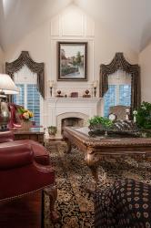
The great room was home to two chairs the homeowners just loved. Instead of replacing with something new, Gigi suggested they reupholster the pieces in a red leather hide. “Because of their scale and shape they really worked in the space,” Lombrano explains. To complement the existing chairs, a new sofa was ordered and the mantel was given a facelift with new accessories. “We really relied on Gigi for a vision for our mantels,” Vicki explains. “The size and scale were really important, and we held out until we found the perfect hurricanes.”
Previously carpeted, the flooring was replaced with a beautiful Asian walnut done in a wider plank, which complements the scale of the room and gives a more updated and modern feel. With the high ceilings, Lombrano knew whatever rug the homeowners selected for the space needed to make a grand statement. The style and color of the rug adds richness and character while still being casual enough for a TV area.
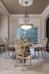
Off the great room, the breakfast area and kitchen had minimal, but still worthwhile updates. The breakfast-room ceiling was painted a darker taupe to contrast the more neutral walls. Window treatments bring a refreshing dose of color and warmth against the wall color and dining ensemble.
In the kitchen, the existing appliances were replaced with Wolf. The cabinet fronts were also refinished to refresh the space. Don suggested elevating the vent hood and raising the cabinets. “We relocated the blower unit to the attic,” he says. “It is virtually silent when we turn it on.” Laughing that he enjoys playing architect and builder, the mechanical aspects of the home were important to Don. A noteworthy mechanical improvement was the total replacement of the home’s HVAC system. In addition, a steamer unit was added for the first floor and humidifiers to the three HVAC units making the home much more comfortable to live in. “It made a major improvement to our overall health,” Don says.
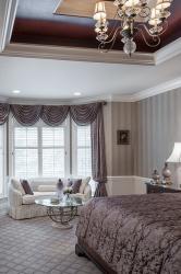
Comfort, but also style, was key in the serene master suite, which highlights varying shades of purple, from the aubergine tray ceiling with a metallic sheen, to the soft shades accented in the rug. Painting the tray pulls together the purple hues from the carpet while allowing the beautiful architectural work in the ceiling to shine.
The adjoining master bath continues the color theme with beautiful wallpaper that complements the bedroom. When the home was built in 2002, the homeowners were aggressive in their master bath design, and today, it is still a look they love.
What they didn’t love was their master closet. The flow just wasn’t working, so a total redesign was necessary. Besides beautiful built-ins that provided more organization and storage than they could have imagined, crown moulding was added to give lift and elevation.
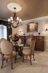
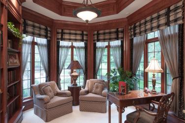
Completing the main level is Don’s library, which is paneled in rich woodwork, and the elegant dining room. In the dining space, Lombrano focused more on editing out existing décor and bringing in larger, simpler pieces with color to spruce up the space. Just off the dining space, the graceful staircase leads to the upper level of the home. The carpeting on the stairs was replaced with a beautiful runner to add drama and color.
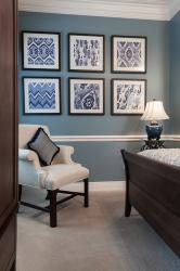
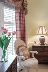
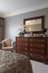
On the second level, two guest bedrooms were given a refreshing facelift with paint, new bedding and accessories. In the “blue room” Vicki fell in love with the artwork she found online. After ordering one print and deciding it was a go, she purchased the entire set to frame on the wall. Double crown moulding and chair rail spruced up the “gray room.” The homeowners also purchased new furniture by Henredon. The collection is classic traditional, but the furniture is not overly carved or ornate giving the space a neo-traditional look.
The other area of the villa in which the homeowners love to spend time is in the finished lower level. Carpeting was replaced with wide, hand-scraped wood flooring to warm up the space. In the bar area, the homeowners were tired of their pink Corian bartop. “When we went looking for granite, we couldn’t find anything we liked,” Don says. “They were all pieces we had seen before.” Vicki wanted something lighter, while he wanted something dark and rich. Nearly giving up, they finally found the perfect balance in a slab that mixes both styles with a few touches of bling. Expanding the bar top to include a place to play cards, the homeowners now love their lower-level bar and find themselves frequently entertaining.
Nearly two years after the start of the renovation, the villa is complete and the couple couldn’t be happier. “To us, this feels like a new home, but we haven’t moved,” Vicki says. “There really is no place like home.”
Resources
Designer: Gigi Lombrano
Authorized Builder Sales
Stone Fabricators
Robert H. Kleine Painting
Dalo Glass Tinting
Rugs By Saga
Design & Detail
KDR Designer Showrooms


