Like many homes that fall victim to multiple renovations, they eventually end up losing their original architectural spirit. A series of piecemeal updates by several different owners often leads to disjointed spaces lacking visual cohesiveness and a natural sense of flow. Such was the scenario for homeowner Lauri Teagan’s charming Creve Coeur home that had lost its identity after decades of remodels.
Built in 1972 by a builder who had constructed all the houses in the neighborhood—and named the street after his daughter—the original mid-century design had become a hodgepodge of '70s, '80s and '90s trends. When Teagan bought the home, she aimed to remove all the outdated influences and honor the original architecture, focusing on its clean lines and authentic materials.
“At the time of purchase, the house had multiple wood types in multiple colors,” recalls the owner. “One of the themes of the renovation was to create consistency. Although we could not replace all the wood, we did ensure the stain was consistent throughout to create the appearance of a more homogeneous home.”
Except for a few accent walls, the interior paint adheres to a basic white that doesn’t detract from the architectural lines of the house. Complementary hues applied throughout remain relatively consistent to encourage flow. In addition to white and wood, black is repeated in nearly every space. Home furnishings and patterned designs were used sparingly to reiterate the clean visual aesthetic. “Instead, we wanted to make the house feel light, airy and spacious,” says Teagan. “While it is a great house for entertaining, the focus is on family. With two kids and three dogs, we didn’t want anything too fragile or precious—and livability was key.”
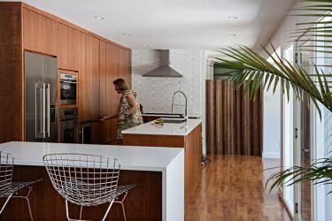
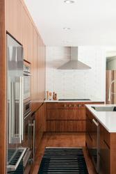
Working with architect Susan Bower of Bower Leet Design, they strove to reclaim the home’s architectural spirit by removing some of the previous renovations. They focused on enhancing the openness and connection to the landscape by reorienting the kitchen and installed new sinks and a new stove to lend a modern touch. “Lauri had clear ideas about what she wanted, so we developed a design plan to incorporate those modifications in a pleasing way,” says Bower. “Builder Tom Roberts of Artisan Constructors made our vision come to life.”
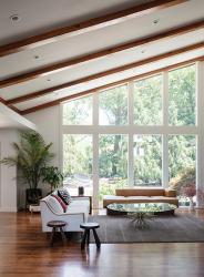
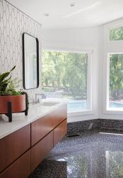
In addition to consistency, light, windows and nature were also key goals. The design team added windows wherever possible to create light and provide spectacular landscape views. The back of the home features a wall of windows, and new skylights in the hallway make a once dark and cramped area feel more open and welcoming. Teagan also requested practical storage wherever possible. Under the steps, she added a set of three pull-out cabinets, two with drawers for out-of-season storage and one full-length hanging cabinet. “When I came up with an unusual idea, Tom made it happen by bringing in subcontractors who would work, brainstorm and problem-solve with me,” notes the homeowner.
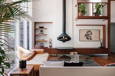
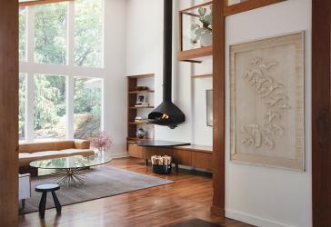
In the living room, an existing sloped double-height ceiling captures the spotlight, so all renovations work to enhance this focal point. The team removed a wall between the kitchen and the living area to create optimal flow and visibility and added windows, with many facing the pool. They also removed a column in the dining area and redesigned the stairway and balcony by implementing a glass railing system. A sleek European fireplace calls attention to the soaring height of the living room’s main wall. This feature was balanced in an asymmetrical composition with the reworked balcony, a framed television and a continuous band of horizontal cabinets with vertical shelves that serve as a display niche.
“Lauri has an eye for mid-century furniture and art, and she searched for quality items at reasonable prices,” says Bower. “I love the public spaces and open and airy flow between the kitchen, dining and living area. This was a home some considered too challenging to renovate, and because there aren’t many structures like this one, standard solutions did not apply. But given the right team with vision and experience, the house was made to glow again.”
In the newly renovated kitchen, the owner didn’t want any embellishments or clutter that would distract from the beauty of the wood, so she decided to forgo drawer pulls, knobs and countertops throughout the kitchen. Instead, the cabinets are full depth with no break and include electrical outlets for operating kitchen appliances without moving them.
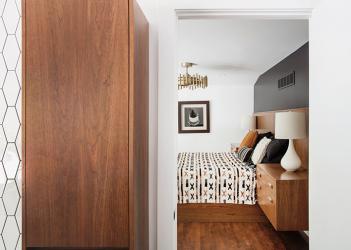
A redesign of the entire primary suite improved circulation and enlarged the closet and bathroom. With the help of Derek Centorbi, custom cabinets were added to the bedroom, including a footboard with a retractable television that prevents obstructing the view of the spa and landscape. Teagan designed the furniture with extra-large floating nightstands built as part of the headboard. Remote-controlled window shades and lights make closing up for the evening virtually effortless.
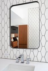
“In the end, I think this home emanates the perfect personality of what a true mid-century modern home deserves,” says Roberts. “Lauri was such a pleasure to work with and had a clear vision of the look she wanted to achieve. The European wall-mounted fireplace, light fixtures, cabinetry and kitchen tile hit the mark on true mid-century design. These features, coupled with preserving the charm of the original house, were important to our team.”
The homeowner’s favorite aspect of her finished home is its light and airy vibe and the spectacular backyard views. “It was important to me that the renovation felt seamless,” notes Teagan. “I did not want to be able to tell what was original and what was added or renovated. While the main purpose of the house is to offer a comfortable refuge for the family, it has also proven to be a wonderful place for entertaining, including my daughter’s recent high school graduation party.”
Resources
Appliances: Autco
Architect: Bower Leet Design
Builder/remodeler: Artisan Constructors
Cabinetry: Centorbi Cabinetry
Window/Door: Kolbe Windows & Doors, Sierra Pacific Windows


