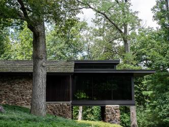
As this Ladue home was being built in the mid-1960s, the current owner was a young boy. His mother drove him by the site every day on their way to school. “I was really interested in home construction then,” the owner recalls. “My mom and dad were having a home built at the same time by Higginbotham Bros., who was building this house, too.” The parallels extended to the architect, the renowned Ralph Fournier, who had designed both homes.
The boy and his mother would often stop by the Ladue home to watch the progress. When asked about his impression of the home when he was a boy, the current owner laughs. “I didn’t like it,” he admits. “I was all wrapped up in the style of the house our family was having built.” Their home had a Country French feel—much more traditional than the Ladue home’s “suburban modernism,” a style for which Fournier became known. “I remember I was really into drawing houses as a little kid and they were all very traditional in feel,” the current owner says. “Up until about 2008 or so when I bought this house, I didn’t really like it.”
But tastes change over time. As he was constantly exposed to creative ideas in a long career in the retail industry, the homeowner found he no longer favored traditional Colonials prevalent throughout St. Louis. When the mid-century home came up for sale, the owner often drove past it. “There was something that drew me to it, because it’s an unusual house,” he says. Viewing the home for the first time in decades, he didn’t get past the front door before turning to his real estate agent to say, ‘How much is this house? Let’s buy it.”
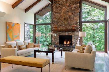
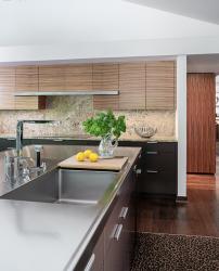
Sited at the top of a hill and surrounded by four acres, the home’s bucolic setting appealed to the current owner. And it had a ‘Goldilocks’ size—not too large, not too small, just right for a single guy who envisioned he’d live on the main level where the master bedroom and bath were located. The house would need some work, however, to bring it to today’s standards. The galley kitchen was narrow and small, indicative of 1960s design, but it opened to a porch. The owner believed he could take the porch space to create a larger kitchen with an adjacent TV room and dining area all in one. In addition, when he bought the home, the living, dining and reception area’s walls and ceiling were all painted a raspberry hue.
“A lot of the work in the first remodel was getting the house back to the bones of mid-century modern,” the owner says. And although full-length windows are a fixture of suburban modernism design, the owner says the original kitchen didn’t take advantage of the views. “We opened it up so that the expanded kitchen, dining and TV area are mainly windows in one big space,” says the owner.
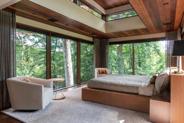
He also envisioned a second remodel which would be an addition to the home. “I’d always had it in my head that I would expand the house for a master bedroom, bath and closet by building an addition, cantilevering it off the east end for a glass-enclosed room,” the owner says. Several architects told him that wasn’t possible, until a friend recommended Lawrence Group. Architect Paul Doerner, a co-founder of the firm, visited the home. “He said, of course we can do what you want,” the owner recalls. Doerner, who passed away last year, shepherded the architectural plans through approvals with the City of Ladue, tweaking the exterior design to add vertical “slats” of wood as a transition from the original stone to the addition’s glass walls.
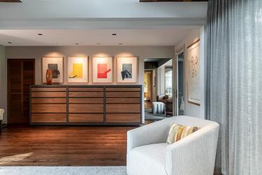
Early in the design process for the addition, the owner consulted with Integration Controls to incorporate automated audio/visual and other design elements in the new space. “We curate technologies so that your home’s tech works for you and not against you,” says Jamie Briesemeister, the company’s co-founder and CEO. The homeowner selected an automated Lutron shading system for the addition’s glass walls. His desire for a TV in the bedroom was actualized by cleverly designing a hidden TV and attached speakers built into cabinetry placed in a master bedroom ‘foyer’ —a space created from the original master bedroom’s footprint.
Jamie says coordinating with Chouteau Building Group, builders of the addition, was critical for success. “There are only so many spaces you have to run wire when a whole bedroom is three walls of glass, so we had to make sure everybody was on the same page,” Jamie says. “The way the addition cantilevers off the side of the house from this stone base, it’s almost like it’s floating,” she says. “It’s really cool.”
Her firm also enhanced the audio in the kitchen, hiding new speakers in the tray ceiling, and added a landscape audio system for the outdoor areas. “We’d also taken control of the existing whole-house music that just didn’t perform very well,” Jamie adds. “Everything is controlled via an app called Control4 Smart Homes that controls his master bedroom shades, all the audio/video that’s connected including the outdoor music, and some of his lighting,” says Jamie.
After the homeowner had remodeled the kitchen, he invited Ralph Fournier to dinner. A friend who also owned a Fournier-designed home attended as well. “It was fun and really interesting to talk to him,” the owner says. Fournier passed away in 2020.
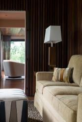
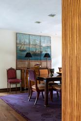
Decades after his first view of the home, the homeowner expresses admiration for Fournier and all the architects who’ve brought his ideas to fruition. “The architecture is what is most interesting about this house,” says the owner. “The interior décor has a lot of meaning for me, but at the same time, it’s designed so your eye is drawn to the windows and the trees outside. I refer to it as my little tree house, and I just love it.”
Resources
Interior design by Nina Coin
Builder: Higgenbotham Brothers Inc., Chouteau Building Group


