Remember the iconic phrase “if you build it, they will come” from the movie Field of Dreams? It could be said that the owners of this St. Charles home reworked the idiom into “if you remodel it, they will come.”
The owners are empty nesters who previously lived about two blocks away. That home, which the husband describes as a “standard, 2-story, 4-bedroom” started feeling a little tight when the couple’s adult children and their spouses came for family gatherings. “We were looking for something where we could spread out, so that as the grandchildren started coming, our house would be the place they’d want to be,” says the wife. “Our other house just wasn’t conducive to that because of the size. When they’d come over, we were all kind of stuck in the kitchen.”
The open floor plan of the new home’s main floor, with kitchen and family room flowing into one large space, an atypical, finished basement with windows and high ceilings, existing crown molding and trim work and a first-floor primary suite appealed to the couple. The home’s back yard, already private and flat, seemed perfect for installing a pool, and an existing elevator also helped seal the deal.
Even with good bones and enviable attributes, the home had some drawbacks. Yellowish paint on the walls, large corbels in the kitchen and fluorescent lighting dated the home, and a primary suite with two separate sleeping areas and bathrooms needed reconfiguring. “It was all very 1980s and 90s,” recalls interior designer Sandra Merritt, principal of Sandra Merritt Designs.
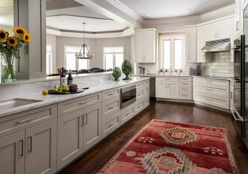
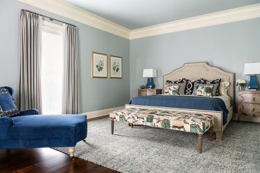
What started with the idea of a simple kitchen refresh and the remodel of the primary suite expanded into work impacting most areas of the home, according to Nate Droste, co-owner of Droste & Sons Construction. The scope of work included refinishing the original walnut floor and adding hardwood in the kitchen, reconfiguring the kitchen island while also installing new kitchen cabinets, appliances and countertops, opening up the stairwell to the basement level with new open railings, converting one of the sleeping areas in the primary suite to a sitting room, removing old lighting and installing new LED fixtures, new paint throughout the home and extensive wood casework in the home office.
Merritt says “the best move they made” was installing the open staircase to the basement. “Previously, it was just walls on all sides of a staircase going down,” she explains. “Now, when you walk into the home, you see the open stairwell going down to the lower level. It feels like a three-level house instead of a house with a basement.” The husband notes he had finished the basements in their previous two homes. “That took a lot of time, and then nobody ever went down there,” he says. Opening up the stairwell in their new home was a high priority, and “our builder came up with a great plan to do that.”
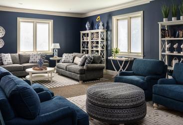
Previous owners had already outfitted part of the expansive basement with a tile floor, a kitchen and leather furniture grouped around a fireplace. “That side felt very masculine to me, so I thought we’d make the other side of the large room feel more feminine, a little softer,” says Merritt. She chose a color scheme of navy and white, painting the walls in Benjamin Moore Navy with fresh white for the crown molding and trim work. “The crown molding elevates the space,” she says. “It’s very bright and doesn’t feel like a basement at all.” Budget-friendly upholstered pieces, tables and rugs invite grandchildren to play.
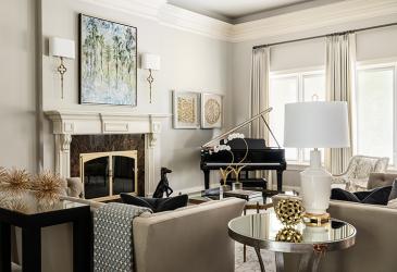
On the main level, the look is traditionally classic yet modern. “We wanted something that would be timeless, that we could live with for quite a while and not have to update,” says the wife. In the living room, mirrored tables lend a modern air to the traditional lines of the new upholstered pieces. “The husband told me early on he didn’t like contemporary, so I had to tiptoe a few of these pieces in,” Merritt says of the tables and a few of the accessories. “He’s very much a traditionalist.”
She notes the dining room’s light fixture was a stretch for both homeowners in terms of style. “I saw this at High Point Market, and I knew it would make the room,” says Merritt. The Currey & Company multi-drop pendant light features mirrors with seams of brass in a cluster. “Even the wife wasn’t sure at first,” says Merritt. “But they trusted me, and everyone who comes in goes crazy for that chandelier.”
Merritt says lighting can change the entire ambience of a home. “You can walk in a house and tell its age just because of the lighting,” Merritt says. “The (previous) lighting in this home really dated the house. We’ve replaced it little by little and it’s made a world of difference.”
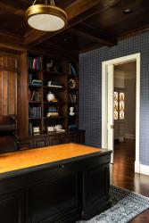
The wife says narrowing design choices from the overwhelming number of possibilities is one of the many advantages in working with a designer. “Sandy helped steer us to things,” says the wife. Case in point: the desk for the husband’s home office. He wanted a traditional desk with a closed front. Merritt suggested several options, including the Hekman executive desk the couple ultimately chose. “We used the desk they picked out to model the trim work and color scheme,” Droste says. “The entire room was done in the same color of stain as the walnut floor.” The finished room features a coffered ceiling and wall of woodwork and shelves behind the desk.
The husband appreciates their home so much now that it's finished. “Quite frankly, I can’t believe what our house looks like today versus where it started. We are so proud to own it.”
Resources
Interior Design Sandra Merritt Designs
Builder Droste & Sons Construction


