“I might have put a band-aid on it if it had just been me,” the owner of this Town and Country home says of recent renovations. Emerging from a divorce, the owner had already been thinking that her beloved 1990s traditionally styled home could use some updating. When she entered into a new relationship that seemed destined for the long haul, the couple contemplated where they’d join households: his or hers? “He had a beautiful home he’d just renovated, but I was much more attached to my home,” says the owner, who’s lived in the house for over 20 years.
“The timing was perfect,” she adds. “I felt like I was creating a new life, we were creating a new life together, and the house kind of deserved new life, too.”
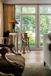
Major priorities for the renovations were overhauling the kitchen and updating the main-floor spaces. In the kitchen, significant construction included expanding the island, repositioning the cooktop and removing existing pantry closets to reconfigure storage space. New cabinetry, counters and appliances were also installed. In the rest of the house, the wish list included removing carpet in first-floor public spaces and replacing it with hardwood, refinishing existing hardwood floors and adding new area rugs, window treatments, paint and furnishings in a more muted, calmer color palette.
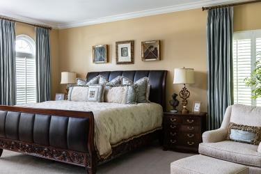
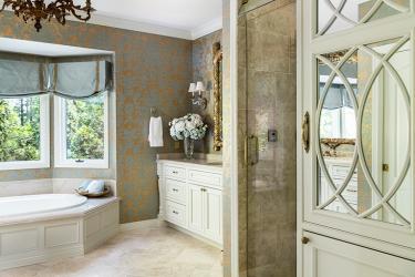
With a polished and practiced eye, the owner calls her preferred design style New Traditional. “I always seek the timeless and the classic, but with a twist,” she says. She’d already remodeled the primary suite with Karr Bick Kitchen + Bath several years prior to the recent first-floor revamp. “That primary bedroom and bathroom renovation turned out so beautifully that I set a new color palette,” says the homeowner, noting she drew inspiration from her long-held love of French blue, “the sort of blue you might see at (the Palace of) Versailles,” the homeowner explains. “I noticed I didn’t get tired of the color or the cabinetry from the bathroom renovation, so that’s why I chose the same exact color for the cabinetry when I started thinking about doing the kitchen.”
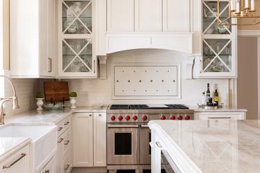
The color is Mouser Cabinetry’s China, according to Wendy Kuhn, lead designer at Karr Bick. “This color has a very subtle undertone of pink,” says Kuhn. “It’s not yellowy or creamy, and it picks up the warmth of her floor and the warmth of the beiges in her kitchen countertop, which is Taj Mahal quartzite. It gives you a white kitchen without it being a ‘cold’ white kitchen.”
In its original design, a pair of built-in pantry closets weren’t particularly functional, the homeowner says. “I had all the space I needed, but it wasn’t well delegated,” the homeowner recalls. Removing the pantry closets and opening up a hallway to the dining room also created a landing space for servicing the dining room. “The new pantry-area cabinetry has rollouts, so the deep cabinets are very functional,” says Kuhn.
The island was expanded in length and depth, and the cooktop moved from the island to the back wall. “She wanted a more welcoming space for people to sit, so getting that cooktop off the island was a high priority,” says Kuhn. The “X” in the glass-front cabinets ties in with the diagonal tile over the Wolf range, and the metal studs in the tile inset incorporate the same finish as the cabinet pulls and light fixtures. “She had a very clear vision of what she wanted, and it all came through in the end with these details,” says Kuhn.
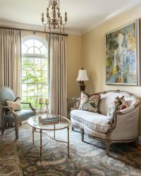
One of the owner’s most cherished areas is a sitting room, which was formerly used as an office. “It had a decidedly masculine bent before, and I wanted it to feel very feminine, uplifting and completely different,” says the homeowner. Banning electronics from the space, she often uses it to host a few friends or to read. “Every little thing in this room represents something from my life, my family and my history,” she says, including a French blue leather armchair with baseball stitching. The homeowner’s father was a baseball enthusiast and passed his love of the game to her. “Every time I look at that chair, I think of my dad.”
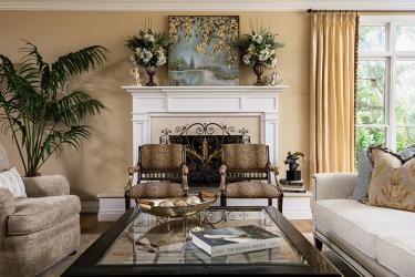
The homeowner disliked the great room’s fireplace when she first viewed the home more than 20 years ago. “I can’t believe I lived with it as long as I did,” says the homeowner, “but when we decided to do the floor in here, I realized if I was going to do something with the fireplace, now was the time to do it.” Working with Forshaw of St. Louis’ Rick Forshaw Jr., the new fireplace features a custom mantel and a surround of Crema Marfil marble. The new area rug is one of several the homeowner selected. “More than anything else, an area rug defines the look or the character of a space,” says Rugs by Saga co-owner Tony Dye.
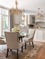
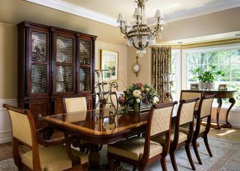
One of the homeowner’s favorite new rugs is the one anchoring the breakfast room. “This rug has every single color I used in the house, and I just love every color in it,” she says. Dye says all the rugs the homeowner selected are traditional Persian rug patterns but woven in modern color palettes. “A rug such as this one gives a space a whimsical lightness, but it’s grounded in tradition,” says Dye.
Quick to praise the skills of the professional team of Kuhn, Dye, Forshaw and Calico’s Kimberly Scails, the homeowner says she enjoys the process of doing most of the design work herself. “For me, it’s a real joy to make a house feel like a home and personalize it with your sense of style, your family history, your cultural influences—all the things that make you who you are. And with my new husband and I coming together to live here, I really wanted the house to feel like our house. It’s like a new house along with our new life, and we’re very excited about how everything turned out.”
Resources
Appliances: Roth Living
Artwork: Brody's, Edwin Pepper, Shubert Design, Sallie Home, Mary Tuttle's Floral & Gifts, B. Davis Designs
Fireplace: Forshaw of St. Louis
Cabinetry: Mouser Cabinetry
Rugs: Rugs by Saga
Granite: Stone Fabricators
Staircase: Donahue Painting & Refinishing
Kitchen/Bath: Karr Bick Kitchen + Bath
Tile/Granite Supplier: Unique Stone Concepts
Window Treatments: Calico Corners


